- How Color Affects the Brain and Emotions
- Color Perception Factors
- Warm vs Cool Colors: Psychological Differences
- Psychological Profiles of Individual Colors
- Applications of Color Psychology
- Color Psychology Myths vs Reality
- How to Choose Colors with Purpose
- Future Trends in Color Psychology
- Color Psychology Isn’t Just Theory – It’s a Tool for Impact
Color psychology is the study of how different hues influence human emotions, thoughts, and behaviors. From the warm comfort of earthy tones to the high-energy impact of bold reds, colors carry meaning – and power – that extends far beyond aesthetics.
In marketing, design, and branding, color matters more than many realize. The psychology of color can shape first impressions, drive user actions, and even affect memory retention. A carefully chosen palette can elevate a brand’s message, improve user experience, or influence a shopper’s decision to click “buy now.”
The roots of color theory in psychology trace back to early thinkers like Johann Wolfgang von Goethe and later contributions from psychologists like Carl Jung, who explored how color relates to personality and mood. Over time, research has expanded to include cultural associations, physiological responses, and practical applications across industries.
In the sections ahead, we’ll explore how color really works – what science and culture say about it – and how to apply that knowledge to create more emotionally resonant, effective visual experiences.
How Color Affects the Brain and Emotions

To understand how color influences us, it’s essential to look at the science behind perception. When light enters the eye, it’s converted into electrical signals that the brain interprets as color. But this process goes beyond simple recognition – colors can trigger measurable changes in brain activity, mood, and even physiological responses.
According to a study published in Frontiers in Psychology, color can influence emotional states, cognitive performance, and even physiological responses like heart rate and blood pressure.
Different hues stimulate different parts of the brain. For instance, warm colors like red and orange can increase heart rate and alertness, while cool colors like blue and green are linked to calmness and reduced stress. These reactions are tied to the release of neurotransmitters like dopamine and serotonin, which play a role in how we feel and respond.
The link between color and emotion isn’t just cultural – it’s deeply instinctual. Even infants show preferences for certain colors, suggesting that our responses are hardwired at some level. Emotional associations with color are also influenced by evolution (e.g., red as a signal for danger) and the environment (e.g., green as a sign of safety or growth).
So, what is color psychology in this context? It’s the intersection of biology, emotion, and perception – a framework for understanding how color can be used to influence feelings and behavior, intentionally or subconsciously.
While color theory psychology traditionally focused on artistic and design principles, modern approaches blend neuroscience and behavioral science, offering powerful insights for anyone looking to communicate visually and emotionally.
Color Perception Factors
Our experience of color isn’t just biological – it’s shaped by who we are, where we’re from, and the context in which we see it. While some associations with color seem nearly universal, many are influenced by culture, gender, age, and individual psychology.
Cultural Influences and Symbolism
In Western cultures, white often symbolizes purity, while in parts of Asia, it represents mourning. Red may evoke love and passion in one culture but signal danger or warning in another. These cultural interpretations are vital for marketers and designers working across global audiences, as misaligned symbolism can lead to confusion or even offense.
Gender Differences in Color Preferences
Research shows men and women often perceive and prefer different colors. For example, women may lean toward softer shades like lavender or turquoise, while men might prefer bolder tones like navy or dark green. These trends are not absolute but can offer helpful guidance when tailoring visuals for a specific demographic.
Age, Personality, and Psychological Conditions
Children are typically drawn to bright, primary colors, while older adults may prefer more muted tones. Personality traits also play a role – extroverts may favor vibrant hues, while introverts might gravitate toward calmer palettes. Certain psychological conditions, such as depression or anxiety, can also affect how individuals respond to specific colors.
Contextual vs Universal Meanings
Some colors evoke consistent colors and emotions across populations – blue is widely seen as calming, for example – while others are deeply contextual. A color’s meaning can shift dramatically depending on setting, lighting, and even adjacent colors.
Understanding these nuances is key to leveraging the psychological effects of color on human behavior. It’s not just about choosing a pleasing palette – it’s about selecting colors that resonate with your specific audience and evoke the intended emotional response.
Warm vs Cool Colors: Psychological Differences

One of the most powerful ways to influence perception and emotion is by choosing between warm and cool colors. These two categories create very different atmospheres and can be used intentionally to guide behavior, enhance mood, or communicate brand values.
Warm Colors: Energizing and Stimulating
Warm colors – such as red, orange, and yellow – tend to evoke feelings of excitement, passion, and warmth. They are attention-grabbing and emotionally intense, making them ideal for calls-to-action, sales promotions, and designs meant to evoke urgency or enthusiasm. Red, for example, can stimulate appetite and increase heart rate, which is why it’s often used in restaurant branding.
Cool Colors: Calming and Reassuring
Cool colors – like blue, green, and purple – are typically associated with calmness, trust, and relaxation. These hues are frequently used in healthcare, tech, and wellness brands because they create a sense of stability and serenity. Blue can reduce anxiety, green is linked to balance and renewal, and purple often suggests creativity and luxury.
When and Why to Use Each Palette
Choosing between warm and cool colors depends on your message and audience. Want to energize, inspire action, or stand out? Warm colors might be your best tool. Need to reassure, calm, or establish trust? Cool tones are often the better fit.
These mood colors aren’t just stylistic choices – they’re strategic tools. By aligning your color palette with the emotional tone you want to set, you can enhance user experience, influence decision-making, and strengthen your brand identity.
WordPress Webdesign
Enhance your agency’s offerings with our WordPress website design services. Get custom, high-quality designs that fit your client’s needs.
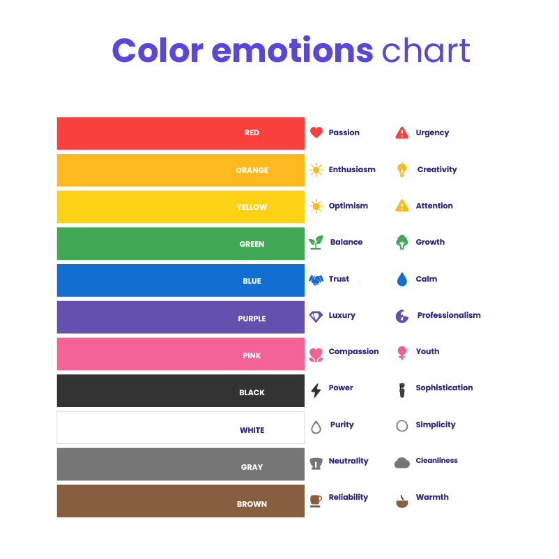
Psychological Profiles of Individual Colors
Each color carries a unique psychological signature – shaping how we feel, act, and respond. Here’s a breakdown of the most commonly used colors and what they tend to communicate, both emotionally and behaviorally.
Red – Passion, Urgency, Danger, Excitement
Red increases heart rate and creates a sense of urgency. It’s often used in clearance sales or warning signs because it grabs attention instantly. Brands like Coca-Cola and Netflix use red to create excitement and boldness.
Orange – Enthusiasm, Creativity, Friendliness
Orange is a stimulating color that evokes warmth and innovation. It’s frequently seen in branding for companies that want to appear energetic and accessible, like Fanta or SoundCloud. Studies show orange can increase feelings of friendliness and openness.
Yellow – Optimism, Energy, Attention
Bright and cheerful, yellow is associated with sunlight and positivity. It’s often used to stimulate mental activity and grab attention – think McDonald’s golden arches or Post-it Notes. However, too much yellow can induce anxiety in some settings.
Green – Balance, Health, Growth
Green has a calming effect and is strongly linked to nature, renewal, and stability. It’s popular in health and eco-conscious brands like Whole Foods and Spotify. Green is also believed to improve concentration and promote relaxation.
Blue – Trust, Calm, Professionalism
Blue is one of the most universally liked colors and is frequently associated with dependability and calm. It’s a favorite in corporate and tech branding—seen in logos like Facebook, PayPal, and IBM. Research shows blue can lower blood pressure and reduce stress.
Purple – Luxury, Mystery, Creativity
Historically linked to royalty and wealth, purple suggests sophistication and imagination. It’s used by brands like Hallmark and Cadbury to signal creativity and elegance. In lighter shades like lavender, it takes on a calming, spiritual tone.
Pink – Compassion, Youth, Femininity
Pink evokes nurturing, innocence, and playfulness. It’s commonly used in marketing aimed at younger audiences or products centered on self-care and compassion—such as Barbie or breast cancer awareness campaigns. Lighter shades are seen as calming and tender.
Black – Power, Sophistication, Formality
Black conveys elegance, control, and authority. It’s dominant in luxury branding (like Chanel or Nike) because it adds weight and seriousness. In design, it can be used to create contrast and a sense of modernity or minimalism.
White – Purity, Simplicity, Cleanliness
Often associated with cleanliness and clarity, white creates space and a sense of new beginnings. It’s widely used in healthcare, tech, and minimalist branding—think Apple’s clean aesthetic or hospitals’ use of white for sterility.
Gray – Neutrality, Stability, Gloom
Gray is reserved, balanced, and practical – but too much can feel dull or detached. It’s often used in backgrounds or to support other colors without competing for attention. Brands like Mercedes-Benz use gray to emphasize sophistication and control.
Brown – Reliability, Warmth, Wholesomeness
Brown is grounded and earthy, often evoking a sense of trust, tradition, and comfort. It’s a popular choice in organic or food-related branding – like Hershey’s or UPS – because it signals naturalness and stability.
Applications of Color Psychology
Understanding the principles of color psychology isn’t just for academics – it has real, practical value across a wide range of fields. Here’s how professionals in various industries use color to shape perception, enhance experiences, and drive results.
A. In Marketing and Branding
Color plays a central role in shaping brand identity and triggering recognition. Think of the red of Coca-Cola or the blue of Facebook – colors are part of what make these brands unforgettable.
Color also impacts conversion rate optimization (CRO). Studies show that simply changing a call-to-action (CTA) button color can significantly affect user behavior. For example, red buttons might trigger urgency, while green can signify safety or progression. The key is aligning color choices with the desired emotional response.
Different industries also show distinct color trends: tech companies lean toward blue for trust, beauty brands use pastels to suggest softness, and food chains often use warm colors like red and yellow to stimulate appetite.
B. In Personal Style and Fashion
Color isn’t just for the canvas – it’s part of how we present ourselves. Dressing strategically can influence how others perceive confidence, creativity, or professionalism.
In personal branding, a well-chosen color palette can help you stand out and send a consistent message. Bright colors can project energy and openness, while neutrals often suggest reliability and maturity.
Clothing also offers a way to express personality – bold hues for extroverts, subdued tones for minimalists, or even color-blocking to signal playfulness and creativity.
C. In Interior Design
Interior spaces can profoundly affect mood, and color is one of the most effective tools for shaping those environments.
Designers use color to create mood-enhancing rooms: blues and greens for relaxation, yellows for optimism, and muted tones for calm. Color zoning – assigning different hues to different areas – can support specific goals like focus in a home office or serenity in a nursery.
Different demographics also respond differently to color. Children tend to thrive in brighter, more stimulating environments, while older adults may prefer softer, more balanced tones.
D. In Healthcare and Therapy
In therapeutic settings, color is used intentionally to promote healing and emotional well-being. Chromotherapy, or color therapy, uses specific colors to influence the body’s energy and mood – like using blue to calm anxiety or green to restore balance.
Hospitals and clinics often choose colors based on their psychological effects. Soft greens and blues are common in waiting rooms to reduce stress, while children’s wards might use more playful and energizing palettes.
E. In Web & UI Design
Digital experiences are deeply influenced by color choices. Designers consider the psychology of color when choosing backgrounds, accents, and navigation elements to guide users through emotional and intuitive journeys.
Accessibility and readability are also top priorities. High-contrast palettes improve usability, especially for users with visual impairments. Meanwhile, emotionally aligned colors can support content goals – for example, calm tones in meditation apps or bold accents in e-commerce sites.
Color Psychology Myths vs Reality
Despite its growing popularity, the field of color psychology is surrounded by myths and oversimplified ideas. While it’s tempting to believe that “red always means danger” or “blue always means calm,” the truth is far more nuanced.
Debunking Common Misconceptions
One of the most persistent myths is that each color has a fixed, universal meaning. For example, many believe blue always induces calm, but in certain contexts – like a corporate environment or a cold hospital room – it may evoke detachment or even sadness.
Similarly, red doesn’t always mean aggression. In romantic branding, red conveys passion; in food packaging, it stimulates appetite. The same color can produce very different effects depending on the audience, cultural background, and placement.
Context and Testing Matter
Understanding what is color psychology means going beyond static charts and tapping into real-world dynamics. It’s not enough to pick a “happy” or “trustworthy” color from a list. Designers and marketers must consider the full context: target audience, industry standards, contrast, lighting, and even screen display.
This is why testing is so important. A button that performs well in one campaign might flop in another simply because the surrounding elements or the audience changed.
Science Over Anecdote
Many color-related claims come from personal anecdotes or generalized assumptions, not data. True color theory psychology is grounded in research from cognitive science, neuromarketing, and cultural studies. While there is no one-size-fits-all formula, science helps identify patterns and tendencies that can guide more strategic decisions.
Relying solely on gut feeling or outdated charts can lead to poor outcomes. By separating myth from evidence, professionals can use color more effectively to support goals, enhance user experience, and create emotionally resonant work.
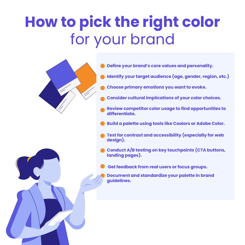
How to Choose Colors with Purpose
Selecting the right colors isn’t just about what looks good – it’s about what works. To design with intention, you need to consider how your color choices will be received by your audience and whether they align with your goals.
Ask the Right Questions
Before choosing a palette, ask yourself:
- Who is my audience? Age, gender, cultural background, and even profession can influence how colors are perceived.
- What emotion do I want to evoke? Should the design feel calming, exciting, trustworthy, or luxurious?
- Are there cultural or situational factors to consider? A color may mean one thing in one region and something entirely different in another.
These questions help ensure that your choices are not just visually appealing, but also strategically aligned with the message and context.
Test, Don’t Assume
In digital design, A/B testing is a powerful tool to validate your color decisions. Changing the color of a CTA button, banner, or background and comparing performance metrics – like clicks, conversions, or time on page – can reveal surprising insights. What you think will work may not match how users actually respond.
Testing removes guesswork and lets data guide your design decisions.
Use the Right Tools
Fortunately, there are plenty of tools available to help you build thoughtful, effective color palettes. Some popular options include:
- Coolors – A fast, easy way to generate harmonious color schemes.
- Adobe Color – Offers features like color harmony rules and accessibility checks.
- Colormind – Uses AI to generate color palettes based on real-world examples.
- Material Design Palette – Helps create color combinations that follow Google’s design guidelines.
These tools take the guesswork out of palette building and help you ensure your colors look great – and feel right – across devices and use cases.
Future Trends in Color Psychology
As technology evolves, so does our understanding and application of color. What once relied solely on instinct or tradition is now being shaped by data, machine learning, and immersive digital experiences.
Evolving Perceptions in Digital Spaces
In today’s fast-paced digital world, color doesn’t just enhance visual appeal – it shapes interactions. With more people spending significant time on screens, subtle shifts in how we perceive and react to color are emerging. For example, dark mode interfaces influence emotional tone and user focus differently than bright, high-contrast environments. Designers are learning to adapt their palettes for multiple screen types, lighting conditions, and user preferences.
AI and Emotionally Intelligent Color Palettes
Artificial intelligence is beginning to revolutionize color strategy. Tools can now generate custom color schemes based on user behavior, emotional goals, or branding needs. These algorithms analyze data to predict which colors are most likely to elicit a desired reaction – such as trust, urgency, or calm – based on patterns across industries and platforms.
This merging of data science with the psychology of color allows for a new level of precision in everything from marketing campaigns to personalized UI experiences.
Immersion Through VR and Color Therapy
Virtual reality is opening doors to a new frontier in color application – immersion. In healthcare and wellness spaces, VR environments are being designed with therapeutic color palettes to reduce anxiety, manage pain, and support emotional healing. These virtual experiences leverage color as a central element in guiding mood and behavior, offering controlled environments that amplify the benefits of traditional chromotherapy.
As tech and neuroscience continue to intersect, color will play an even greater role in how we communicate, connect, and create across digital and physical spaces.
Color Psychology Isn’t Just Theory – It’s a Tool for Impact

From influencing purchasing decisions to shaping moods and guiding user behavior, color psychology plays a vital role in how we experience the world – both online and off. Whether you’re designing a website, building a brand, decorating a space, or curating your wardrobe, understanding the emotional and behavioral power of color gives you an edge.
What matters most is using that knowledge intentionally. Start by asking the right questions, testing different palettes, and refining based on real-world results. The psychology of color isn’t static – it’s dynamic and deeply contextual, which means your approach should be adaptable, data-informed, and aligned with your audience’s needs.
If you’re looking to apply color more effectively in your digital projects – whether that’s through high-converting landing pages, emotionally aligned UI design, or brand development – The White Label Agency can help. Our team of designers, strategists, and developers knows how to use color not just to make things look good, but to make them work. Explore our white label design and development services today and contact us to bring strategy, science, and creativity together.