

- What is Responsive Design?
- What is Adaptive Design?
- Responsive vs Adaptive Design: Key Differences
- When to Use Responsive Design
- When to Use Adaptive Design
- Combining Both Approaches
- Challenges and Best Practices
- Future Trends in Web Design: What’s Next?
- Making the Right Choice: Adaptive vs Responsive Web Design
Today, users hop from phones to laptops to tablets and websites need to keep up. It’s not just about looking pretty – it’s about working smoothly no matter what device you’re using. Two key design approaches dominate this space: adaptive and responsive web design.
Responsive web design focuses on creating flexible layouts that adjust dynamically to fit different screen sizes, providing a consistent user experience.
Adaptive web design, on the other hand, delivers specific layouts tailored to predefined screen widths.
So, which one’s the secret formula for awesome websites? Well, that’s where things get interesting. Understanding the ins and outs of adaptive vs. responsive design isn’t just tech talk – it’s the key to creating web experiences that users love and businesses thrive on. Let’s dive in and unpack these approaches.

What is Responsive Design?
Responsive web design is a design approach that ensures websites automatically adjust to fit any screen size or device. Rather than creating separate layouts for different devices, responsive design uses fluid grids, flexible images, and media queries to create layouts that dynamically respond to the user’s environment.
Key Characteristics of Responsive Design
- Fluid Grids: Instead of fixed-width layouts, fluid grids proportionally scale content based on screen size, ensuring a consistent design across devices.
- Flexible Images: Images within responsive designs adjust in size and resolution to fit different screen dimensions, maintaining visual quality without slowing down the site.
- Media Queries: These CSS techniques allow the website to detect the device’s screen size and adjust the layout accordingly. It helps ensure that users have an optimal viewing experience whether using a smartphone, tablet, or desktop.
Benefits of Responsive Design
- Scalability: Responsive design adapts to all devices, from the smallest smartphones to large desktop monitors, making it future-proof as new devices emerge.
- SEO-friendly: Google prioritizes mobile-friendly websites, and responsive design ensures that your site is optimized for both search engines and users.
- Cost-effective: Rather than developing separate websites for mobile and desktop, responsive design provides a unified solution, reducing development and maintenance costs.
Challenges of Responsive Design
- Performance on Low-bandwidth Devices: While responsive sites adapt to screen sizes, they don’t always account for bandwidth differences, which can lead to slower load times on mobile devices.
- Complex Layouts: For highly intricate websites, responsive design can be difficult to implement without causing layout or performance issues, especially with older browsers or very large websites.
Real-world Examples
Many high-traffic websites, like Amazon and The New York Times, utilize responsive design to ensure seamless user experiences across a wide range of devices. These sites adjust fluidly, displaying product images, articles, and interfaces in a way that feels native whether viewed on a smartphone or a desktop computer.
Understanding the difference between adaptive vs responsive design helps in choosing the right approach for your project, balancing user experience, performance, and development complexity.

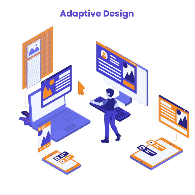
What is Adaptive Design?
Adaptive web design creates different layouts for specific device types. Instead of one flexible layout that adjusts to all screens, it uses pre-made designs for smartphones, tablets, and desktops. The website detects the device and loads the right layout. This approach aims to give users the best experience for their particular device.
The design only changes at set screen sizes, called breakpoints. For example, there might be layouts for:
- Phones (small screens)
- Tablets (medium screens)
- Desktops (large screens)
This differs from responsive design, which continuously adjusts a single layout to fit any screen size. Adaptive design focuses on optimizing the experience for common device categories.
Key Characteristics of Adaptive Design
- Fixed Layouts: Adaptive design uses fixed layouts tailored to specific screen sizes, allowing precise control over how the website appears on each device.
- Device-specific Designs: With adaptive design, different versions of the website are created for various devices, ensuring the best possible experience for users whether they’re on a phone, tablet, or desktop.
- Breakpoints: The design shifts at specific breakpoints, which are the screen widths where a new layout is triggered. Each breakpoint is designed to fit a particular device type.
Benefits of Adaptive Design
- Optimized for Specific Devices: Adaptive design allows designers to create unique, tailored experiences for each device, ensuring that content and layout are optimized for the end user.
- Faster Load Times on Certain Screens: Since the layout is designed specifically for a certain device, unnecessary resources (like large images or videos) can be excluded, leading to faster load times on mobile devices or smaller screens.
Challenges of Adaptive Design
- More Development Time: Since adaptive design requires building multiple versions of a website, it often involves more time and resources during both development and maintenance.
- Requires Multiple Layouts: Unlike responsive design, which scales a single layout, adaptive design needs a different layout for each screen size category, increasing complexity for developers and designers.
Real-world Examples
Popular websites like Apple and Amazon often incorporate elements of adaptive design. For example, Apple’s website delivers distinct experiences based on whether the user is on a desktop or a mobile device. This device-specific tailoring ensures that the site is both visually and functionally optimized for the user’s device.
Understanding the difference between adaptive vs responsive web design is crucial when deciding which approach is right for your project. While adaptive design offers precise control over the user experience on each device, it requires more upfront effort in development and maintenance.
Responsive vs Adaptive Design: Key Differences
When choosing between adaptive vs responsive web design, it’s essential to understand how each approach handles layouts, development, performance, and flexibility. While both aim to deliver an optimal user experience across different devices, they do so in different ways. Below is a comparison of their key differences:

Common Misconceptions
One common misconception is that responsive design always leads to slower performance compared to adaptive design. While it’s true that responsive sites can load unnecessary assets on smaller devices, this can be mitigated with proper optimization techniques such as using lazy loading, compressing images, and implementing content delivery networks (CDNs). In many cases, well-optimized responsive websites perform just as efficiently as their adaptive counterparts.
Another misunderstanding is that adaptive design is always better for user experience. While it offers greater control over how a website looks on specific devices, the added complexity in development and maintenance can outweigh its benefits, especially for smaller projects with limited resources.
Understanding the pros and cons of adaptive vs responsive web design helps you make the right decision for your web development project. Each approach has its place, depending on factors like project scope, target audience, and long-term maintenance plans.

When to Use Responsive Design
Responsive web design is an excellent solution for many web projects, particularly for businesses looking to create a user-friendly experience across multiple devices without incurring the cost of developing multiple layouts. Below are key situations where responsive design is ideal:
1. Cost-efficiency for Small to Medium Businesses
For small to medium-sized businesses, responsive design is a cost-effective solution. Since it only requires creating a single layout that adapts to various screen sizes, it significantly reduces development and maintenance costs compared to adaptive design, which requires multiple layouts for different devices. This efficiency makes it a popular choice for startups and companies with limited budgets who still want to deliver a consistent user experience.
2. SEO Optimization and User Experience
Responsive websites are favored by search engines like Google, as they provide a seamless experience across devices without duplicating content. This means you only have one URL for both mobile and desktop versions, which simplifies crawling and indexing for search engines. Moreover, offering users a site that adjusts effortlessly to their device improves overall user experience, leading to lower bounce rates and higher engagement – factors that also contribute to better SEO performance.
3. Future-proofing Design
Responsive design is built to adapt to a wide range of screen sizes, making it an ideal choice for future-proofing your website. As new devices with varying dimensions are introduced, your responsive site will automatically adjust to fit them, eliminating the need for constant redesigns. This scalability makes it a great long-term investment.
Tips for Building a Responsive Site
To ensure your responsive site performs optimally across all devices, here are a few best practices to keep in mind:
- Optimize Images: Use tools like lazy loading and image compression to ensure images don’t slow down your site, particularly on mobile devices.
- Minimize Code: Keep your CSS and Javascript lightweight by removing unnecessary code, which can bog down load times on smaller devices with limited bandwidth.
- Use Mobile-First Design: Start your design process with mobile layouts in mind, then scale up to larger screens. This approach ensures that your site remains user-friendly on smartphones while still delivering an excellent experience on desktops.
- Test Across Devices: Regularly test your website on different devices and browsers to ensure it maintains its functionality and aesthetics. Tools like Google’s Mobile-Friendly Test and BrowserStack can help you evaluate your site’s performance.
Responsive design is often the best choice for businesses seeking cost-efficiency, improved SEO, and the ability to future devices. Understanding the differences in adaptive vs responsive web design can help you make an informed decision about which approach suits your project’s needs.
When to Use Adaptive Design
Adaptive design is ideal when targeting specific devices or when performance is a top priority. Here are situations where adaptive design is the better choice:
1. Optimizing for Specific Devices or Audiences
If your audience primarily uses certain devices (e.g., iPads or specific smartphone models), adaptive design ensures your website is perfectly tailored for those devices. This allows for a more customized and precise user experience.
2. High-Performing Requirements
For websites or apps where speed and performance are critical, adaptive design can deliver optimized layouts that load faster by serving only the necessary assets for each device, reducing unnecessary load times.
3. Designing for Apps or Specialized Digital Environments
In environments where control over the user experience is essential, such as apps or in-car digital systems, adaptive design allows for a highly specialized approach to user interface design.
Tips for Efficient Adaptive Design:
- Use Breakpoints Strategically: Focus on the most common screen sizes to limit the number of layouts required.
- Reuse Elements: Incorporate shared design components across multiple layouts to reduce redundancy.
- Plan for Growth: Design layouts that can easily be updated as new devices emerge, minimizing future development work.
Choosing between adaptive vs responsive web design depends on your project’s specific needs and goals.
WordPress Web Design Agency
Partner with our white label WordPress web design agency for custom, scalable solutions. We design, develop, and maintain websites tailored to your clients.
Combining Both Approaches
In some cases, a hybrid approach that combines both adaptive and responsive web design can be the most effective solution. This method allows you to leverage the flexibility of responsive design while optimizing for specific devices using adaptive techniques.
Where Hybrid Approaches Shine
Industries like eCommerce and media sites often benefit from this combination. For example, a responsive layout can ensure that product listings and media content adjust fluidly across devices, while adaptive elements provide specific layouts for high-traffic devices like tablets or smartphones. This offers both scalability and an enhanced user experience tailored to the audience’s needs.
Practical Tips for Implementing a Hybrid Approach:
- Start with Responsive as a Base: Use responsive design as the foundation, ensuring your layout works across all devices.
- Implement Adaptive Breakpoints for Key Devices: Identify the most common devices your users are on and introduce adaptive breakpoints to fine-tune the experience for those screens.
- Optimize Performance for Both: Leverage adaptive design to serve lightweight versions of your website to mobile users while using responsive elements to adjust layouts dynamically.
Combining adaptive vs responsive web design approaches can give you the best of both worlds – scalability and optimization for specific devices.
Challenges and Best Practices
Both adaptive vs responsive web design approaches present unique challenges for developers and designers.
Common Challenges
- Managing Breakpoints (Adaptive): For adaptive design, developers must create multiple layouts to fit specific screen sizes. Managing these different breakpoints can become complex and time-consuming, especially as new devices emerge.
- Ensuring Smooth Transitions (Responsive): Responsive design requires fluid transitions between screen sizes. Ensuring that content resizes smoothly without breaking the layout or causing performance issues can be difficult, particularly with intricate designs.
Best Practices
- Use Flexible Grids (Responsive): To avoid layout issues, use flexible grid systems that can adapt smoothly across devices. Testing on different screen sizes regularly can help catch potential problems early.
- Limit Breakpoints (Adaptive): Focus on the most common devices for your audience to reduce the complexity of managing multiple layouts. For example, media sites like BBC optimize for specific breakpoints, delivering tailored content without overcomplicating design management.
- Optimize for Performance: Whether using adaptive or responsive design, optimizing images, using lazy loading, and compressing assets can significantly improve site speed across devices.
By understanding the challenges in adaptive vs responsive web design, developers can implement best practices to deliver a seamless user experience.

Future Trends in Web Design: What’s Next?
As web design continues to evolve, new trends are emerging that will impact the choice between adaptive vs responsive web design.
Enhanced Device Recognition
Adaptive design will become more sophisticated in detecting and responding to device capabilities:
- Hardware-Aware Design: Layouts could adapt not just to screen size, but to processing power, available memory, and even battery life.
- Input Method Optimization: Designs might change based on whether a user is using touch, mouse, stylus, or voice input.
Performance-Driven Adaptations
Both adaptive and responsive approaches will focus more on performance optimization:
- Smart Asset Loading: Adaptive techniques might be used to serve different image resolutions or video qualities based on network conditions and device capabilities.
- Predictive Pre-loading: AI could analyze user behavior to predict and pre-load content, making responsive transitions feel instantaneous.
Accessibility-First Design
Future web design will prioritize accessibility more than ever:
- Adaptive Accessibility: Layouts might change not just for device types, but for user needs, such as larger text sizes, high-contrast modes, or simplified navigation for users with different abilities.
- Responsive Voice Interfaces: As voice interactions become more common, responsive design principles will extend to creating flexible voice user interfaces.
Context-Aware Layouts
Web designs will become more aware of the user’s context:
- Location-Based Adaptations: Layouts might change based on whether a user is at home, work, or on the go.
- Time-Sensitive Design: The design could adapt to the time of day or user’s schedule, prioritizing different content or features.
Micro-Interactions and Animation
The future of web design will see more focus on subtle, meaningful animations:
- Responsive Animations: Animations will adapt smoothly across device sizes, enhancing the user experience without compromising performance.
- Adaptive Micro-Interactions: Small interactive elements might change behavior based on device type, such as hover effects transforming into tap actions on touch devices.
Progressive Web Apps (PWAs)
PWAs are becoming more popular as they offer app-like experiences through web browsers. This trend requires designers to build for performance and usability, where a combination of adaptive and responsive design can ensure seamless transitions between mobile and desktop experiences.
To stay ahead, designers should prioritize flexibility and future-proof their designs by adopting scalable solutions that incorporate elements of both adaptive and responsive techniques.
WordPress Webdesign
Enhance your agency’s offerings with our WordPress website design services. Get custom, high-quality designs that fit your client’s needs.
Making the Right Choice: Adaptive vs Responsive Web Design
Understanding the differences between adaptive vs responsive web design is crucial for any web development project. Responsive design offers scalability, cost-efficiency, and SEO benefits, making it ideal for small to medium-sized businesses. Adaptive design, on the other hand, provides a more tailored user experience with optimized performance for specific devices, which is invaluable for projects with high-performance requirements or specialized digital environments.
Choosing the right approach depends on your project’s goals, target audience, and long-term needs. Whether you need the flexibility of responsive design or the precision of adaptive design, it’s essential to weigh the pros and cons of each method. If you’re unsure which design strategy is best for your website, consider reaching out to professionals for expert guidance.
At White Label Agency, our team of experienced designers and developers specializes in both adaptive and responsive web design. We help agencies deliver scalable and high-performance websites for their clients. By partnering with WLA, you can focus on growing your business while we handle the complexities of web design. Contact us and we will help you choose the right design method for your next project.