

- Foundations of Responsive Design
- Strategic Planning & Setup
- WordPress Webdesign
- Building a Responsive Layout
- Advanced CSS Techniques
- Performance Optimization
- Enhancing User Experience (UX)
- Testing & Quality Assurance
- SEO & Digital Marketing Considerations
- Hire a WordPress Designer
- Emerging Trends & Future-Proofing
- Case Studies & Real-World Examples
- Mastering WordPress Responsive Design: Final Thoughts & Next Steps
Websites must perform seamlessly across a wide range of devices – from desktops to smartphones and everything in between. Responsive WordPress design is the approach of building or adapting a WordPress website to automatically adjust its layout, content, and functionality based on the user’s screen size and device capabilities.
So, what is responsive WordPress design exactly? It’s a design method that ensures your site looks great and functions properly whether it’s accessed on a laptop, tablet, or mobile phone. Rather than creating separate versions of your site for each device, responsive design provides a single, flexible solution.
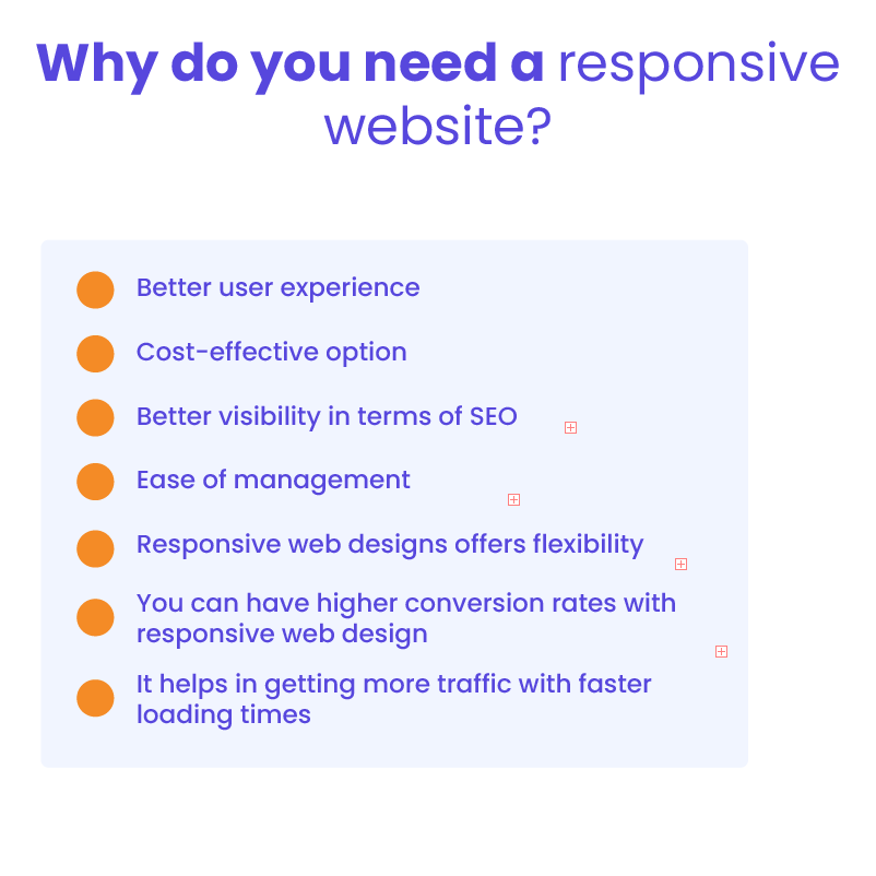
Understanding how to make WordPress responsive is crucial for staying competitive. With mobile usage dominating internet traffic, responsiveness is no longer optional – it’s a necessity. A responsive site improves user experience and engagement by making content accessible and easy to navigate. It also contributes to better SEO performance and higher conversion rates.
Investing in responsive design future-proofs your website. As new devices and screen sizes continue to emerge, a responsive site remains adaptable, ensuring long-term usability and consistent performance across platforms.
Foundations of Responsive Design

The fundamentals of responsive design serve as the building blocks for creating websites that work beautifully across all devices. Understanding these core principles helps developers and designers implement solutions that scale naturally with different screen sizes while maintaining usability and aesthetic appeal.
Evolution of Responsive Web Design
The concept of responsive design emerged as a solution to the growing number of devices with varying screen sizes. Initially, websites were built primarily for desktop viewing. As smartphones and tablets became mainstream, designers adopted a mobile-first approach, prioritizing small screens and scaling up for larger devices. This shift has greatly influenced how we build modern websites – including those on WordPress.
Today, responsive web design WordPress practices ensure that sites automatically adapt to the user’s device, offering a seamless experience without the need for separate mobile versions.
Core Principles
Creating a WordPress responsive site begins with understanding a few key principles:
- Fluid grids and flexible layouts
Instead of fixed-width elements, fluid grids use relative units (like percentages) to scale content proportionally across screen sizes. - Media queries and breakpoint strategies
CSS media queries detect the user’s screen size and apply different styles at specific breakpoints, allowing content to rearrange and resize as needed. - Adaptive images and scalable typography
Images should adjust based on resolution and bandwidth, while text must remain readable on both small and large screens. Techniques likesrcsetandemunits help maintain visual balance and accessibility.
Mastering these core ideas is essential for building responsive, user-friendly WordPress websites that look great and function smoothly across all devices.
Strategic Planning & Setup
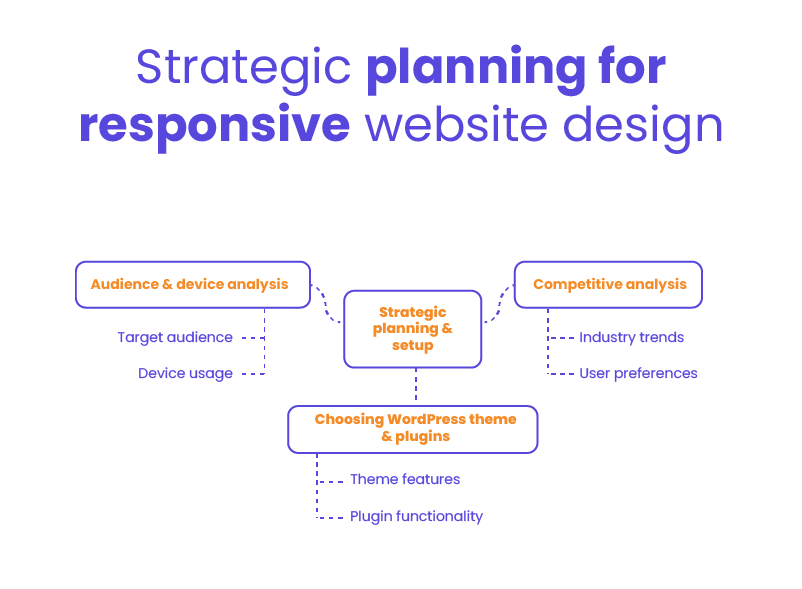
Before diving into code or selecting themes, proper planning sets the foundation for a successful responsive WordPress project. Taking time to analyze your audience, research competitors, and select the right tools will save countless hours of troubleshooting later and ensure your site meets both user expectations and business objectives.
Audience & Device Analysis
Identifying your target audience’s preferred devices, screen sizes, and usage patterns helps shape a responsive strategy that meets their expectations. Are most visitors using mobile phones? Do they switch between desktop and tablet? These insights inform everything from layout choices to performance optimizations.
Competitive analysis also plays a key role. By studying how similar websites in your industry handle responsiveness, you can identify strengths to emulate and gaps to improve on. Market research adds another layer, offering clues about user preferences and evolving trends that impact design decisions.
Choosing the Right WordPress Theme & Plugins
The foundation of a responsive website starts with your theme. When selecting one, look for features like built-in responsiveness, speed optimization, mobile-friendly menus, and accessibility support. Reputable developers often include live demos so you can preview how the theme behaves across different devices.
Equally important are the tools you use to build and manage your site. Page builders like Elementor, WPBakery, and Beaver Builder offer drag-and-drop flexibility and built-in responsive controls. Additionally, plugins that handle image optimization, caching, and mobile menus contribute to a smoother, device-friendly experience.
Making thoughtful choices at this stage sets you up for long-term success and ensures your site performs well across the board.
WordPress Webdesign
Enhance your agency’s offerings with our WordPress website design services. Get custom, high-quality designs that fit your client’s needs.
Building a Responsive Layout
With planning complete and tools selected, it’s time to focus on constructing a layout that adapts seamlessly across devices. The structure you create forms the skeleton of your website, determining how content flows and rearranges as screen sizes change.
Fluid Grid Systems
A core element of WordPress responsive design is the use of fluid grid systems. These grids allow your layout to flex and adapt based on the viewer’s screen size. Instead of fixed-width columns, designers use percentages to define widths, ensuring each element scales proportionally on different devices.
To maintain consistency, stick to a clear column structure – commonly 12 or 16 columns – and apply consistent spacing through margins and padding. This approach keeps your design organized and readable, whether viewed on a phone, tablet, or desktop.
Responsive Typography & Visuals
Typography plays a major role in usability. Choose font sizes and line heights that adjust gracefully across screen sizes. Use relative units like em or rem instead of pixels so text scales fluidly with the layout.
Images and multimedia should be both responsive and optimized. To enhance performance and clarity:
- Use modern image formats like WebP, which offer better compression without quality loss.
- Implement
srcsetto serve different image resolutions based on screen size and device. - Add lazy loading to defer offscreen images until they’re needed, improving load times and user experience.
If you’re wondering how to make WordPress responsive, focusing on layout, typography, and visuals is a crucial part of the equation. These foundational steps help ensure your site looks sharp and loads efficiently across all devices.
Advanced CSS Techniques
Beyond basic responsive layouts, advanced CSS techniques allow for more sophisticated adaptations and interactions across devices. These approaches give designers precise control over how elements behave at different screen sizes, ensuring optimal experiences for users regardless of how they access your WordPress site.
Media Queries & Breakpoints
Media queries are the backbone of responsive styling. They allow you to apply specific styles based on screen width, orientation, resolution, and more. While standard breakpoints – like 768px for tablets and 1024px for desktops – are common starting points, custom breakpoints tailored to your audience’s devices often deliver better results.
For more complex layouts, advanced CSS strategies like CSS Grid and Flexbox offer powerful ways to rearrange content dynamically. You can create multi-column sections that collapse smoothly into single-column layouts on smaller screens, or reorder elements without changing the HTML structure – ideal for maintaining semantic markup and accessibility.
Flexible Components & Modules
Truly responsive design goes beyond layout – it extends to every interactive element on the page. Navigation menus should shift from horizontal lists on desktop to collapsible or hamburger-style menus on mobile. This ensures users can easily browse your site regardless of device.
Forms are another critical touchpoint. Inputs, dropdowns, and buttons must scale properly and remain usable on smaller screens. Consider touch targets, label placement, and spacing to ensure a frictionless experience.
Other components like sliders, carousels, and accordions also need to adapt. Keeping components modular and using flexible widths and heights helps maintain consistency while making future updates easier.
Performance Optimization
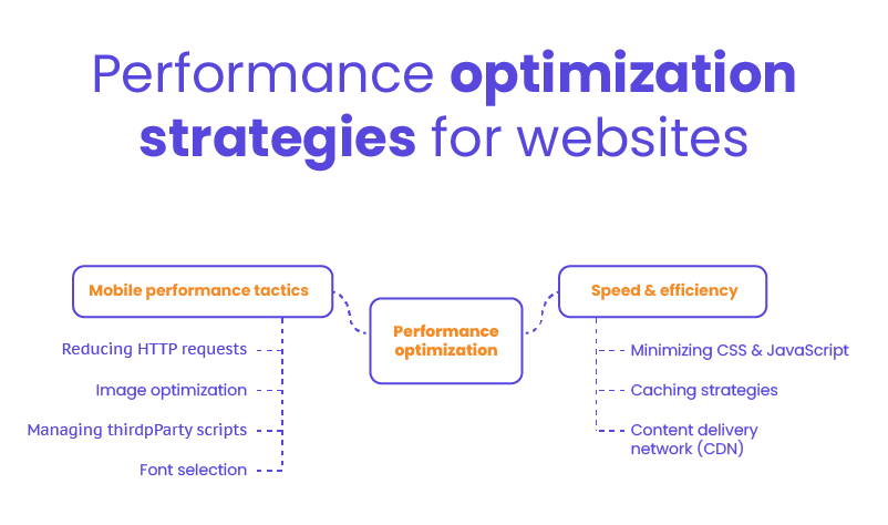
A responsive website isn’t just about looking good on different screens—it must also perform well. Speed and efficiency directly impact user satisfaction, search rankings, and conversion rates.
Speed & Efficiency
One of the most effective ways to boost speed is by minimizing your CSS and JavaScript files. Removing unused code, combining files, and using minification tools can significantly reduce page load times.
Caching is another critical tool in your performance toolkit. By storing certain elements of your site in the browser or server cache, repeat visitors experience faster load times without downloading the same resources again. Server-side caching, browser caching, and object caching can all be layered for maximum impact.
Using a Content Delivery Network (CDN) can also dramatically improve load speed, especially for users accessing your site from different regions. CDNs distribute your website’s static content – like images, scripts, and stylesheets – across multiple servers worldwide, ensuring users are served from the location nearest to them.
Mobile Performance Tactics
Mobile users often rely on slower connections, so optimizing for performance on small devices is essential. Start by reducing the number of HTTP requests – limit the use of large libraries and unnecessary plugins. Compress images, serve scaled-down versions for mobile, and use formats optimized for performance like WebP.
Third-party scripts – like ad trackers, analytics, and widgets – can slow your site down if not managed properly. Load them asynchronously when possible and audit which ones are truly necessary. Likewise, choose fonts carefully: limit the number of font families and weights, and use modern formats like WOFF2 to reduce load time.
Small changes in performance can make a big difference in user experience, engagement, and conversion rates.
Enhancing User Experience (UX)
While technical implementation forms the foundation of responsive design, the ultimate goal is creating exceptional user experiences across all devices. How visitors interact with and navigate your WordPress site determines its effectiveness.
Mobile-First Design Strategies
A strong user experience begins with a mobile-first mindset – designing for the smallest screen first and scaling up. This approach helps prioritize the most important content and ensures that calls to action are immediately visible and accessible. Clear content hierarchy, ample spacing, and intuitive navigation all contribute to a smoother experience for users on mobile devices.
Touch interactions should also be front and center in your design strategy. Buttons need to be large enough to tap easily, interactive elements must respond quickly, and gestures like swiping or pinching should be accounted for. Equally important is accessibility: ensure all users, including those with disabilities, can navigate your site effectively through screen readers, keyboard input, and high-contrast visuals.
Consistent Branding Across Devices
One of the hallmarks of great UX is consistency. Regardless of device or screen size, your visual identity – logos, colors, fonts, and tone – should remain uniform. This builds trust and recognition while reinforcing your brand’s message.
Incorporating WordPress responsive design into your overall UX strategy ensures not only functional responsiveness but also visual and experiential coherence. From typography to layout behavior, every detail should contribute to a consistent, enjoyable journey for the user – whether they’re browsing on a phone in a coffee shop or on a desktop in the office.
Testing & Quality Assurance
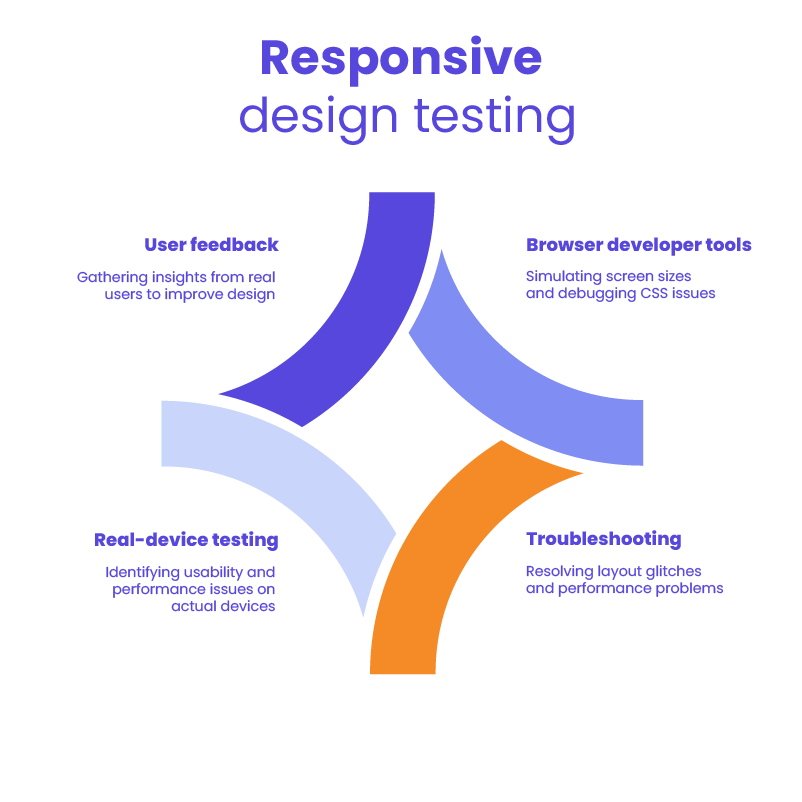
Even the most meticulously designed responsive WordPress site needs thorough testing to ensure it performs as expected across all devices and scenarios. Proper QA identifies issues before they impact users, verifies technical requirements, and validates that the site delivers on its intended goals. A systematic approach to testing is essential for delivering a polished, professional experience.
Tools & Methodologies
Once a responsive layout is in place, thorough testing is essential to ensure it works across all intended devices and screen sizes. Browser developer tools – like Chrome DevTools or Firefox’s responsive design mode – are great for simulating various screen widths, inspecting breakpoints, and debugging CSS issues.
However, simulators only go so far. Real-device testing is critical for identifying usability or performance issues that may not show up in emulators. This includes testing on different operating systems, browsers, and connection speeds. Tools like BrowserStack or physical device labs can help you cover a wide range of environments.
Troubleshooting Common Issues
During testing, it’s common to encounter layout glitches – elements not aligning properly, text overlapping, or navigation breaking on smaller screens. Isolating the issue with inspect tools and reviewing your CSS breakpoints and media queries can help resolve these quickly.
Performance problems, such as slow load times or laggy interactions, should also be addressed during this phase. Look for uncompressed images, excessive scripts, or render-blocking resources.
Finally, gathering feedback from actual users provides valuable insights into how your site performs in real-world scenarios. Encourage users to report bugs, note any confusing areas, and share their overall experience. This continuous loop of testing and feedback helps you fine-tune the design and deliver a polished, user-friendly product.
SEO & Digital Marketing Considerations
Search engines prioritize sites that deliver excellent experiences across all devices, making responsiveness not just a UX concern but a critical factor in digital marketing success.
Mobile SEO Best Practices
With search engines prioritizing mobile-first indexing, it’s essential to ensure your site is optimized for mobile visibility. That means your mobile and desktop versions should contain the same high-quality content, metadata, and internal links. Avoid using separate URLs for mobile pages to reduce the risk of duplicate content and crawl inefficiencies.
A clean site structure, fast load times, and proper viewport configuration all contribute to better rankings. These practices align closely with the principles of WordPress responsive design, which ensures your content is equally accessible and indexable across all devices.
Schema Markup & Structured Data
Structured data helps search engines understand your content more clearly. Implementing schema markup – such as for articles, products, or local business information – can enhance your listings with rich snippets like ratings, FAQs, and event details.
Making sure this markup is mobile-friendly and responsive ensures your content remains properly formatted and visible in mobile search results, helping drive both visibility and clicks.
Analytics & Conversion Optimization
Tracking how users interact with your site across devices is critical. Use analytics tools to monitor mobile-specific metrics like bounce rate, time on page, and conversion paths. These insights will help identify areas for improvement and measure the effectiveness of your responsive design choices.
A/B testing is another powerful tool. Test variations of call-to-action placements, navigation styles, or content layout to see what drives the most engagement on mobile devices. The data you collect will guide design refinements and improve overall performance.
Integrating responsive design with your SEO and marketing strategy ensures your site isn’t just mobile-ready – it’s also optimized to attract, engage, and convert.
Hire a WordPress Designer
Discover the benefits of choosing to hire a WordPress designer. Enjoy focused attention, quick turnaround, cost-effectiveness, and expert design for the projects.
Emerging Trends & Future-Proofing
The digital landscape evolves continuously, with new devices, technologies, and user expectations emerging regularly. Staying informed about current trends while preparing for future developments helps ensure your responsive WordPress site remains relevant and effective for years to come.
Progressive Web Apps (PWAs) & Headless WordPress
As user expectations evolve, modern technologies like Progressive Web Apps (PWAs) and headless architecture are becoming more relevant. PWAs offer app-like functionality – such as offline access, push notifications, and faster performance – while still running in a web browser. Headless WordPress allows developers to separate the front-end from the back-end, giving them more flexibility to deliver content through APIs across multiple platforms and devices.
Combining these approaches with WordPress responsive design ensures your site is not only adaptable but also high-performing and scalable for future demands.
Adaptive vs. Responsive Design
While responsive design is flexible and fluid, adaptive design serves predefined layouts for specific screen sizes. In some cases, a hybrid approach may be beneficial – using adaptive techniques for complex user flows or highly customized interfaces, and responsive elements for general content.
Understanding when and where to apply each method helps you deliver the most effective user experience without overengineering the solution.
Innovations in UX/UI for Mobile
The future of mobile design goes beyond layouts. Voice interactions, gesture-based navigation, and AI-driven personalization are reshaping how users interact with websites. Features like smart content recommendations, chatbots, and predictive search can enhance engagement and streamline the user journey.
Staying ahead of these trends and integrating them thoughtfully within your design strategy ensures your site remains competitive, user-friendly, and aligned with the next generation of digital experiences.
Case Studies & Real-World Examples
Theory alone isn’t enough—seeing responsive design principles applied successfully in real-world scenarios provides valuable insights and inspiration. So, let’s take a look at some of the case studies.
Successful Responsive WordPress Sites
Many businesses and organizations have embraced WordPress responsive design to deliver seamless user experiences across all devices. Here are a few standout examples:
- TechCrunch
This well-known tech news platform runs on WordPress and showcases an elegant, responsive layout. Its fluid grid system, responsive typography, and optimized mobile navigation contribute to fast load times and high user engagement. - The Walt Disney Company
Disney’s corporate site uses WordPress to maintain brand consistency while delivering a mobile-friendly experience. The design leverages flexible components and responsive imagery to accommodate its large and varied content catalog. - Sony Music
The Sony Music website blends multimedia with mobile-first design. It uses responsive frameworks to feature artist profiles, videos, and event details – ensuring fans can explore content effortlessly on any device.
Lessons Learned
These examples reveal a few common lessons:
- Start with mobile in mind: Sites that prioritize mobile usability from the beginning tend to perform better across the board.
- Test continuously: Regular testing on real devices helps catch design inconsistencies and layout issues before users notice them.
- Optimize media: Using scalable images, video formats like WebM, and lazy loading improves speed and responsiveness.
Each of these brands faced challenges – whether it was handling large content libraries, managing multimedia, or maintaining performance under traffic spikes – but they overcame them through thoughtful planning, agile development, and commitment to user experience.
By following these best practices, you can apply WordPress responsive design principles to your own site with confidence and clarity.
Mastering WordPress Responsive Design: Final Thoughts & Next Steps
Creating a successful WordPress responsive website means more than just making it look good on different devices – it’s about building an experience that performs well, adapts seamlessly, and aligns with your business goals. Throughout this guide, we’ve covered key strategies such as adopting a mobile-first approach, using fluid grids and media queries, optimizing performance, and continuously testing across real devices. These practices work together to improve usability, boost engagement, and support stronger SEO and conversion outcomes.
To continue building your expertise, explore tools like Chrome DevTools and GTmetrix for performance testing, and stay up to date with resources from Web.dev, CSS-Tricks, and Smashing Magazine. Engaging with developer communities such as the WordPress.org forums, Stack Overflow, and related subreddits can also provide ongoing support and fresh insights as web standards evolve.
If you’re ready to take the next step but don’t have the in-house capacity to implement these strategies, White Label Agency is here to help. We specialize in building clean and fully WordPress responsive websites for agencies that need a reliable development partner. Whether you need full builds, theme customization, or ongoing support, we’ll make sure your clients get results – without the overhead on your end. Contact us today to learn how we can support your next responsive project and help you scale with confidence.