

Web design is all about precision, and every pixel counts. Screen resolution directly affects how designers view and interact with their work. A higher resolution provides more detail, clarity, and workspace, which can lead to more efficient design processes. As web designers strive for pixel-perfect layouts and smooth user experiences, choosing the right resolution is crucial.
When comparing 1080p vs 1440p, it’s essential to understand the key differences. 1080p resolution (1920×1080) is widely used and is known for its affordability and sufficient clarity for many design tasks. On the other hand, 1440p resolution (2560×1440) offers greater screen real estate and sharper visuals, making it popular among professionals who need more workspace and higher-quality displays.
In this blog, we’ll explore the best screen resolution for web design, comparing 1080p vs 1440p for designers and discussing how each affects performance and usability in web design workflows.
Hire a WordPress Designer
Discover the benefits of choosing to hire a WordPress designer. Enjoy focused attention, quick turnaround, cost-effectiveness, and expert design for the projects.
Which Resolution Should You Choose for Web Design?
When deciding between 1080p vs 1440p for web design, there are several factors to consider, including budget, workload, and user experience. Each resolution offers distinct advantages depending on your needs and the type of work you do.

1. Budget Considerations
For web designers on a tight budget, 1080p resolution is a practical choice. It’s more affordable and widely available, making it a popular option for beginner designers or freelancers who are just starting out.
When to use 1080p: Junior web designers working on simple WordPress sites may find 1080p sufficient, especially if they primarily work on one monitor with minimal multitasking.
However, as you advance in your career or handle more complex projects, upgrading to 1440p resolution can be worth the investment. It provides sharper visuals and a larger workspace, which improves productivity.
When to use 1440p: Agency-based designers who often juggle multiple projects at once can benefit from the added real estate of 1440p, allowing them to have design tools, browsers, and other applications open side-by-side.
2. Workload and Design Workflow
Designers working on high-detail projects, such as eCommerce sites or custom UX/UI layouts, will appreciate the extra clarity and precision offered by 1440p resolution. With 1440p, you can see more of your designs without constant zooming or panning, which is especially helpful when working with multiple elements or testing responsive layouts.
Example: A graphic designer handling detailed iconography or high-resolution imagery for a brand might struggle with 1080p due to the limited pixel density. In contrast, 1440p offers more space and reduces the need for scaling, making it easier to preview work closer to how end users will experience it.
3. User Experience and Performance
In terms of 1080p vs 1440p performance, 1080p tends to be lighter on system resources, making it ideal for designers working on standard laptops or mid-range desktops. The performance demand is lower, so you won’t experience as much strain when running design software or multitasking.
Tip from a web designer: For professionals using advanced design tools like Adobe Photoshop or Sketch, 1440p offers smoother performance with enhanced clarity. The increased workspace allows for better organization, improving overall workflow efficiency. For a UX designer working on large projects with multiple breakpoints, the additional screen space of 1440p can streamline the process.
Recommendations
- Beginners or Freelancers: Start with 1080p resolution to keep costs low, especially if you’re primarily designing simpler websites or working on a single monitor.
- Professional Designers: Upgrade to 1440p resolution for better screen real estate and visual clarity. It’s a more efficient option for handling complex designs, especially for those using multi-monitor setups.
- Agency-Based Teams: Invest in 1440p across your design department to maximize productivity. The larger resolution can handle intensive workloads and multitasking without compromising performance.
The best screen resolution for web design ultimately depends on your specific needs and setup, but upgrading to 1440p will provide long-term benefits in terms of workspace and clarity.
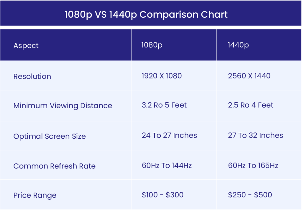
1080p Resolution
1080p resolution, also known as Full HD, offers a screen resolution of 1920×1080 pixels. As of August 2024, it remains a dominant choice, accounting for approximately 8.29% of global screen resolutions. This widespread adoption makes 1080p one of the best screen resolutions for web design, especially for those on a budget.
Key Features and Benefits of 1080p:
- Cost-effective option for freelancers and small businesses
- Sufficient clarity for most web design tasks
- Ideal for basic layouts and responsive WordPress sites
When considering 1080p vs 1440p for designers, 1080p offers a balance between affordability and performance. It’s particularly suitable for:
- Entry-level designers
- Those primarily working on web projects that don’t require heavy multitasking
- Designers focused on basic web layouts
However, 1080p has limitations. When working with highly detailed visual elements or handling multiple windows, some designers may find the screen real estate restrictive compared to higher resolutions.
1440p Resolution
1440p resolution, also known as Quad HD, features a pixel dimension of 2560×1440. This higher resolution has gained significant popularity among designers who demand superior visual clarity and more workspace.
Key Features and Benefits of 1440p:
- Sharper images with over 3.6 million pixels (compared to 1080p’s 2.1 million)
- Smoother lines and reduced jagged edges in text and graphics
- More screen real estate for multitasking
In the 1080p vs 1440p performance debate, 1440p often comes out on top for professional use. It’s particularly beneficial for:
- Visually intricate homepage designs with high-resolution images or custom fonts
- UX designers who need to view design tools, a browser, and code simultaneously
- Managing large or detailed projects that require precision and clarity
The additional screen space and sharper visuals make 1440p one of the best screen resolutions for web design, especially for those handling complex projects or requiring optimal workflow efficiency.
When choosing between web design resolutions, consider your specific needs, budget constraints, and the complexity of your projects. While 1080p remains a viable option for many, the trend is moving towards 1440p as designers seek to optimize their workflow and visual output.
1080p vs 1440p: Key Differences in Web Design
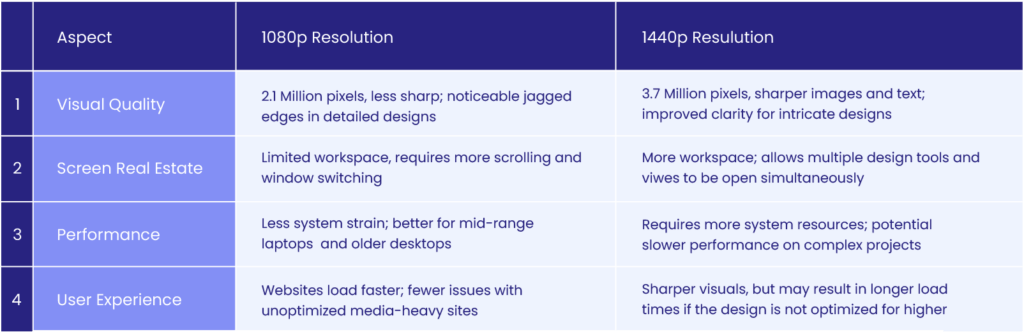
1. Visual Quality
The primary distinction between 1080p and 1440p lies in their pixel density and sharpness:
- 1440p: Approximately 3.7 million pixels
- 1080p: About 2.1 million pixels
This higher pixel count in 1440p resolution results in:
- Crisper images
- Sharper text
- Improved clarity for detailed web designs
Practical impact:
- Web designers working with intricate icons, fonts, or UI elements will notice fewer jagged edges on a 1440p display.
- The difference becomes particularly noticeable when:
- Zooming in on design elements
- Testing layouts for high-resolution screens
2. Screen Real Estate
1440p resolution offers a significant advantage in workspace:
- 1440p: More space to work
- Allows multiple design tools, browser windows, and coding environments to be open simultaneously
- Reduces feeling of clutter
- 1080p: Less workspace
- Often requires more scrolling and window-switching
- Still functional but more limiting
Example scenario: A designer working on a responsive layout can view desktop, tablet, and mobile versions side-by-side on a 1440p screen, reducing time spent switching between views.
3. Performance
When comparing 1080p vs 1440p performance:
- 1440p:
- Requires more system resources
- Design software and hardware work harder to render images and layouts
- Can lead to slower performance on complex projects if the system isn’t optimized
- 1080p:
- Places less strain on hardware
- Better option for designers using mid-range laptops or older desktops
Consideration: Designers working with complex projects in tools like Adobe XD or Figma may notice performance differences.
4. User Experience
From an end-user perspective:
- 1440p:
- Offers superior visual experience due to increased sharpness and clarity
- Potential trade-off: longer loading times for non-optimized websites
- 1080p:
- Generally faster loading times
- Less demanding on system resources
Key point: While 1440p provides the best screen resolution for web design in terms of visual clarity, the user experience can suffer if the design isn’t optimized for performance.
Example: A media-heavy site with high-resolution images may load more slowly for users on 1440p displays, especially if images and content aren’t appropriately scaled.
Impact of Screen Resolutions on Adaptive and Responsive Web Design
- Designing for Multiple Resolutions
When designing for various resolutions like 1080p vs 1440p, flexibility is key. Web designers should consider the following factors:
- Fluid grids and breakpoints: Fluid grids automatically adjust column widths based on the user’s screen size. Breakpoints define when layouts shift, ensuring that designs remain functional on both 1080p resolution and 1440p resolution screens.
- Fonts, images, and scaling: Large images optimized for 1440p may not scale well on 1080p, affecting load times and visual quality. Use responsive units like “em” or “rem” for fonts to maintain readability across all resolutions.
- How Different Resolutions Influence Mobile-First Design
A mobile-first design strategy begins with small screens and scales up. Challenges arise when adapting designs to larger screens, such as 1080p and 1440p:
- Hidden challenges: Larger screens, like 1440p, can reveal issues such as awkward whitespace or misaligned elements that weren’t visible on smaller screens.
- Design adjustments: What works on a smaller screen or 1080p resolution may feel too spread out on a 1440p resolution, requiring design tweaks to avoid a disjointed user experience.
- Resolution Considerations in User Experience (UX) Testing
Testing for user experience across multiple resolutions is essential to ensure consistent performance:
- Simulating user experiences: Test websites on both 1080p and 1440p displays to identify issues related to scaling, image quality, or layout alignment.
- Tools for testing: Use browser resizing tools or emulators to simulate how a site functions on various screens. Ensure that images optimized for 1080p vs 1440p load efficiently without sacrificing performance.
The Future of Resolutions in Web Design: Is 1440p Becoming the Standard?
As display technology evolves, 1440p resolution is gaining popularity, especially among web designers. While 1080p resolution has been the standard for years, 1440p offers more screen real estate and sharper visuals, making it increasingly attractive for design professionals.
Why 1440p is Gaining Momentum
- Higher Pixel Density: 1440p offers roughly 3.7 million pixels compared to 1080p’s 2.1 million. This increase in pixels provides sharper images and more workspace, crucial for handling detailed projects.
- Design Precision: As websites become more media-rich and visually complex, designers need more accurate displays. The extra clarity provided by 1440p resolution is a significant advantage for tasks like responsive layouts, high-resolution graphics, and UI design.
1080p vs 1440p: What’s the Current Standard?
- Widespread Use of 1080p: Despite the growing popularity of 1440p, 1080p resolution remains widely used due to its affordability and lower system requirements. For many beginner designers or those working on simpler projects, 1080p is still a practical choice.
- 1440p for Professionals: On the other hand, 1440p is becoming the go-to for professionals and agencies that prioritize screen space and sharper visuals. As more designers shift toward higher-resolution displays, 1440p is emerging as a top choice in terms of the best screen resolution for web design.
Will 1440p Become the New Standard?
While 1440p is likely to become more common as technology improves and costs decrease, it hasn’t fully replaced 1080p resolution yet. The debate between 1080p vs 1440p for designers will continue for some time, especially as budget-conscious designers balance cost with performance.
As a result, 1440p resolution is well-positioned to become the industry standard for web design in the future, particularly for professionals looking for enhanced productivity and visual accuracy in their workflows.
WordPress Web Design Agency
Partner with our white label WordPress web design agency for custom, scalable solutions. We design, develop, and maintain websites tailored to your clients.
Conclusion
In the debate between 1080p vs 1440p, the main differences lie in:
- Resolution: 1080p resolution has 2.1 million pixels, while 1440p resolution offers 3.7 million, providing sharper visuals.
- Screen Real Estate: 1440p provides more workspace, allowing for better multitasking, while 1080p is more budget-friendly but limited in space.
- Performance: 1080p vs 1440p performance varies based on hardware demands. 1440p requires more system resources, making it better suited for complex design tasks.
Choosing the right resolution depends on your specific needs, whether it’s affordability or maximizing productivity.
Design Considerations
- Workflows: 1440p resolution enhances design workflows by offering more space and sharper clarity, while 1080p is a solid choice for simpler tasks.
- User Experience: The user’s screen resolution affects how they experience your website. Testing across web design resolutions ensures a consistent look and feel.
- Adaptive Design: Both resolutions influence adaptive and responsive design principles, and testing designs on different screens helps maintain visual consistency.
Final Takeaway
When designers decide between 1080p vs 1440p, it’s important to evaluate both performance and usability. Tools like Google PageSpeed Insights, GTmetrix, and Pingdom can help assess how designs perform across resolutions.
Stay adaptable—ensure your designs work seamlessly across a range of devices and resolutions, delivering an optimal experience for all users.
Need professional design support? With The White Label Agency, you can elevate your design projects with expert services tailored to your needs. Contact us today to start working together!


