

In the modern day, having a website that is both visually stunning and user-friendly is essential for a successful business. However, more and more devices of different screen sizes are available to access the internet in recent years, so web designers face the challenge of creating websites that are responsive for all screen resolutions. How then do we choose what is the best resolution for web design? In this article, we will explore the different factors that affect screen resolution, including the importance of responsive design and the impact of image optimization.
Responsive design: The key to enhancing user experience
Users expect a smooth experience when browsing websites. They can use desktops, laptops, tablets and smartphones. This is where responsive design comes into play. The importance of responsive design cannot be underestimated, especially with the increasing number of mobile users. Responsive design allows a website to adapt to the screen size of the device that accesses it, ensuring at the same time that it looks great and functions without any flaws. Website owners can optimize their websites for different screen sizes and resolutions, allowing them to reach customers across a wide range of devices.
Responsive design involves adapting a website to different device sizes and resolutions, as well as creating different versions of the website’s layout and design for various device sizes. Techniques such as fluid grid systems and CSS media queries are commonly used to create responsive websites.
Additionally, responsive design can help to reduce bounce rates, increase engagement, and improve overall user satisfaction, which in turn can lead to higher conversions. In short, responsive design is key to enhancing the user experience on all devices.

Importance of optimizing images
Optimizing images for the web is crucial. It ensures that your website loads quickly and provides a good user experience. Large, high-resolution images can slow down your site and cause visitors to lose interest while waiting.
When optimizing images for your WordPress site, it’s important to consider the resolution and file format of the image. JPEG and PNG are the most commonly used file formats for web images. It’s important to choose the right format based on the type of image and the level of compression required. Choosing between JPEG and PNG formats depends on the type of image, the level of detail and colors, and the desired level of compression. JPEG is typically used for complex images with many colors, while PNG is better suited for images with fewer colors and distinct shapes.
By optimizing images for the web, you can improve the site’s performance, provide a better user experience and ensure that content is accessible to a wider audience.
Popular screen resolutions for WordPress sites
Here are some of the most commonly used resolutions for WordPress sites:
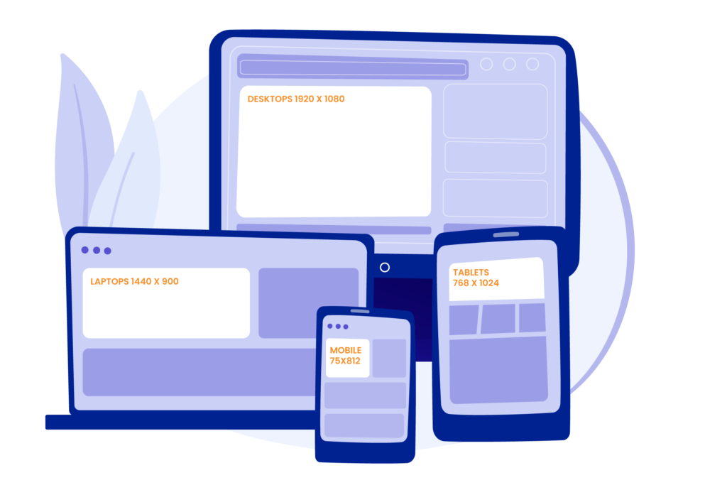
1920 x 1080 – The most commonly used resolution for desktop computers and laptops. It is widely used because it provides a good balance between screen real estate and image quality.
Yes, 1920 x 1080 may be a standard and common resolution, but whether or not it is the best resolution is hard to define, because it can be based on many aspects, like specific needs and goals of your website.
Here are several reasons why 1920 x 1080 may be the best resolution for web design:
- 1920 x 1080 is a resolution that is widely supported by modern computer monitors, laptops, and even mobile devices. This means that your website will look good on a wide range of devices.
- With a resolution of 1920 x 1080, images and text will appear sharp and clear, which can enhance the overall user experience.
- Because it is a standard resolution, there are many design tools and templates available that are optimized for this resolution.
However, some users may have older monitors with lower resolutions, while others may have newer screens that support resolutions beyond 1920 x 1080. Because of that, it’s important to design your website to be responsive and adaptive, so that it matches different screen sizes and resolutions.
1440 x 900 – Is a popular choice for web design that is a relatively large size for computer monitors and laptops. However, it’s not as high resolution as 1920 x 1080, so it loads faster.
Here are several reasons why it might be a good choice:
- 1440 x 900 is a slightly smaller resolution than 1920 x 1080, but it is still considered a relatively large size for computer monitors and laptops. It means your website will still be able to display at its best on most devices.
- Because 1440 x 900 is not as high resolution as others, it may be a more cost-effective (requires less expensive hardware to run smoothly) option for some users. This could be a good choice if your target audience is price-sensitive or if you’re designing a website that needs to be accessible to users with a range of budgets.
In addition to selecting the right resolution, it’s also important to optimize your images for the web. This means compressing your images so that they load quickly and don’t slow down your website’s loading times.
In conclusion, the best resolution for web design depends on your specific needs and vision. Consider the preferences of your target audience, as well as the content and design of your website. Creating your website to be responsive and adaptive makes it look good on different devices and resolutions.
FAQs
What is the best resolution to have?
The best resolution for web design depends on your target audience and their devices. However, a great starting point is to design for a 1920×1080 pixels resolution, which is standard for modern desktop screens.
For mobile-first designs, focus on 360×640 pixels as a baseline for smartphones. It’s crucial to implement responsive web design to ensure your website looks excellent on all screen sizes and resolutions, from small mobile devices to large desktop monitors.
By designing for flexibility, you can cater to a broader audience without compromising user experience.
Which resolution is better, 1920×1080 or 2560×1440?
Both resolutions have their advantages, and the choice between 1920×1080 (Full HD) and 2560×1440 (QHD or 2K) depends on your specific needs and your target audience’s devices:
1920×1080 (Full HD):
Advantages: More common and widely supported across devices.
Optimized for faster load times due to smaller image sizes.
Ideal for users with older hardware or lower-end monitors.
Best For: General web design targeting a broad audience.
Ensuring compatibility with older or budget devices.
2560×1440 (QHD):
Advantages: Higher pixel density, leading to sharper visuals, especially on larger screens.
Becoming increasingly popular as more users upgrade to high-resolution displays.
Ideal for Retina or high-DPI displays (e.g., Apple devices).
Best For: Websites focused on visuals, like photography, art, or premium products.
Targeting an audience with modern, high-resolution devices.
Which resolution is better, 1920×1080 or 3840×2160?
The choice between 1920×1080 (Full HD) and 3840×2160 (4K Ultra HD) depends on the goals of your web design and the audience you’re targeting. Here’s a comparison to help you decide:
1920×1080 (Full HD):
Advantages:Most common and universally supported resolution.
Optimized for faster load times due to smaller asset sizes.
Compatible with a wide range of devices, including older monitors and laptops.
Use Case:Websites targeting general audiences with mixed device capabilities.
Projects where speed and broad compatibility are priorities.
3840×2160 (4K Ultra HD):
Advantages:Offers incredible clarity and detail, especially on large screens.
Essential for Retina and high-DPI displays, making your visuals future-proof.
Ideal for showcasing high-quality visuals like photography, videos, or luxury products.
Drawbacks:Requires more resources (larger images, higher processing power).
May result in slower load times if assets aren’t optimized.
Use Case:Websites targeting high-end users with 4K monitors or Retina displays.
Designs for premium products or industries emphasizing visual quality.
What is the best resolution after 1920×1080?
The best resolution after 1920×1080 (Full HD) is 2560×1440 (QHD or 2K). Here’s why:
Why Choose 2560×1440 (QHD):
Improved Visual Quality:
Offers sharper and clearer visuals than 1920×1080, making it a great middle ground before jumping to 4K (3840×2160).
Compatibility:
Widely supported on modern monitors and devices, especially for users with higher-end screens.
Balanced Performance:
Provides a noticeable improvement in clarity without the heavy resource demands of 4K, ensuring faster load times and smoother performance.
Practical for Web Design:
Suitable for websites that need higher-quality visuals but still cater to a wide range of devices.
When to Use 2560×1440:
Audience Profile: Target users who are likely to use modern monitors, including creative professionals or tech-savvy audiences.
Content Type: Ideal for image-heavy or visually rich websites, like portfolios, photography, and eCommerce sites.
What About 3840×2160 (4K)?
If your audience primarily uses 4K monitors or Retina displays, consider designing for 4K Ultra HD (3840×2160). However, the resource demands are significantly higher, and it’s best paired with responsive web design to optimize performance across all devices.
In summary, 2560×1440 is the best step up after 1920×1080 for balancing visual quality, performance, and broad compatibility.