

- WordPress Webdesign
- Exceptional Fonts for WordPress
- WordPress Web Design Agency
- Best Practices for Using Fonts on WordPress Websites
- How to Optimize Font Performance on WordPress
- SEO and Accessibility Considerations
- Testing and Previewing Fonts on WordPress
- Crafting Your Perfect WordPress Typography
Imagine landing on a beautifully designed WordPress website, only to find the text difficult to read or mismatched with the site’s tone. The font choice – a seemingly small detail – can make or break the entire experience. Whether you’re building a blog, eCommerce site, or professional portfolio, the fonts you choose play a vital role in how visitors perceive and interact with your site.
Font selection is more than just aesthetics. It directly influences readability, shapes user experience, and reinforces your brand identity. A well-chosen font can keep visitors engaged, while the wrong one might drive them away. In WordPress design, where creativity and functionality intersect, choosing the right WordPress fonts is essential to crafting a site that leaves a lasting impression.
This guide is here to help you make those decisions with confidence. From exploring the best WordPress fonts for different website types to understanding how font selection impacts SEO, accessibility, and performance, we’ll cover it all. Whether you’re a seasoned designer or just starting your WordPress journey, this guide will equip you with everything you need to choose and optimize fonts for your website.
WordPress Webdesign
Enhance your agency’s offerings with our WordPress website design services. Get custom, high-quality designs that fit your client’s needs.
Exceptional Fonts for WordPress
Choosing the right font for your WordPress site is a blend of art and science. Below, we explore eight exceptional fonts that combine style, functionality, and performance. Whether you’re building a professional blog, an eCommerce store, or a portfolio, these fonts offer the versatility and impact needed to make your site stand out.

1. Roboto
Font Style & Characteristics:
A modern, geometric sans-serif font designed with clarity and legibility in mind.
Best Use Cases:
Perfect for mobile-friendly designs, app-based websites, and blogs. It’s versatile enough for both headings and body text.
Compatibility:
Highly compatible with most WordPress themes, especially responsive and minimal designs.
Performance:
Optimized by Google for fast loading, making it ideal for performance-focused websites.
Examples of Popular Websites:
Google and Android platforms widely use Roboto to enhance their modern, clean user interfaces.

2. Open Sans
Font Style & Characteristics:
A clean and neutral sans-serif font that’s highly readable across devices.
Best Use Cases:
Excellent for body text in content-rich blogs, corporate websites, and portfolios.
Compatibility:
Easily integrates with WordPress themes and is a common default in popular page builders.
Performance:
Lightweight and optimized for the web, ensuring excellent loading times.
Examples of Popular Websites:
Frequently seen on news and tech blogs for its simple, readable design.
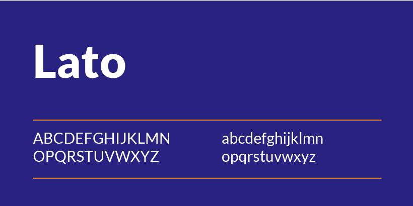
3. Lato
Font Style & Characteristics:
A sans-serif font with rounded edges and a friendly, approachable aesthetic.
Best Use Cases:
Ideal for startups, creative websites, and blogs that require a touch of personality.
Compatibility:
Compatible with a wide range of WordPress themes, especially those that focus on modern design.
Performance:
Web-optimized for fast loading and seamless user experiences.
Examples of Popular Websites:
Creative agencies and personal blogs often use Lato for its inviting and versatile design.
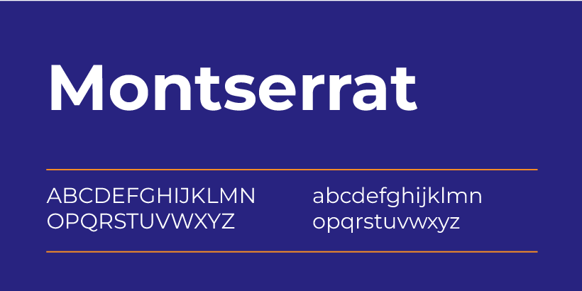
4. Montserrat
Font Style & Characteristics:
A bold, contemporary sans-serif font inspired by urban typography.
Best Use Cases:
Perfect for headers, banners, and call-to-action sections where attention is key.
Compatibility:
Works seamlessly with visually striking WordPress themes designed for eCommerce or portfolios.
Performance:
Heavier weights might slightly affect load times, but overall, it performs well on the web.
Examples of Popular Websites:
Frequently used on design-focused and retail websites to grab attention.

5. Oswald
Font Style & Characteristics:
A condensed sans-serif font with strong, modern lines.
Best Use Cases:
Excellent for headlines and subheadings on minimalist websites or those with bold designs.
Compatibility:
Compatible with WordPress themes that focus on clean layouts and typographic hierarchy.
Performance:
Designed specifically for web use, ensuring efficient performance even on slower connections.
Examples of Popular Websites:
Commonly seen on news portals and tech-focused blogs that require sharp, impactful typography.

6. Playfair Display
Font Style & Characteristics:
A serif font with elegant, high-contrast letterforms, perfect for sophisticated designs.
Best Use Cases:
Ideal for luxury brands, fashion websites, or blogs with an emphasis on storytelling.
Compatibility:
Best paired with modern WordPress themes that focus on elegant, editorial designs.
Performance:
May slightly impact loading times on text-heavy pages due to its complex design, but still web-optimized.
Examples of Popular Websites:
Often used by fashion and lifestyle websites for its refined, classy aesthetic.

7. Raleway
Font Style & Characteristics:
A stylish, sans-serif font with a wide range of weights and a contemporary feel.
Best Use Cases:
Perfect for branding elements like logos, headings, and feature sections.
Compatibility:
Performs well with WordPress themes emphasizing creativity and design.
Performance:
Web-optimized, but heavier font weights can marginally affect loading times.
Examples of Popular Websites:
Creative portfolios and agency websites frequently use Raleway for its versatility.

8. Source Sans Pro
Font Style & Characteristics:
A simple, modern sans-serif font designed specifically for readability.
Best Use Cases:
Ideal for body text in blogs, corporate sites, and educational platforms.
Compatibility:
Works effortlessly with WordPress themes that prioritize content-focused layouts.
Performance:
Lightweight and built for web performance, ensuring quick load times.
Examples of Popular Websites:
Educational and tech websites use Source Sans Pro for its clarity and professional look.
By incorporating these best WordPress fonts into your design, you can enhance your site’s usability and style while maintaining excellent performance. Whether you’re building a blog, an online store, or a professional site, these fonts will help you create a visually stunning and user-friendly experience.
WordPress Web Design Agency
Partner with our white label WordPress web design agency for custom, scalable solutions. We design, develop, and maintain websites tailored to your clients.
Best Practices for Using Fonts on WordPress Websites
Selecting the perfect typography for your site goes beyond simply picking fonts—it’s about how you use them. Following these best practices ensures your design stays cohesive, user-friendly, and optimized for performance.
Limit the Number of Fonts
Using too many fonts can make your website look cluttered and unprofessional. Limit your selection to 2-3 fonts to maintain consistency and improve load times. A common approach is to use one font for headings and another for body text, with an optional accent font for special elements like call-to-action buttons.
For example:
- Heading: Montserrat
- Body Text: Open Sans
- Accent: Playfair Display
Not only does this approach create a harmonious design, but it also ensures your fonts load faster by minimizing the number of HTTP requests. Tools like a WordPress fonts preview plugin can help visualize how the chosen fonts will look together on your site.
Font Pairing Tips
Creating the perfect font combination involves balancing contrasting styles while maintaining harmony. Here are some examples of font pairings that work well together:
- Roboto (Headings) + Lato (Body Text): A modern and approachable combination ideal for blogs or corporate sites.
- Oswald (Headings) + Source Sans Pro (Body Text): A sharp, professional pairing suitable for tech or business websites.
- Playfair Display (Headings) + Open Sans (Body Text): A sophisticated mix perfect for fashion or lifestyle blogs.
When choosing from your list of WordPress fonts, aim for fonts with complementary characteristics to enhance your site’s readability and aesthetic.
Optimizing Font Sizes and Weights
Readable typography is key to a great user experience. Follow these guidelines to optimize font sizes and weights:
- Headings: Use 24px–36px for H1 and adjust downward for subheadings (H2, H3).
- Body Text: Stick to 16px–18px for body content, ensuring it’s easy to read on all devices.
- Font Weights: Avoid using excessive weights (e.g., ultra-light or ultra-bold) throughout your site. Use bold sparingly to highlight important elements.
Testing your fonts with a WordPress fonts preview tool can help fine-tune these settings before going live.
Responsive Font Scaling
Your fonts should look great on any device, from desktop to mobile. Use responsive font scaling to ensure that text adjusts seamlessly to different screen sizes. This can be achieved with relative units like em, rem, or percentages in your CSS.
For WordPress users, many themes and plugins include built-in options for responsive typography. Plugins like Typography by Brainstorm Force or custom CSS settings in page builders like Elementor allow you to preview and adjust font sizes across breakpoints.
Responsive typography not only improves user experience but also boosts your SEO, as search engines prioritize mobile-friendly websites.
By following these best practices and leveraging tools for list of WordPress fonts and WordPress fonts preview, you can create a website that’s visually cohesive, easy to read, and optimized for every visitor. The right approach to fonts can elevate your site’s design while ensuring fast performance and user satisfaction.
How to Optimize Font Performance on WordPress
Optimizing font performance is crucial to ensure your website loads quickly and provides a seamless user experience. Poorly optimized fonts can slow down your site and negatively impact user engagement and search engine rankings. Below are actionable steps to enhance font performance on your WordPress site.
1. Font Loading Techniques
Efficient font loading ensures your website displays text quickly without unnecessary delays. Here are two techniques to improve loading times:
- Preloading Fonts:
Preloading tells the browser to prioritize specific font files, reducing the time it takes to display text. To preload fonts in WordPress, you can add the following code to your functions.php file or a custom plugin:
HTML
<link rel=”preload” href=”your-font-file.woff2″ as=”font” type=”font/woff2″ crossorigin=”anonymous”>
- Font-Display Swap:
Using the font-display property in your CSS allows text to appear in a fallback font until the custom font is fully loaded. This eliminates “invisible text” issues:
HTML
@font-face {
font-family: ‘CustomFont’;
src: url(‘custom-font.woff2’) format(‘woff2’);
font-display: swap;
}
This method ensures users see content immediately, enhancing the overall experience.
2. Compressing Fonts
Using compressed font formats like WOFF2 significantly reduces file sizes, improving load times without sacrificing quality.
- Convert Fonts to WOFF2:
Many font files are available in outdated formats like TTF or OTF. Use free tools like Transfonter to convert your fonts to WOFF2 for better performance. - Host Compressed Fonts Locally:
While many WordPress themes use Google Fonts, hosting compressed versions locally can further improve loading speeds and give you more control over your site’s performance.
3. CDN and Font Hosting Options
A Content Delivery Network (CDN) can help deliver WordPress fonts faster by caching them on servers closer to your visitors.
- Use a Font CDN:
Google Fonts and Adobe Fonts already leverage global CDNs to ensure fast delivery. However, if you’re hosting custom fonts, consider using CDNs like Cloudflare or KeyCDN to cache and deliver font files efficiently. - Self-Hosting vs. CDN:
While self-hosting gives you more control, using a CDN often provides better performance for global audiences. You can integrate CDNs with WordPress easily using plugins like WP Rocket or CDN Enabler.
By implementing these optimization techniques, you can enhance the performance of your WordPress fonts, resulting in faster loading times, improved user experience, and higher search engine rankings. Whether you’re preloading, compressing, or leveraging a CDN, these strategies ensure your typography not only looks great but also performs exceptionally.

SEO and Accessibility Considerations
Typography directly impacts user experience and accessibility, which in turn influence your site’s SEO performance. By making strategic font choices and ensuring accessibility, you can create a more inclusive and search-engine-friendly website. Here’s how to optimize your WordPress fonts for both SEO and accessibility.
Impact of Fonts on SEO
The fonts you choose affect crucial user experience metrics that search engines evaluate, such as time on page, bounce rate, and overall readability.
- User Engagement Metrics:
Readable and visually appealing WordPress fonts encourage users to stay longer on your site and explore more pages. Fonts that are hard to read or clash with your site’s design can frustrate visitors, leading to higher bounce rates. - Page Speed Considerations:
Search engines favor fast-loading websites, so optimizing your fonts (as discussed earlier) can also boost your SEO rankings. - Mobile Friendliness:
Since Google prioritizes mobile-first indexing, choosing fonts that display well on all devices is critical. Responsive WordPress fonts that adjust seamlessly across screen sizes contribute to better mobile performance.
Ensuring Font Accessibility
Accessibility ensures that your website can be used by all visitors, including those with visual impairments or cognitive challenges.
- High-Contrast Colors:
Pair your WordPress fonts with background colors that offer sufficient contrast. Tools like the WebAIM Contrast Checker can help ensure your text meets WCAG standards. - Avoid Decorative Fonts for Essential Text:
Reserve decorative fonts for headings or accents, and use simple, sans-serif fonts like Roboto or Open Sans for body text to improve legibility. - Use ARIA Labels:
Ensure that screen readers can interpret your font content by including ARIA (Accessible Rich Internet Applications) labels where necessary. This is particularly helpful for navigational or interactive text.
Readable Font Sizes
Font size plays a key role in accessibility and readability. A poorly sized font can make even the most attractive WordPress fonts unusable.
- Recommended Sizes:
- Headings: Start at 24px–36px for H1 and scale down for H2, H3, and smaller headings.
- Body Text: Use a minimum of 16px for optimal readability on desktops and 14px for mobile devices.
- Line Spacing and Letter Spacing:
Provide adequate spacing between lines and letters to reduce strain on the eyes. A line height of 1.5 and letter spacing of 0.03em are generally good baselines.
By choosing fonts that are both user-friendly and accessible, you can create a WordPress website that not only appeals visually but also performs well in search rankings. Accessible typography ensures inclusivity, while SEO-optimized WordPress fonts help you attract and retain more visitors.

Testing and Previewing Fonts on WordPress
Choosing the perfect font for your website doesn’t end with selection—you need to ensure it looks great and performs well in a live environment. Proper testing and previewing allow you to fine-tune your typography for the best user experience. Here’s how to test and preview fonts effectively.
1. Font Preview Tools
Previewing fonts before they go live helps you visualize how they’ll look in your site’s layout. WordPress offers several tools and plugins for this purpose:
- Google Fonts Typography Plugin:
This free plugin allows you to browse and preview Google Fonts directly in your WordPress Customizer. You can apply fonts to headings, body text, and specific elements, seeing changes in real-time. - Use Any Font Plugin:
With this plugin, you can upload custom font files (e.g., WOFF2 or TTF) and preview how they’ll look on your site. It’s perfect for using premium or unique fonts. - Elementor Font Options:
If you’re using a page builder like Elementor, you can live-preview fonts while designing individual pages or sections.
These tools streamline the process of selecting and customizing fonts to fit your site’s aesthetic.
2. Browser Compatibility Check
Fonts may display differently across browsers due to rendering variations. Testing your fonts on multiple browsers ensures a consistent appearance for all users.
- Browsers to Test:
Focus on popular browsers like Chrome, Safari, Firefox, Microsoft Edge, and mobile browsers. - Cross-Browser Testing Tools:
Use tools like BrowserStack or LambdaTest to check how your fonts appear on different browsers and devices. - Fallback Fonts:
Always specify a fallback font in your CSS, such as Arial or Georgia, in case the primary font fails to load:
CSS
font-family: ‘Roboto’, ‘Arial’, sans-serif;
3. A/B Testing Fonts
Not sure which font resonates best with your audience? A/B testing helps you determine which font drives better engagement and readability.
- Testing Tools:
Use tools like Google Optimize, Crazy Egg, or Optimizely to create A/B tests for different fonts. - Metrics to Track:
Focus on metrics like time on page, bounce rate, and conversion rates to evaluate the performance of each font. - Implementation Tips:
- Test only one font element at a time, such as body text or headings, to isolate results.
- Run the test for at least two weeks to collect sufficient data.
A/B testing ensures you’re not just guessing when selecting fonts – it allows you to make data-driven decisions that enhance your site’s usability.
Crafting Your Perfect WordPress Typography
Typography is a cornerstone of web design, and choosing the right fonts can elevate your WordPress site’s aesthetic, usability, and performance. Throughout this guide, we’ve explored some of the best WordPress fonts, from the modern versatility of Roboto and Open Sans to the elegance of Playfair Display and Raleway.
When selecting fonts for your site, remember these key tips:
- Stick to 2-3 fonts to maintain consistency and improve loading speeds.
- Pair fonts thoughtfully to create harmony between headings and body text.
- Optimize fonts for performance using techniques like compression, preloading, and responsive scaling.
- Always prioritize readability and accessibility to ensure your website appeals to a diverse audience.
While it’s essential to focus on performance and readability, don’t hesitate to experiment. Font choices allow you to inject personality into your website, reflect your brand identity, and engage users in a meaningful way.
Ready to take your website design to the next level? Contact White Label Agency today and let our experts help you craft a stunning, high-performance WordPress site tailored to your needs.


