

- Why Aesthetic Fonts Matter in Web Design
- Types of Aesthetic Fonts
- Top 10 Aesthetic Fonts for Web Design
- Font Pairing and Combining Aesthetic Fonts
- Common Mistakes to Avoid When Pairing Fonts
- How to Choose Aesthetic Fonts for Your Brand
- Optimizing Aesthetic Fonts for Web Performance
- Implementing Aesthetic Fonts in WordPress
- 2024 Font Trends: What’s New in Aesthetic Fonts
- The Power of Aesthetic Fonts in Web Design
- FAQs
Aesthetic fonts are more than just a stylistic choice; they play a pivotal role in shaping the overall user experience and conveying a brand’s identity. From beautiful fonts that evoke elegance to trendy fonts that give a modern edge, choosing the right web design fonts can transform a website into a visually engaging and memorable space.
In general, fonts influence how users perceive content and interact with your website. Whether you are aiming for a sleek, minimalist look or a bold, artistic vibe, selecting the most popular fonts and integrating them thoughtfully can help elevate your design. As trends evolve, so too do the preferences for typography, making it crucial to stay updated with the latest aesthetic fonts that look good and also align with current design trends.
In this blog, we will explore some of the best web design fonts that will enhance your site’s aesthetics and captivate your audience.

Why Aesthetic Fonts Matter in Web Design
Typography is a fundamental element in web design, and the selection of modern web fonts can set the tone and style for an entire website. Whether you’re creating a professional portfolio or a vibrant eCommerce store, the right web typography brings personality and clarity to your site, guiding users through your content with ease.
Font choices directly impact readability, visual hierarchy, and user engagement. Stylish fonts for websites can create a dynamic flow in your design, helping to emphasize important sections while ensuring the text remains legible. Choosing fonts that complement your layout allows users to navigate seamlessly, enhancing the overall user experience.
Beyond aesthetics, fonts carry psychological weight. The selection of trendy website fonts can influence how users perceive your brand, from professionalism to playfulness. Different fonts evoke different emotional responses, affecting user behavior and shaping their interaction with your website. For instance, bold, clean fonts often signify trust and authority, while more playful or handwritten fonts can convey creativity and friendliness.
Ultimately, understanding the power of typography helps you create a visually cohesive and engaging website that resonates with your audience.

Types of Aesthetic Fonts
From timeless elegance to modern trends, different web design fonts offer unique characteristics that can enhance your site’s overall aesthetic and functionality.
Beautiful Fonts: Elegant and Sophisticated Styles for Professional Designs
When it comes to creating a polished and professional website, beautiful fonts are key to achieving that elegant, timeless look. These aesthetic fonts are often characterized by clean lines, balanced proportions, and a refined style that enhances the sophistication of your web design.
Fonts like Serif, Baskerville, and Playfair Display are classic examples that exude professionalism and class, making them perfect for corporate websites, portfolios, and high-end e-commerce stores. These web design fonts are particularly effective when you want to convey trust, authority, or luxury.
Trendy Fonts: Modern Styles Shaping Web Design
Trendy fonts are constantly evolving, reflecting the latest visual trends. Currently, minimalistic sans-serif fonts, bold typography, and even retro-inspired designs are popular in web design.
What makes these web design fonts trendy is their ability to balance modern aesthetics with functionality. They work well for startups, creative portfolios, and tech websites where a contemporary, cutting-edge look is essential. Using aesthetic fonts that are trending allows your website to feel current and relevant, giving users the impression that your brand is forward-thinking and in tune with modern design sensibilities.
Most Popular Fonts for Web Design: Tried and Tested Choices
While trends come and go, there are some aesthetic fonts that remain staples in web design due to their versatility and readability. Fonts like Helvetica, Roboto, and Open Sans are some of the most popular fonts for web design because they work across various screen sizes and devices. Their simplicity makes them adaptable to a wide range of websites, from blogs to eCommerce platforms. These fonts are often chosen because they strike the perfect balance between aesthetic appeal and practicality, ensuring a smooth user experience while maintaining a stylish appearance.
Top 10 Aesthetic Fonts for Web Design
Choosing the right aesthetic fonts for your project can elevate your website design, making it more visually appealing and user-friendly. Below are the top 10 web design fonts that stand out for their style, versatility, and widespread use.

1. Helvetica
Use cases: Headlines, logos, body text
Why it’s popular/aesthetic: Helvetica is one of the most classic aesthetic fonts, known for its clean, minimalist lines that work across different design styles. Its timeless appeal has made it a favorite for both corporate and creative designs.
Font pairing suggestions: Works well with Georgia or Open Sans for contrast.
Example websites: Apple and Lufthansa use Helvetica to create a sleek, professional look.
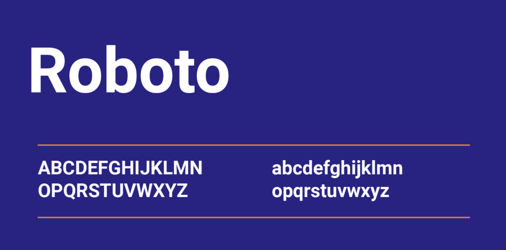
2. Roboto
Use cases: Body text, UI elements, navigation
Why it’s popular/aesthetic: Roboto is a modern, highly legible font designed for web interfaces, making it one of the go-to web design fonts for digital platforms. Its geometric shapes and readability at all sizes make it ideal for websites with lots of content.
Font pairing suggestions: Pairs beautifully with Lora or Merriweather for a modern yet balanced look.
Example websites: Google uses Roboto extensively across its services and products.

3. Playfair Display
Use cases: Headlines, hero sections
Why it’s popular/aesthetic: This serif font exudes elegance and sophistication, making it perfect for beautiful fonts used in luxury or editorial websites. Its high contrast between thick and thin strokes creates a dramatic visual impact.
Font pairing suggestions: Combine with sans-serif fonts like Montserrat or Lato for a clean, modern contrast.
Example websites: Vogue and other high-fashion brands favor Playfair Display for its refined aesthetic.
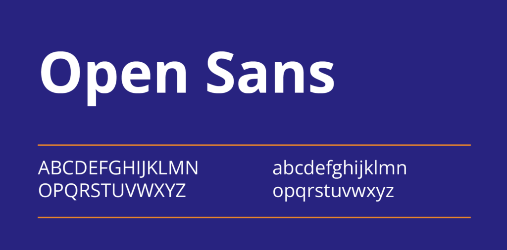
4. Open Sans
Use cases: Body text, navigation
Why it’s popular/aesthetic: A versatile and highly readable font, Open Sans is a top choice for many websites due to its clean lines and simplicity. It’s ideal for ensuring readability across various devices and screen sizes, making it one of the most practical web design fonts.
Font pairing suggestions: Matches well with more decorative fonts like Oswald or Raleway.
Example websites: WordPress and Medium frequently use Open Sans for its neutral, clean appearance.

5. Lato
Use cases: Body text, captions, call-to-action buttons
Why it’s popular/aesthetic: Lato is known for its warm, friendly feel while still maintaining a professional look. Its subtle roundness and distinct letterforms give it an approachable yet refined aesthetic.
Font pairing suggestions: Pairs excellently with bold display fonts like Bebas Neue or with serif fonts like Playfair Display.
Example websites: Various startups and tech companies use Lato for its combination of modernity and friendliness.
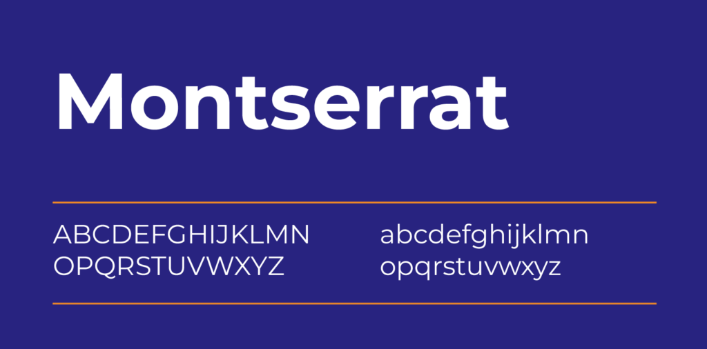
6. Montserrat
Use cases: Headlines, hero sections, logos
Why it’s popular/aesthetic: Montserrat is a geometric sans-serif font with a modern edge, making it one of the trendiest aesthetic fonts in web design. Its clean and sharp lines make it great for bold, eye-catching headlines.
Font pairing suggestions: Works well with more traditional serif fonts like Playfair Display or Merriweather.
Example websites: Used by many creative agencies and portfolios for its bold, modern look.
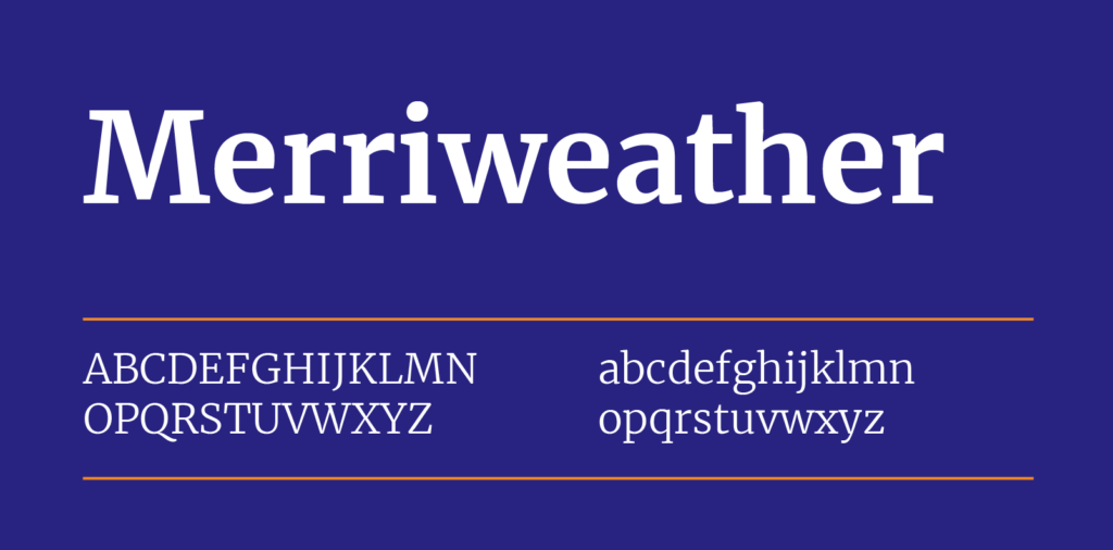
7. Merriweather
Use cases: Body text, blog posts, long-form content
Why it’s popular/aesthetic: Merriweather was designed specifically for reading on screens, making it perfect for content-heavy websites like blogs or news outlets. Its classic serif design ensures readability while offering a traditional yet modern aesthetic.
Font pairing suggestions: Pairs beautifully with sans-serif fonts like Roboto or Lato for a balanced, readable design.
Example websites: The New York Times and other editorial sites often use Merriweather for its timeless appeal.
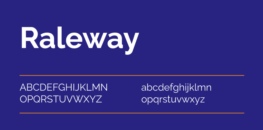
8. Raleway
Use cases: Headlines, logos, navigation menus
Why it’s popular/aesthetic: Raleway is an elegant sans-serif font that works great for creative websites. Its thin letterforms and clean look make it one of the most sophisticated web design fonts for minimalist and artistic websites.
Font pairing suggestions: Looks stunning alongside Open Sans or Roboto for a seamless modern design.
Example websites: Many fashion and design blogs use Raleway for its sleek and stylish appearance.

9. Futura
Use cases: Headlines, logos, captions
Why it’s popular/aesthetic: Futura is a geometric sans-serif font that is both modern and timeless. Its bold lines and sharp edges make it an ideal choice for brands that want to convey innovation and professionalism.
Font pairing suggestions: Try pairing with serif fonts like Georgia or Playfair Display for a well-rounded design.
Example websites: Futura is used by brands like Volkswagen and IKEA for its modern, forward-thinking design.

10. Georgia
Use cases: Body text, blog posts, long-form content
Why it’s popular/aesthetic: Georgia is a classic serif font that remains one of the most popular choices for web design fonts. Its readability and traditional style make it perfect for blogs, editorial sites, and content-driven websites.
Font pairing suggestions: Pairs well with sans-serif fonts like Helvetica or Lato for a balanced, easy-to-read layout.
Example websites: Sites like The Guardian and The Telegraph often use Georgia for its classic, readable look.
Font Pairing and Combining Aesthetic Fonts
When designing a website, selecting the right aesthetic fonts is only half the battle – pairing them effectively can elevate your design to a new level. Combining web design fonts requires balance, creativity, and attention to readability to ensure your site looks great but is user-friendly as well.
Best Practices for Pairing Fonts in Web Design
- Pair Serif with Sans-Serif Fonts: A tried-and-true method in web design is to combine a classic serif font with a modern sans-serif. The contrast between the ornate details of a serif font and the clean lines of a sans-serif helps create a visual hierarchy that’s easy on the eyes. For example, pairing a serif like Georgia with a sans-serif like Helvetica creates a refined yet approachable look.
- Limit Font Combinations: While it can be tempting to experiment with multiple web design fonts, it’s best to stick with two or three complementary fonts to avoid visual clutter. Using too many fonts can make your design feel disorganized and chaotic.
- Use Fonts with Similar Proportions: Choose fonts that have similar letter height and spacing to create a cohesive look. For example, fonts like Montserrat and Open Sans both have geometric qualities that make them work harmoniously together.
Combining Trendy and Classic Fonts for a Cohesive Look
Combining trendy fonts with more timeless aesthetic fonts is a great way to keep your web design fresh while ensuring it remains functional and professional. Here’s how you can do it effectively:
- Mix Modern with Traditional: If you use a trendy font like Raleway for headlines, balance it out with a classic font like Times New Roman for body text. This contrast helps maintain legibility while adding a contemporary flair.
- Match the Tone of Your Website: Trendy fonts like Futura or Raleway are perfect for modern, creative websites, while classic fonts like Georgia and Merriweather work well for more traditional or content-heavy sites. Mixing these fonts thoughtfully ensures your design feels intentional and well-matched to the brand.
Common Mistakes to Avoid When Pairing Fonts
- Overcomplicating with Too Many Fonts: As mentioned earlier, limit yourself to two or three web design fonts. Adding too many fonts can disrupt the flow of your design and make it feel disjointed.
- Ignoring Readability: Trendy fonts can be visually striking but might lack clarity when used for longer text. Ensure your primary text font is easy to read, especially in body copy, and save more decorative aesthetic fonts for headings or special sections.
- Not Considering Font Weights: When pairing fonts, it’s crucial to consider the weight and thickness of each font. Combining two bold or two thin fonts can create an unbalanced look. Instead, opt for fonts with contrasting weights – pairing a bold headline font with a lighter body font, for example.
By following these guidelines, you can create a balanced and aesthetically pleasing design using the best aesthetic fonts for your website.
WordPress Web Design Agency
Partner with our white label WordPress web design agency for custom, scalable solutions. We design, develop, and maintain websites tailored to your clients.
How to Choose Aesthetic Fonts for Your Brand
Selecting the right aesthetic fonts for your brand is crucial in creating a visual identity that resonates with your audience. The fonts you choose should reflect your brand’s personality, complement your color scheme, and align with your overall design aesthetic. Here’s how to ensure you’re picking the best web design fonts for your brand.
Considerations for Selecting the Right Aesthetic Font Based on Brand Personality
Every brand has a unique voice and message, and your choice of aesthetic fonts should enhance and communicate this.
- Modern and Minimalist Brands: If your brand is sleek and forward-thinking, opt for clean, sans-serif fonts like Helvetica or Montserrat. These fonts convey professionalism, simplicity, and innovation, making them ideal for tech companies, fashion brands, or startups.
- Creative and Artistic Brands: For brands with a focus on creativity or artistry, such as design agencies or art-centric businesses, trendy and decorative fonts like Playfair Display or Rustico can add flair and uniqueness.
- Traditional and Trustworthy Brands: If your brand aims to convey reliability and tradition, choose serif fonts like Georgia or Merriweather. These fonts are often associated with authority and heritage, making them perfect for law firms, educational institutions, or financial services.
Matching Fonts with Color Schemes and Visual Elements
Pairing web design fonts with your brand’s color scheme is essential for creating a cohesive design.
Complementary Colors: Your font’s color should complement your website’s visual elements, including logos and imagery. A vintage serif font like Baskerville in muted tones pairs well with warm, retro color schemes, while a sleek sans-serif like Roboto looks best in cool, neutral palettes.
High Contrast: Dark fonts on light backgrounds (and vice versa) improve readability and make your design pop. For example, pairing a bold black font like Futura with a light, pastel color palette can create a striking modern aesthetic.
Examples of How Popular Brands Use Aesthetic Fonts Effectively
- Apple: Apple’s use of the Helvetica family demonstrates how a clean, minimalist sans-serif font can embody modernity, innovation, and simplicity. The neutral yet stylish font works perfectly with Apple’s minimalist brand identity.
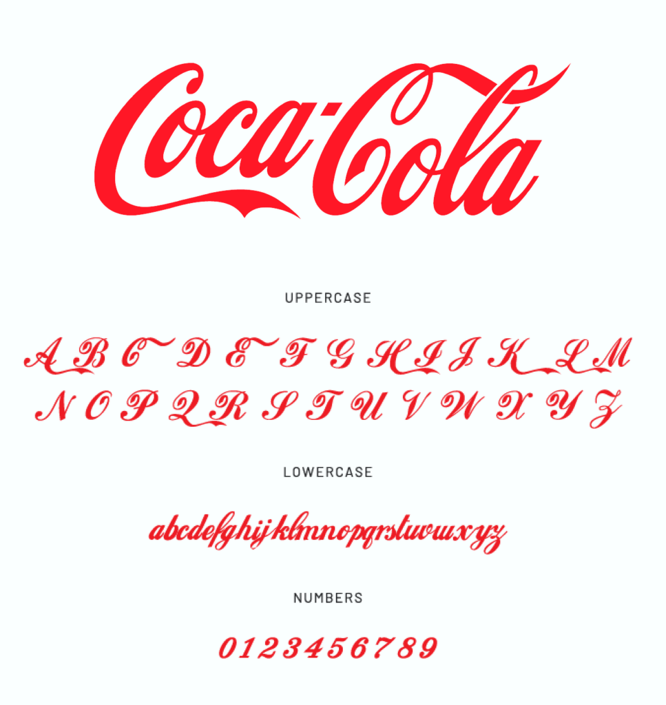
- Coca-Cola: The Coca-Cola brand famously uses a cursive, flowing font in its logo, which adds to its vintage charm. This choice reflects the brand’s history and global recognition while enhancing its classic aesthetic.
- Nike: Nike’s bold use of Futura in its campaigns aligns with the brand’s powerful, energetic personality. The strong geometric shapes of the font convey movement and confidence, perfectly mirroring Nike’s brand message.
By choosing the right aesthetic fonts for your brand and aligning them with your visual identity, you can ensure that your website design is attractive and also reflective of your core values and personality.
Optimizing Aesthetic Fonts for Web Performance
While selecting the perfect aesthetic fonts can enhance the visual appeal of your website, it’s equally important to ensure that these fonts don’t slow down your site. Optimizing web design fonts for performance helps maintain fast loading speeds, improves user experience, and ensures your site functions smoothly across all devices.
Font File Sizes and Loading Speed Optimization
The size of your font files directly impacts your website’s loading speed. Large font files can significantly slow down your site, leading to a poor user experience. To prevent this:
- Use Web-Specific Formats: Opt for web-friendly font formats like WOFF or WOFF2, which compress font files without losing quality. These formats are more efficient than traditional TTF or OTF files, reducing file sizes and load times.
- Limit Font Variants: Avoid overloading your site with too many font weights or styles (e.g., bold, italic, etc.). Stick to two or three variations of each font to keep file sizes manageable while still achieving the desired aesthetic.
- Subsetting Fonts: Only include the characters your website needs. If you’re using a font with multilingual characters but only need the Latin alphabet, subsetting the font to remove unnecessary characters can reduce its size.
Tools to Optimize Font Performance
Several tools are available to help you optimize aesthetic fonts for web performance:
- Google Fonts: Google Fonts is a popular and easy-to-use service that hosts web design fonts optimized for fast loading. It allows you to customize font weights and only loads the characters you need, improving site performance.
- Font Squirrel: Font Squirrel offers a variety of free fonts optimized for web use. It also includes a web font generator that can convert traditional font formats to WOFF or WOFF2, ensuring that your fonts are both lightweight and browser-compatible.
- Adobe Fonts: For more advanced options, Adobe Fonts (formerly Typekit) offers a wide range of aesthetic fonts that are automatically optimized for web performance.
Tips for Ensuring Cross-Browser Compatibility and Mobile Responsiveness
Ensuring that your web design fonts look consistent across all browsers and devices is crucial for maintaining a cohesive design:
- Use Web-Safe Fonts as Fallbacks: Not all browsers or devices support custom fonts. By setting web-safe fonts like Arial, Helvetica, or Georgia as fallbacks in your CSS, you ensure that your content remains readable if the custom font fails to load.
- Test on Multiple Browsers: Fonts may render differently in browsers like Chrome, Firefox, Safari, and Edge. Always test your site on multiple platforms to ensure your aesthetic fonts look as intended.
- Ensure Mobile Responsiveness: Mobile users make up a significant portion of web traffic, so your fonts need to scale well on smaller screens. Use responsive typography techniques such as setting font sizes in relative units (e.g., em or rem) instead of fixed units (like px) to ensure your fonts adjust smoothly across different screen sizes.
By following these steps, you can enjoy the benefits of aesthetic fonts while ensuring your website remains fast, responsive, and visually consistent.
Implementing Aesthetic Fonts in WordPress
While selecting the right aesthetic fonts is essential, it’s equally important to know how to integrate them smoothly into a WordPress site. Here’s a step-by-step guide to making sure your beautiful fonts look great and also perform well on WordPress.
- Using Custom Fonts in WordPress
- Google Fonts Integration: One of the easiest ways to add trendy fonts to WordPress is through Google Fonts. Plugins like Google Fonts Typography make this process seamless. You can browse and integrate fonts directly from the WordPress dashboard.
- Custom Font Upload: If you’re looking to add a unique or premium font, the Custom Fonts Plugin allows you to upload your font files directly. This method ensures your website stands out with fonts that aren’t available on free platforms.
- Choosing Aesthetic Fonts for WordPress Themes
- Certain WordPress themes, especially premium ones, come with pre-built support for aesthetic fonts. Look for themes that offer typography options within the theme customizer, making it easy to experiment with different fonts.
- Page Builders: If you’re using page builders like Elementor or Divi, both come with extensive font options. You can easily apply trendy fonts to different sections of your website without needing additional plugins.
- Optimizing Fonts for Speed and Performance
- Load Only What You Need: WordPress users often make the mistake of loading too many font variations (weights, styles, etc.), which can impact site speed. Stick to 2-3 variations of your chosen aesthetic fonts to keep your WordPress site fast.
Font Preloading: By adding a few lines of code to your theme’s header.php file, you can preload fonts, improving the perceived load time.
- Responsive Typography in WordPress
- One unique aspect of web typography that’s often overlooked is how aesthetic fonts look across different devices. WordPress makes it easy to adjust font sizes based on screen sizes through plugins like Responsive Typography.
- You can ensure that your aesthetic fonts look just as beautiful on mobile devices as they do on desktops by setting font size breakpoints.
- SEO Considerations for Aesthetic Fonts
- Font Load Time and Rankings: Google has started factoring in Core Web Vitals for ranking purposes, and font load time can directly impact your SEO. Make sure your aesthetic fonts load fast by using only web-safe fonts or integrating Google Fonts with font-display: swap.
Fallback Fonts: Always set a fallback font in your WordPress CSS to ensure that if the custom font fails to load, your users will still see a professional design.
- Custom CSS for Font Styling
If you want to take full control of how your aesthetic fonts appear in WordPress, adding custom CSS is the way to go. By using the Customizer’s “Additional CSS” section, you can fine-tune font size, weight, line spacing, and more.
- Font Accessibility in WordPress
- Aesthetic fonts should look beautiful but also be accessible to all users. Make sure your fonts are readable for users with visual impairments by maintaining a strong contrast ratio and avoiding overly decorative aesthetic fonts for body text. Tools like WP Accessibility help ensure your aesthetic font choices are accessible.

2024 Font Trends: What’s New in Aesthetic Fonts
As we move into 2024, aesthetic fonts continue to evolve, with new trends shaping the look and feel of modern web design. From retro-inspired designs to bold, experimental typefaces, the typography landscape is brimming with exciting possibilities. Here’s a breakdown of the upcoming aesthetic font trends for the year ahead, and what you can expect to see more of in 2024.
1. Retro-Inspired Aesthetic Fonts
Vintage styles from the 70s, 80s, and 90s are making a big comeback. Fonts like Cooper Black and Benguiat, known for their nostalgic appeal, are seeing a revival in web design, especially for creative portfolios and fashion brands.
2. Minimalist Sans-Serifs
Clean, simple sans-serif fonts like Helvetica and Roboto remain top choices for 2024. These web design fonts are favored for their clarity and timeless appeal, particularly in tech and corporate websites where readability is key.
3. Handwritten Fonts
Handwritten aesthetic fonts are trending for their warm, personal touch. Brush script and signature-style fonts like Salted Mocha add authenticity to designs, making them ideal for lifestyle blogs, personal brands, and eCommerce sites looking to connect with their audience.
4. Bold, Experimental Typography
Designers are pushing boundaries with oversized, distorted, and playful aesthetic fonts in 2024. These experimental aesthetic fonts are being used sparingly, mainly in hero sections or headlines, where they can make a bold statement.
5. Variable Fonts
Variable fonts offer flexibility and improved performance. They allow designers to adjust weight and width within a single font file, making them ideal for responsive web design. This trend is expected to grow as designers look for efficient ways to maintain style without sacrificing speed.
6. Geometric Fonts
Playful, geometric fonts with symmetrical lines like Poppins will be popular in 2024. These fonts bring a modern, quirky vibe, making them perfect for innovative brands in tech, fashion, and architecture.
WordPress Webdesign
Enhance your agency’s offerings with our WordPress website design services. Get custom, high-quality designs that fit your client’s needs.
The Power of Aesthetic Fonts in Web Design
Choosing the right aesthetic fonts is essential in creating a visually appealing and engaging website. Fonts play a key role in shaping user experience, reinforcing brand identity, and keeping your design in line with the latest trends. Whether you’re aiming for a modern, minimalist look or a bold, creative style, the right font can elevate your website’s aesthetic and functionality.
We encourage you to experiment with different aesthetic fonts to find the perfect match for your brand. However, be mindful of maintaining a cohesive visual identity, ensuring that your fonts align with your overall design and brand message.
At The White Label Agency, we specialize in WordPress web design. Our team understands the power of typography and is ready to help you create a website that looks great and also enhances your brand’s online presence. Contact us today and elevate your brand and user experience.
FAQs
What is the best font for aesthetics?
The best font for aesthetics depends on the context and design goals. However, some fonts are renowned for their aesthetic appeal across various platforms:
Serif Fonts:
Garamond: A timeless and elegant serif font that is great for classic and sophisticated designs.
Baskerville: Offers a more refined, traditional look with a touch of formality.
Playfair Display: Popular for its modern take on classic serif styles, perfect for stylish and creative projects.
Sans-Serif Fonts:
Helvetica: Known for its clean and modern appearance, making it versatile for minimalistic and professional designs.
Futura: Has a geometric feel that brings a modern, aesthetic vibe.
Avenir: Combines modernity and simplicity, with smooth lines that make it suitable for a range of design aesthetics.
Display and Decorative Fonts:
Lobster: Great for playful and informal designs, especially for logos or headlines.
Raleway: A stylish sans-serif font with a sleek appearance, often used for both body text and headings.
Minimalistic and Modern Fonts:
Montserrat: A popular choice for web design with its simple, yet appealing, geometric structure.
Poppins: Clean and modern with a slightly rounded appearance, perfect for contemporary aesthetics.
Each of these fonts can enhance the visual appeal of your design, so choose based on your brand’s personality, readability needs, and the emotional tone you want to convey.
What is the Gen Z aesthetic font?
The Gen Z aesthetic is characterized by a preference for unique, expressive, and visually engaging fonts that reflect their dynamic and diverse tastes. Some fonts that resonate well with this aesthetic include:
Quicksand: A versatile and clean font with rounded edges and geometric shapes, capturing a modern and friendly vibe.
Montserrat: A sleek and elegant font offering multiple weights and styles, suitable for various design purposes.
Bebas Neue: A bold and eye-catching font with strong, uppercase letters, adding a touch of edginess to designs.
Raleway: A modern and minimalist font with thin letterforms and subtle curves, ideal for sleek and contemporary designs.
Poppins: A vibrant and youthful font with rounded corners and wide letter spacing, creating a playful and friendly appearance.
These fonts align with Gen Z’s inclination towards modern, clean, and expressive typography, making them popular choices for contemporary designs.
What font is most pleasing to the eye?
The most visually pleasing font often depends on readability, spacing, and context. However, here are some widely regarded options for eye-pleasing fonts:
Sans-Serif Fonts:
Helvetica: Known for its clean, neutral design, it’s easy on the eyes and highly versatile for both digital and print formats.
Arial: A classic sans-serif font that is simple, readable, and commonly used across many platforms.
Verdana: Designed specifically for screen use, with wide letters and ample spacing, making it highly readable and visually comfortable.
Avenir: A modern font with geometric lines and balanced spacing, perfect for a sleek, pleasing look.
Serif Fonts:
Georgia: Created for excellent readability on screens, with a classic look that pairs well with digital and print content.
Garamond: Elegant and timeless, it provides a harmonious, aesthetically pleasing appearance for long-form reading.
Merriweather: A serif font designed to be highly legible on screens, with comfortable spacing and readability in mind.
Humanist Fonts:
Optima: A humanist sans-serif that blends the clean lines of sans-serif fonts with the elegance of serifs.
Gill Sans: Offers a unique and friendly appearance that is gentle on the eyes while maintaining readability.
Modern Fonts:
Roboto: A popular modern font that balances geometric forms with natural curves, often used in web design for its readability.
Open Sans: Highly legible and versatile, suitable for digital interfaces and print.
What is the aesthetic font for headings?
The best aesthetic fonts for headings are Bebas Neue, Playfair Display, and Montserrat for a modern, eye-catching look.


