

Analogous colors are groups of three to five colors that sit next to each other on the color wheel. Have you ever looked at a sunset? Notice how the colors smoothly flow from orange to red to purple? That’s a perfect example of analogous colors in nature.
In color theory, there are various color harmonies and analogous colors hold a special place because they naturally complement each other without creating strong contrast. This makes them particularly valuable in designs where you want to convey harmony, stability, and natural progression.
What Are Analogous Colors?
Analogous colors consist of three colors next to each other on the color wheel and these groups usually have:
- A dominant color: Usually a primary or secondary color.
- A supporting color: A secondary or tertiary color adjacent to the dominant color.
- An accent color: Either a mix of the first two or a tertiary color that adds contrast or emphasis.
Since the traditional 12-part color wheel is circular and any color can be a starting point, there are 12 possible 3-color analogous combinations, here’s a complete list of them:

- Red, Red-Orange, Orange
- Red-Orange, Orange, Yellow-Orange
- Orange, Yellow-Orange, Yellow
- Yellow-Orange, Yellow, Yellow-Green
- Yellow, Yellow-Green, Green
- Yellow-Green, Green, Blue-Green
- Green, Blue-Green, Blue
- Blue-Green, Blue, Blue-Violet
- Blue, Blue-Violet, Violet
- Blue-Violet, Violet, Red-Violet
- Violet, Red-Violet, Red
- Red-Violet, Red, Red-Orange
While usually represented as three colors, analogous combinations can also extend to 4 colors for added depth and complexity, maintaining the same harmonious flow.
What is the Analogous Color scheme?
An analogous color scheme is a color palette that consists of three to five colors that are adjacent to each other on the color wheel. These colors share a similar hue, creating a harmonious and cohesive visual effect.
Characteristics of an Analogous Color Scheme:
- Adjacent Colors: The colors are next to each other on the color wheel (e.g., blue, blue-green, and green).
- One Dominant Color: Typically, one color is the dominant hue, while the others act as supporting or accent colors.
- Low Contrast: The scheme is visually pleasing and not as contrasting as complementary color schemes.
Examples of Analogous Color Schemes:
- Warm Palette: Red, red-orange, orange, yellow-orange, and yellow.
- Cool Palette: Blue, blue-green, green, yellow-green, and yellow.
- Nature-Inspired Palette: Green, yellow-green, yellow, and orange.
Comparisons with Other Color Schemes
The magic of analogous colors is in their shared characteristics. Because these colors are neighbors on the wheel, they usually contain similar base hues, which creates a natural analogous harmony in design. Key differences from other schemes:

- Complementary colors: use two colors from opposite sides of the wheel (like blue and orange). Unlike analogous colors’ gentle flow, complementary pairs create strong, dynamic contrast.
- Triadic colors: use three colors equally spaced around the wheel (like red, blue, and yellow). While analogous colors blend smoothly, triadic colors create bold, balanced designs.
- Split-complementary colors: take one main color and uses the two colors beside its complement. Unlike analogous colors’ simplicity, this creates more tension and complexity while maintaining some harmony.
The main difference is that analogous schemes prioritize smooth transitions and natural harmony, while other schemes use more contrast and tension for different visual effects.
What is the mood of analogous colors?
The mood of analogous colors is typically harmonious, calming, and cohesive. Because these colors are closely related on the color wheel, they naturally blend well together and create a unified visual experience. The specific mood they convey depends on the section of the color wheel they come from:
- Warm Analogous Colors (e.g., red, orange, yellow):
These evoke feelings of energy, warmth, excitement, and enthusiasm. They are often associated with passion, comfort, and optimism. - Cool Analogous Colors (e.g., blue, green, violet):
These create a tranquil, soothing, and peaceful mood. They are often associated with nature, calmness, and relaxation. - Neutral Analogous Colors (e.g., yellow-green, green, yellow):
These can strike a balance between energizing and calming, depending on the dominant hue.
Analogous color schemes are ideal for creating designs that feel cohesive and visually pleasing without being too stark or jarring. They are commonly used in interior design, branding, and artwork to establish a specific emotional tone.
Applications of Analogous Colors
Analogous schemes based on primary and secondary colors are frequently used in design and branding. They create visual analogous harmony and evoke emotions that align with specific brand messages, here is how they are used effectively across various industries:
Primary Color-Based Analogous Color Schemes
Red-Based Scheme
Colors: Red, Red-Orange, Orange
These colors create energy and warmth. They are effective in design when the goal is to attract attention and show enthusiasm. The strong colors help make designs noticeable and memorable.

Common Applications
- Product & Web Design: Creates energetic designs that attract attention. Companies like Mastercard and Kodak use these colors to stand out.
- Art: Sunset (1872) by Camille Pissarro uses these colors to show the warm light of a sunset.
- Nature: Appears in sunsets, showing warmth and energy that influences both art and design.
Blue-Based Scheme
Colors: Blue, Blue-Green, Green
The blue-based analogous scheme shows reliability and calm—the smooth transition from blue to green works well in business designs to show stability and progress.
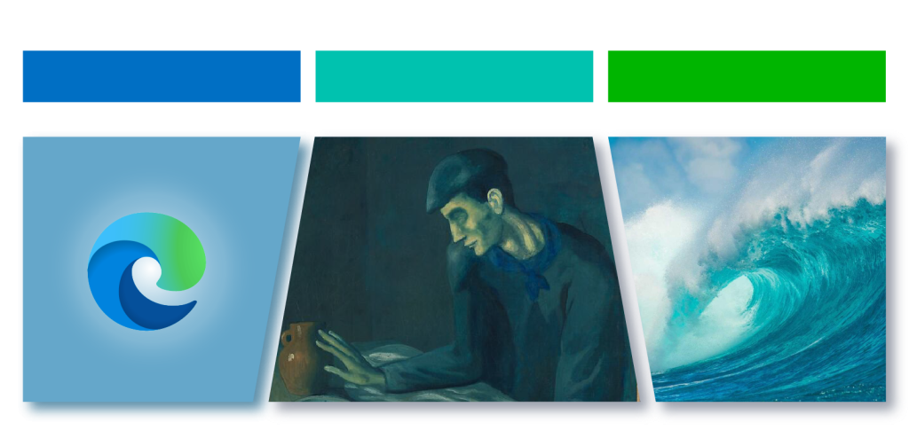
Common Applications
- Product & Web Design: Often used in business websites to show trust and expertise. Microsoft Edge uses these colors to appear reliable.
- Art: The Blind Man’s Meal by Pablo Picasso uses these colors to create a quiet, thoughtful mood during his Blue Period.
- Nature: Seen in oceans, showing depth and peace.
Yellow-Based Scheme
Colors: Yellow, Yellow-Green, Green
This combination works well for designs about nature and health. It shows freshness and growth, making it popular with environmental brands.

Common Applications
- Product & Web Design: Companies like Subway use these colors to show health and environmental care in their designs.
- Art: Self-Portrait with Bandaged Ear by Vincent van Gogh uses these colors to show vibrancy and renewal.
- Nature: Found in fields and flowers, showing life and energy.
Secondary Color-Based Analogous Color Schemes
Orange-Based Scheme
Colors: Orange, Yellow-Orange, Yellow
This warm combination shows happiness and creativity. It works well in designs that need to be friendly and lively.

Common Applications
- Product & Web Design: Firefox uses these colors to appear friendly and energetic. They are also common in children’s designs and creative tools.
- Art: Orange and Yellow by Mark Rothko uses these colors to show warmth and feeling.
- Nature: Appears in fall leaves and sunset light, showing warmth and creativity.
Purple-Based Scheme
Colors: Purple, Blue-Violet, Blue
This combination shows refinement and imagination. Luxury brands often use these colors to appear special and creative.

Common Applications
- Product & Web Design: Microsoft 365 uses these colors to show professionalism and creativity in its various services.
- Art: Waterloo Bridge: Sunlight Effect by Claude Monet uses these colors to create a peaceful, dreamlike scene.
- Nature: Seen in purple-blue flowers and evening skies, showing calm and luxury.
Tips for Using Analogous Colors in Web Design
Creating Visual Interest with Contrast
When using analogous colors, your design can sometimes look flat. To fix this, add complementary colors or neutral shades to make important elements stand out. For example, if your website uses shades of blue and green, try adding small touches of orange to highlight important buttons or clickable elements.
Working with Temperature
Analogous colors can be either warm (like red, orange, yellow) or cool (like blue, green, purple). You can create an engaging design by using both – try warm colors for headlines to grab attention, and cool colors for less important elements like footers to create a sense of calm. This mix helps keep visitors engaged without overwhelming them.
Playing with Color Intensity
The intensity of your colors greatly affects your website’s mood. Bright, saturated colors work great for energetic websites like gaming sites. For more relaxing websites, like wellness blogs or educational platforms, use softer, less intense versions of your chosen colors.
Case of 60-30-10 Rule with Analogous Colors
Divide your analogous colors using this simple rule:
- 60% should be your main color (usually for backgrounds)
- 30% should be your secondary color (for elements like menus)
- 10% should be your accent color (for buttons and highlights)
This is the result:

So above is a sophisticated dark theme for the web design of the analytical dashboard, this is how we did it:
- 60% deep navy background (1a1f35 to 2d3555),
- 30% slightly lighter card elements (2a3352 to 252d47)
- 10% bright accent blue (#4f78ff) for interactive elements
We used an analogous color scheme with deep navy, midnight blue, and bright blue to create a professional and cohesive look that’s easy on the eyes, especially important for data-heavy interfaces where users spend long periods.
Finding the Right Colors
Use color tools like Adobe Color or Coolors to explore different analogous color combinations. These tools make it easy to adjust colors and see how they work together before adding them to your design.
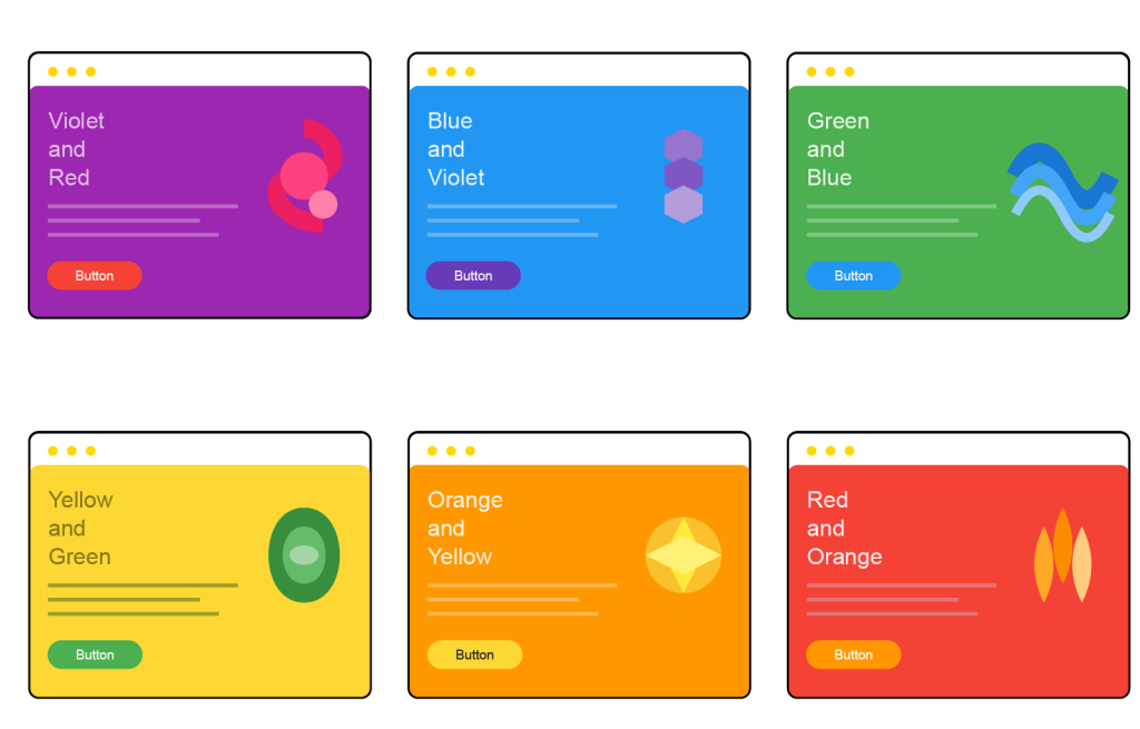
Below are some examples of using only analogous colors in web design:
Conclusion
The beauty of analogous colors lies in their harmony and versatility. By understanding these color relationships and applying principles like the 60-30-10 rule, you can create websites that not only look professional but also effectively communicate your brand’s message.
At White Label Agency, we specialize in creating custom web designs that leverage the power of color psychology and modern design principles. Whether you need a complete website redesign or white-label web design services for your clients, our team can help you create stunning, conversion-focused websites using sophisticated color schemes. Contact us today to discuss your web design projects.
FAQs
What are the 3 analogous colors?
The three analogous colors are any three colors that sit next to each other on the color wheel. For example:
Red, red-orange, and orange
Blue, blue-green, and green
Yellow, yellow-green, and green
These colors share a similar hue, creating a harmonious and visually pleasing effect. Analogous color schemes are often used in design to create a cohesive and balanced look.
What are complementary and analogous colors?
Complementary Colors
Complementary colors are pairs of colors that sit directly opposite each other on the color wheel. Examples include:
Red and Green
Blue and Orange
Yellow and Purple
These colors provide high contrast and vibrant visuals when placed together, making them great for creating eye-catching designs. Complementary colors are often used in branding and marketing to grab attention.
Analogous Colors
Analogous colors are groups of colors that sit next to each other on the color wheel. Examples include:
Red, Red-Orange, and Orange
Blue, Blue-Green, and Green
Yellow, Yellow-Green, and Green
These colors create a harmonious and cohesive look. Analogous schemes are commonly used in interior design, art, and graphic design to create a soothing and unified appearance.
Is purple a analogous color?
Purple can be part of an analogous color scheme, but it is not an analogous color on its own. Analogous colors are groups of three (or more) colors that are next to each other on the color wheel. For example:
Purple, Blue-Purple, and Blue
Purple, Red-Purple, and Red
In these cases, purple is one of the colors in an analogous scheme, creating a harmonious and visually appealing combination.
Are green and brown analogous colors?
No, green and brown are not analogous colors.
Analogous colors are groups of three (or more) colors that are next to each other on the color wheel, and brown is not a primary or secondary color on the traditional color wheel.
Instead, brown is a neutral color created by mixing complementary colors (such as red and green) or by blending multiple colors.
However, green and brown are often seen together in nature (like trees and foliage), which makes them visually harmonious even though they are not technically analogous. This natural pairing can still create a pleasing design, but it doesn’t follow the strict definition of analogous colors.
Are pink and orange analogous colors?
No, pink and orange are not technically analogous colors.
Analogous colors are groups of colors that sit next to each other on the color wheel, sharing a common hue. Pink and orange are not next to each other on the traditional color wheel; they are separated by red.
However, you could create a loose analogous scheme with pink, red, and orange, as pink is often seen as a tint of red. This combination can work harmoniously in designs, but strictly speaking, pink and orange alone do not form an analogous pair.
Are green, and blue analogous?
Yes, green and blue are analogous colors because they are next to each other on the color wheel.
In an analogous color scheme, green and blue are often paired with blue-green (a transitional hue between them) to create a harmonious and cohesive look. This combination is associated with feelings of calmness, serenity, and nature, making it popular in designs and artwork that aim to evoke a peaceful mood.
What are the five analogous colors?
Five analogous colors are five consecutive hues on the color wheel, all sharing a similar undertone, creating a harmonious look. For example:
Red, Red-Orange, Orange, Yellow-Orange, and Yellow
Blue, Blue-Green, Green, Yellow-Green, and Yellow
Purple, Red-Purple, Red, Red-Orange, and Orange
These combinations are often used to create a cohesive and visually appealing design. The exact five colors depend on the section of the color wheel you’re working with.
which pair of colors shows analogous harmony?
A pair of colors that shows analogous harmony consists of two colors that are next to each other on the color wheel. Examples of such pairs include:
Blue and Green
Yellow and Orange
Red and Red-Orange
Violet and Blue-Violet
These pairs share similar hues, creating a sense of unity and balance. They are commonly used in designs to evoke a harmonious and pleasing visual effect.


