

Color is clearly the dominant element in design, and every designer can elevate their web design projects by mastering color theory, especially when working with WordPress design.
Not all users may be aware of this, but at the heart of every design there are sophisticated decisions made about the use of primary colors, secondary colors, and tertiary colors. Understanding how to utilize these colors to create any type of design can enhance the user experience and overall aesthetic of the product.
In this blog, we will explore color theory: how primary, secondary and tertiary colors work together with different types of colors – including monochromatic, analogous, complementary, triadic, and split complementary. Most importantly, we will provide you with practical tips on how to use them effectively in your WordPress design projects.
WordPress Webdesign
Enhance your agency’s offerings with our WordPress website design services. Get custom, high-quality designs that fit your client’s needs.
What are Primary Colors?
Primary colors are the foundation of the color wheel. In the RYB model, these colors are Red, Yellow, and Blue. They are called primary as they cannot be created by mixing other colors and also are the source from which all other colors are derived.
So, we can say that primary colors are the building blocks of the rest of the colors. By mixing primaries in different combinations, you can get the secondary colors and further, the tertiary colors.
For more thorough information about primary colors, please check our blog.
Now, let’s discuss the use of primary colors and color theory in web design based on WordPress theme examples:
Primary Colors in Web Design
Red
A good example of how color theory and primary colors can be used in web design is a theme by ThemeForest for Restaurants.

This theme predominantly uses red, a primary color in the RYB model. Red is a common color choice for restaurant websites and branding, think of Mcdonald’s, KFC, Wendy’s, etc, they all use red because it is often associated with appetite, energy and warmth in color theory.
The use of red creates a sense of excitement and urgency and is perfect for a restaurant setting as it encourages users/visitors to take action. This WordPress theme also balances the intensity of red with more neutral tones and secondary colors. For example, white and light gray backgrounds help the red and yellow elements stand out.
By using another primary color yellow, the theme balances the intensity of red and adds a touch of happiness and positivity.
To test the live demo, click here.
Yellow
An excellent example of applying color theory and primary colors in web design is a WordPress theme by ThemeForest. This particular theme uses yellow, another primary color in the RYB model. According to color theory, using yellow in design conveys energy, optimism and visibility. It is a bold and attention-grabbing color that naturally draws the human eye. As this WordPress design is for construction and industrial websites, the use of the primary color yellow reflects caution and safety (think of construction signs and equipment).

This example shows how primary colors can be used in WordPress design to create a website that is well-designed and also aligned with industry-specific needs. You can test a live demo of this theme here.
Blue
Here is The Globaly WordPress theme, which prominently features blue as the dominant color, which we already know is one of the primary colors in the RYB model. This is a strong example of how primary colors, particularly blue, can be leveraged to build a professional and user-friendly website. The theme is for consulting and professional services and since blue is often associated with trust, reliability and professionalism in color theory, it aligns well with the theme’s purpose. By using blue as the primary color, the theme creates a sense of calmness and authority, making it an ideal choice for building a trustworthy brand identity.

You can test the live demo on this link.
What are Secondary Colors?
By mixing two primary colors in equal parts, you get secondary colors. For example:
- Red + Yellow = Orange
- Blue + Yellow = Green
- Red + Blue = Purple
On the color wheel, secondary colors are positioned between the primary colors from which they are derived. You can see that orange is placed between yellow and red, green between yellow and blue, and purple between red and blue. The positioning perfectly shows how secondary colors naturally interact with their adjacent primary colors.

To read more about the secondary colors in design, you can read our blog.
Secondary Colors in Web Design
Orange
The Fuller Creative theme uses orange as a key accent color throughout its design. From the perspective of a color theory, orange is an ideal choice for this type of WordPress design, as it is a warm, energetic color that is made from the passion and excitement of red and the cheerfulness of yellow. Hence, the color orange is the perfect choice to convey creativity, enthusiasm and a forward thinking attitude for a creative agency website.

Test the Fuller Creative theme here.
Green
This WordPress theme mostly uses the color green, and it can be used in web design by businesses or organizations that are focused on sustainability, green energy, environmental initiatives, recycling and related topics.

The main accent color of this WordPress design is the color green, a secondary color formed by blue and yellow. The use of green is balanced with neutral tones like light gray and white, for the overall web design to remain clean and easy to navigate.
Green is universally associated with nature. It often symbolizes growth, renewal and health. In web design, it is often used for businesses in the environmental sector, for instance, eco-friendly products like reusable items or organic food; it is also commonly used in alternative energy solution businesses.
You can design a WordPress website with this theme here.
Purple
Now about the secondary color purple and its usage in modern web design. This WordPress theme is designed for businesses that want to present themselves with a unique and refined visual identity.

The dominant color in this WordPress design is purple, creating a distinct and luxurious feel throughout the design. Purple, a secondary color is created by mixing red and blue, and gives the theme a sense of creativity and sophistication. The color is paired with clean, neutral backgrounds.
According to color theory, purple is an excellent choice for this type of WordPress design as it is often associated with creativity and imagination and fits perfectly with the themes of creative agencies.
To test a demo version click here.
What are Tertiary Colors?
Tertiary colors are created by mixing a primary color with a secondary color that is adjacent to the color wheel. The six tertiary colors are:
- Red-orange (vermilion)
- Yellow-orange (amber)
- Yellow-green (chartreuse)
- Blue-green (teal)
- Blue-purple (indigo)
- Red-purple (magenta)
Usually, tertiary colors are used to add depth and sophistication to a design. For designers, they offer a way to create smooth transitions between primary and secondary colors, resulting in a more harmonious composition.
Tertiary Colors in Web Design
In WordPress design, tertiary colors are often used to balance the overall design. For instance, a web designer might use the color teal for buttons or icons, to create a soft contrast against a blue (primary color) background. A very common way of using another tertiary color amber is to highlight important information without the intensity of pure yellow or orange.
For more in-depth information about the use of tertiary colors in WordPress design, you can read our blog about tertiary colors.
Types of Colors in Design
In web design, each type of color plays a unique role in shaping the mood, tone and feel of a design. In this section, we will break down color schemes and share how you can use them in your web design projects.
Monochromatic Colors
Monochromatic colors are shades, tints and different tones of a single color. According to color theory, this scheme is based on a single hue and variations in its lightness and saturation. Monochromatic colors create a minimalist design and are perfect for a clean and focused look. Here is an example of using it in web design.

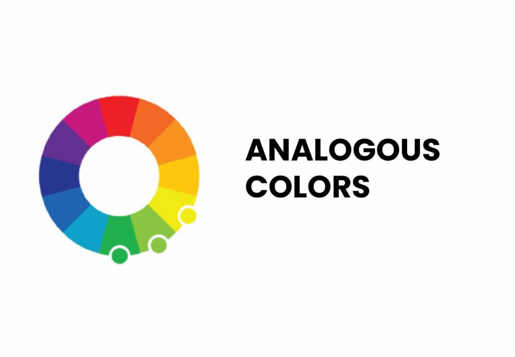
Analogous Colors
Analogous colors are next to each other on the color wheel, and in color theory, these colors blend well together, as they are often found in nature and are pleasing to the eye. Analogous colors create a unified and pleasing effect without much contrast.
Complementary Colors
On the color wheel, complementary colors are positioned at the opposite of each other. These colors create high contrast and impact and are often used for drawing attention. Hence, they may be used for highlighting key elements in web design, such as “like” buttons or calls to action.

Triadic Colors
Three colors that are evenly spaced around the color wheel are often referred to as triadic colors. They are used for creating balanced and vibrant designs that won’t overwhelm the viewer.

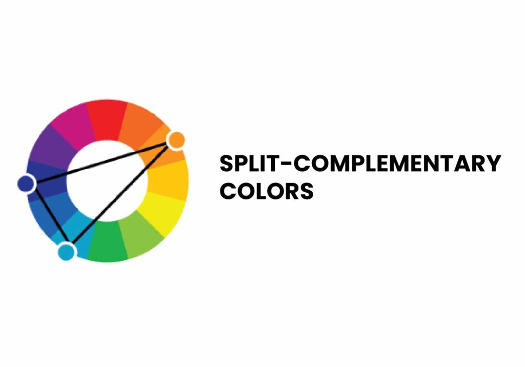
Split-Complementary Colors
Split-complementary colors are a variation of the complementary scheme, where you use one base color and two colors adjacent to its complementary color. Color theory explains that this scheme is used for creating strong visual contrast similar to complementary colors but without that much tension. Split-complementary colors are ideal for adding nuance and depth to your design.
Warm Colors vs. Cool Colors
Color theory also suggests categorizing colors into warm colors (red, orange, yellow, etc.) and cool colors (blue, green, purple, etc.). Warm colors are often associated with energy and excitement, while cool colors are linked to professionalism and calmness.
In web design, warm colors are great for creating a sense of urgency or excitement (e.g., restaurant websites) and cool colors are perfect for establishing a calm and trustworthy atmosphere (e.g., consulting websites). By knowing psychological effects web designers can easily create the desired mood and emotional response in their WordPress design.

Hire a WordPress Designer
Discover the benefits of choosing to hire a WordPress designer. Enjoy focused attention, quick turnaround, cost-effectiveness, and expert design for the projects.
Conclusion
In this blog, we’ve covered the roles of primary, secondary and tertiary colors in web design, particularly in the context of WordPress design. We discussed how primary colors form the foundation of all color schemes, how secondary colors add richness and variety to it and how tertiary colors can bring sophistication to your designs.
We also examined different types of colors — including monochromatic, analogous, complementary, triadic, and split-complementary — and how each of them can be used in web designs.
If you want to further enrich your web design skills, explore more tips and insights in our whitepaper 10 Tips for the Best Website Design.
Contact our sales team today to see how we can collaborate on your next design project.
FAQs
What are the four main primary colors?
A: Technically, there are three primary colors in most color models. In the RGB color model used for digital displays, the primary colors are Red, Green, and Blue. In the RYB (traditional art) color model, the primary colors are Red, Yellow, and Blue.
However, if you’re looking for a fourth color, it may refer to an extended or alternative model, such as CMYK used in printing, where the primary colors are Cyan, Magenta, Yellow, and Key (Black).
Which 3 are the secondary colors?
The three secondary colors are Green, Orange, and Purple. These colors are created by mixing the primary colors in the RYB (Red, Yellow, Blue) color model:
Green is made by mixing Blue and Yellow.
Orange is made by mixing Red and Yellow.
Purple (or Violet) is made by mixing Red and Blue.
These secondary colors are positioned between the primary colors on the color wheel and create a balanced and harmonious palette when used together.
What are the seven primary colors?
There isn’t a standard set of seven primary colors in any color model. Primary colors typically refer to a set of three colors that can be combined to create a broad range of other colors. In the RYB color model, these are Red, Yellow, and Blue. In the RGB color model used for digital displays, the primary colors are Red, Green, and Blue.
If you’re thinking of seven colors, you might be referring to the spectrum of visible light, often represented as the colors of the rainbow:
Red
Orange
Yellow
Green
Blue
Indigo
Violet
These seven colors form the natural spectrum seen in a rainbow, not primary colors in the context of color theory or design.
What is a tertiary color?
A tertiary color is created by mixing a primary color with a secondary color that is adjacent to it on the color wheel. This results in six unique colors that bridge the gap between the primary and secondary colors, adding more depth and variety to the color palette.
Examples of Tertiary Colors:
Red-Orange (mix of Red and Orange)
Yellow-Orange (mix of Yellow and Orange)
Yellow-Green (mix of Yellow and Green)
Blue-Green (mix of Blue and Green)
Blue-Violet (mix of Blue and Violet)
Red-Violet (mix of Red and Violet)
These tertiary colors provide a richer range of options for designers and artists, allowing for more nuanced and visually interesting color schemes.
What is the difference between primary and secondary colors?
The main difference between primary and secondary colors lies in how they are created and their roles in color theory:
Primary Colors: These are the foundational colors that cannot be made by mixing other colors. In the RYB color model (commonly used in art), the primary colors are Red, Yellow, and Blue. In the RGB model (used in digital displays), they are Red, Green, and Blue. Primary colors are used as the base for creating all other colors.
Secondary Colors: These are created by mixing equal parts of two primary colors. In the RYB color model, the secondary colors are:
Green (mix of Blue and Yellow)
Orange (mix of Red and Yellow)
Purple (Violet) (mix of Red and Blue)
Primary colors are the building blocks of color theory, while secondary colors result from their combination, providing a richer palette for design and artistic use.
What three colors go well together?
Three colors that go well together often form a triadic color scheme, which is balanced and visually appealing. Some popular combinations include:
Red, Yellow, and Blue: A classic, vibrant triadic scheme that works well for bold and dynamic designs.
Orange, Green, and Purple: A secondary color triad that offers a fresh and playful look.
Teal, Coral, and Mustard Yellow: A modern combination that provides a balanced, warm, and sophisticated palette.
The key to making these combinations work is to let one color dominate while using the other two as accents to create harmony and avoid visual overload.


