
- Why Websites Use Sticky Headers
- How a Fixed Header Works Technically
- Setting Up a Sticky Header in WordPress
- Using a Plugin for Sticky Header
- Adding CSS Manually
- Making It Work on Mobile
- How to Make the Header Shrink on Scroll
- Common Issues with Sticky Headers and How to Fix Them
- When Not to Use Fixed Headers
- Getting Help With WordPress Development
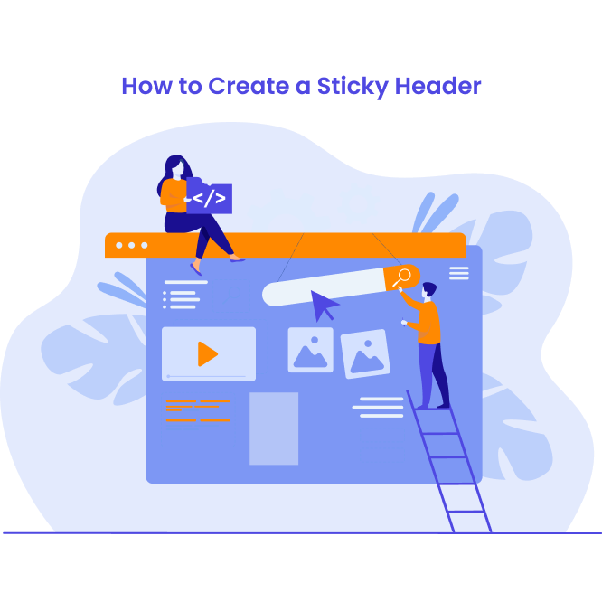
If you have ever scrolled down a website and noticed the menu following you, that is a sticky header. It’s become pretty standard on many websites.
From a technical point of view, sticky headers are not complicated. You are just keeping the header in place while the rest of the page moves underneath it. Still, there are a few practical things worth thinking through before turning it on.
In this blog, we’ll explain how sticky header functionality actually works and show you how to add it to your WordPress website.
Why Websites Use Sticky Headers
The main reason for using sticky headers is convenience. When someone is halfway down a long page and wants to navigate somewhere else, sticky headers make it easier to scroll all the way back to the top to find the menu.
Some sites really benefit from this. If you’re running an e-commerce site with lots of product pages, keeping the search bar and cart icon visible makes sense. Same thing for documentation sites where people jump between sections frequently.
Here is what our Account Manager, Jack, thinks about sticky headers and why so many clients ask for them.
“We get asked about sticky headers a lot, and usually for good reason. Many clients feel it can help with conversion rates, and that makes sense when you think about it.
Your menu is often where the conversion starts. That is where your main services are put up. If someone is scrolling through your site and getting interested in what you offer, it helps to keep those options visible instead of making them scroll back up to find them.”
How a Fixed Header Works Technically
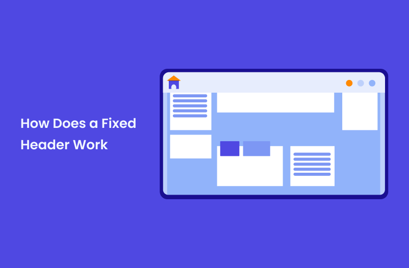
Sticky headers use CSS positioning. There are two main approaches: position: fixed and position: sticky.
Fixed positioning takes the header out of the normal document flow and locks it to the viewport. It stays put no matter what. Sticky positioning is newer and a bit smarter: the header scrolls normally until it reaches the top of the viewport, then it sticks.
Most WordPress themes that include sticky headers use fixed positioning because browser support is universal. But one thing worth noting is that sticky positioning works in modern browsers but can be inconsistent in older ones.
Setting Up a Sticky Header in WordPress
If your theme already includes a sticky header option, you’ll find it in the theme customizer. You can go to Appearance > Customize and look for header settings. There’s usually a checkbox or toggle for “sticky header” or “fixed header.”
You can simply enable it, check how it looks, and you’re done. That’s the simple version.
But if your theme doesn’t have this built in, you have a few other options as well.
Using a Plugin for Sticky Header
Several plugins add fixed header functionality without touching any code. StickyMenu is one that is commonly used. You can install it, activate it, and it makes your header stick automatically.
The plugin settings let you adjust when the header becomes sticky, add animations, and control how it behaves on mobile devices. Most of the default settings work fine, but you can tweak them if needed.
The downside is you’re adding another plugin to maintain. At WLA, we always recommend using as few plugins as possible. It simply overloads the website, and as our Head of Maintenance, Anna, says, ”every plugin is a potential vulnerability.”
If you’re only using it for this one feature, it might make more sense to just add the CSS yourself.
Adding CSS Manually
If you want to avoid a plugin, you can add the sticky behavior with custom CSS. This works if your theme doesn’t interfere with fixed positioning.
You can go to Appearance > Customize > Additional CSS and add something like this:
CSS
.site-header {
position: fixed;
top: 0;
width: 100%;
z-index: 999;
}
You’ll need to adjust .site-header to match whatever class your theme uses for the header. You can inspect the page in your browser to find the correct selector.
The z-index value makes sure the header stays on top of other content when you scroll. The width: 100% keeps it spanning the full width of the screen.
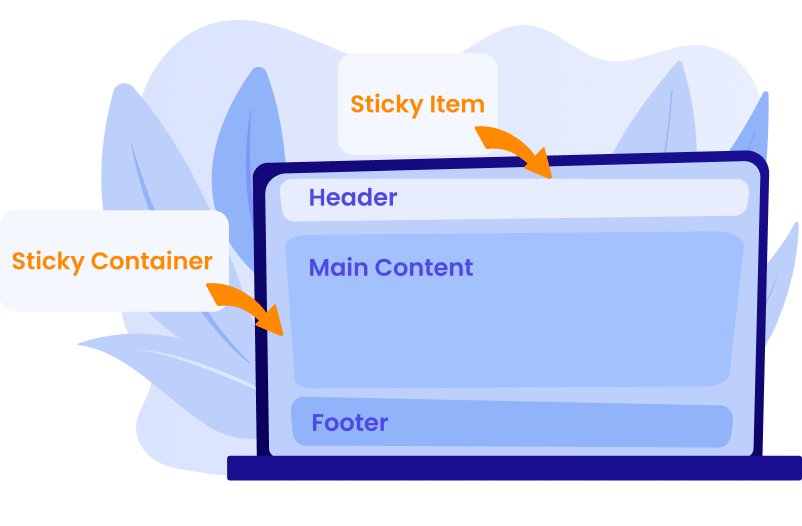
There’s one problem with this approach, though: when the header becomes fixed, it gets removed from the document flow. That means the content below it jumps up to fill the space where the header used to be. You’ll need to add padding to the top of your content to compensate.
CSS
body {
padding-top: 80px;
}
Here, you might also need to adjust the pixel value to match your header height.
Making It Work on Mobile
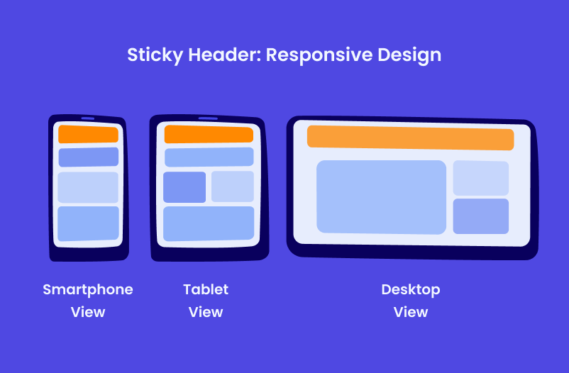
Desktop and mobile often need different treatment. A sticky header that works well on a large screen might take up too much space on a phone.
Some sites disable the sticky behavior on mobile entirely. Others shrink the header when it becomes sticky so it doesn’t dominate the screen. This usually means hiding the logo or reducing its size and making menu items smaller.
You can handle this with media queries in your CSS:
CSS
@media (max-width: 768px) {
.site-header {
position: relative;
}
}
This disables the fixed positioning on screens smaller than 768 pixels. The header scrolls normally on mobile but stays sticky on desktop.
How to Make the Header Shrink on Scroll
A lot of sticky headers shrink when you scroll down. The logo gets smaller, padding reduces, and the whole thing takes up less vertical space. This gives you the navigation access without covering too much content.
If your theme supports this, there’s usually a setting for it. If not, you’ll need JavaScript to detect scrolling and add a class to the header when the user scrolls past a certain point.
Here’s basic JavaScript that adds a “scrolled” class to the header after scrolling 100 pixels:
JavaScript
window.addEventListener('scroll', function() {
if (window.scrollY > 100) {
document.querySelector('.site-header').classList.add('scrolled');
} else {
document.querySelector('.site-header').classList.remove('scrolled');
}
});
Then you can add CSS to make the header smaller when that class is present:
CSS
.site-header.scrolled {
padding: 10px 0;
}
.site-header.scrolled .logo {
height: 40px;
}
WordPress Development Agency
Experience WordPress development with our custom-coded websites. Perfect for agencies, our reliable service ensures timely delivery and client satisfaction.
Common Issues with Sticky Headers and How to Fix Them
Setting up a sticky header in WordPress seems simple, but there are a few common issues. The challenges tend to come from how it interacts with the rest of the page as people scroll and navigate. A few small adjustments can prevent common layout and usability issues.
- Content gets hidden under the header when you jump to anchor links. If someone clicks a link that takes them to a specific section of the page, that section ends up partially hidden behind the fixed header. To avoid this, you can add a scroll offset to account for the header height.
- The header height changes and breaks the layout. If your header includes elements that shift size or wrap on different screen sizes, the fixed height padding you added might not work everywhere. In this case, you either need to calculate this dynamically with JavaScript or use flexible layouts that accommodate different header heights.
- Z-index conflicts happen when other elements on the page also use high z-index values. Dropdown menus, popups, or modal windows might appear behind the sticky header. You’ll need to adjust z-index values to get the stacking order right.
- Performance can suffer on older devices. Fixed positioning is generally fine, but if you’re also adding JavaScript for shrinking animations or other effects, it can cause scrolling to feel janky on slower phones. We recommend testing on actual devices, not only browser dev tools.
When Not to Use Fixed Headers
The thing is, not every site needs fixed headers. If your pages are short and the navigation is always within view anyway, making the header sticky adds complexity without benefit.
Sites with large headers sometimes look better without sticking. If your header includes a big logo, tagline, and substantial navigation menu, keeping all that stuck to the top while scrolling can feel heavy. In such cases, we recommend either shrinking it aggressively when it sticks or skipping the sticky feature entirely.
Some design styles just work better with headers that scroll away naturally. This is more of a design judgment call than a technical one.
Getting Help With WordPress Development
We handle this kind of WordPress customization regularly at WLA. Whether it’s custom navigation or more complex site modifications, we work as a white-label partner for agencies that need development support.
We’ve worked with 600+ agencies on WordPress projects, handling everything from small tweaks to full site builds. If you need WordPress development work done under your agency’s brand, we are here to help. Schedule a call with our team to learn how we can help your agency grow.


