- Understanding the Triadic Color Scheme
- WordPress Web Design Agency
- Triadic Colors Examples in Design
- Building a Triadic Color Palette for WordPress
- The Benefits of Using Triadic Colors in WordPress Design
- Specific WordPress Tips for Triadic Colors
- How to Use Triadic Colors in WordPress Theme Customization
- Common Mistakes to Avoid with Triadic Color Schemes
- Hire a WordPress Designer
- Create Engaging WordPress Sites with the Perfect Triadic Color Scheme
- FAQs
Colors influence design, they define how users perceive and interact with a website. One of the most balanced and visually appealing color combinations is the triadic color scheme, which is made up of three colors that are equally spaced on the color wheel. These triadic colors work together to create a sense of harmony while allowing for bold contrast, making them an excellent choice for a variety of design projects.
In the context of WordPress, using a triadic color palette can help designers achieve visual balance while maintaining a vibrant and dynamic aesthetic. Whether you’re building a blog or a business website, leveraging triadic color examples can elevate your design and create a more engaging user experience.

Understanding the Triadic Color Scheme
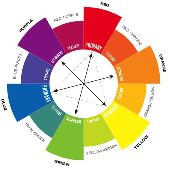
In color theory, the triadic color scheme is built by selecting three colors that are evenly spaced around the color wheel, forming a perfect triangle. This structure creates a visually balanced yet vibrant contrast, marking it one of the most dynamic approaches to color. The three chosen colors work together harmoniously, providing contrast without overwhelming the design.
In WordPress design, applying a triadic color scheme allows you to create an engaging user experience with bold visual elements that still feel cohesive. For example, you might select one dominant color for your background, a second color for typography, and a third for call-to-action buttons. This method ensures that each element stands out while still contributing to an overall harmonious look.
When it comes to color theory in web design, the triadic color scheme is perfect for color schemes for websites that want to be visually striking yet organized. Whether you are working on a blog or an eCommerce site, applying triadic colors to your WordPress theme can help your website feel both unique and balanced.
WordPress Web Design Agency
Partner with our white label WordPress web design agency for custom, scalable solutions. We design, develop, and maintain websites tailored to your clients.
Triadic Colors Examples in Design
The triadic color scheme is widely used across various design fields due to its balance of vibrancy and harmony. By selecting three colors evenly spaced around the color wheel, designers can create visually striking websites, logos, and graphics. Below, we will explore several real-world triadic color examples to demonstrate how different industries and niches can benefit from this approach.
For example, many eCommerce sites use a triadic color palette to distinguish their brand while maintaining a consistent and appealing look. A fitness website might use green as the dominant color (symbolizing energy and growth), with supporting colors like blue and red for call-to-action buttons and headings. Similarly, a creative agency could combine yellow, magenta, and cyan to achieve a modern, eye-catching aesthetic.
In WordPress design, using triadic colors can significantly enhance user engagement. Themes like “Neve” and “Astra” offer customizable options to incorporate a triadic color scheme, helping to build brand identity while ensuring a cohesive website look.

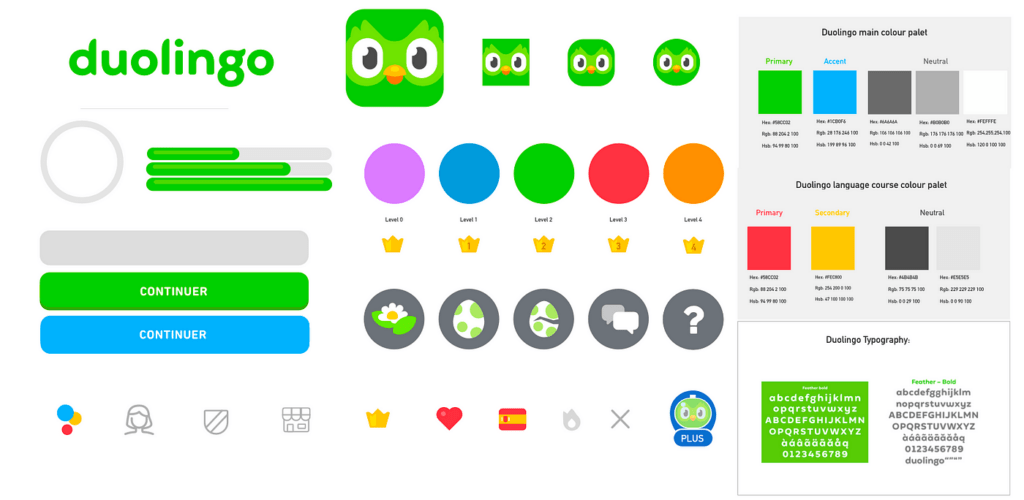
For a real-life example of a website that successfully utilizes a triadic color scheme, we can look at Duolingo, a popular language-learning platform. Duolingo employs a triadic color palette that features green as the dominant color, with orange and blue as supporting colors. The site’s design is bright, engaging, and user-friendly, using this triadic color scheme to guide users through various actions on the site.
This color choice not only enhances readability and user engagement but also strengthens the brand’s playful, educational identity. The vibrant contrast between the green (used for background and key elements), orange (used for buttons and calls to action), and blue (for headings and other important elements) has contributed to Duolingo’s success in maintaining a visually appealing and easy-to-navigate interface.
For WordPress users, using plugins such as Elementor or WPBakery Page Builder can help easily implement triadic color palettes. These tools allow users to adjust background colors, buttons, and typography, making the design process smoother and customizable.
By leveraging triadic colors effectively, designers can create websites that not only stand out but also offer a cohesive user experience, resulting in improved brand recognition and higher engagement.

Building a Triadic Color Palette for WordPress
Creating a visually appealing triadic color palette can elevate the look and feel of your WordPress site, ensuring both vibrant contrasts and harmony across your design. Whether you are designing a blog, business website, or eCommerce platform, a well-balanced triadic color scheme will help your site stand out while maintaining consistency.
Here’s a step-by-step guide to building your triadic color palette using popular tools like Adobe Color or Coolors:
Select Your Primary Color
Start by choosing a dominant color that aligns with your brand’s identity. For example, if your site represents an eco-friendly business, green might be your primary color to symbolize growth and sustainability.
Find Complementary Colors on the Color Wheel
Using a tool like Adobe Color or Coolors, select two additional colors that are evenly spaced from your primary color on the color wheel. These colors will create the triadic scheme. For instance, if you chose green as your dominant color, the tool might suggest blue and orange as your supporting colors.
Balance Your Hues
Once you have your three colors, adjust the saturation and brightness to create a harmonious look. This is especially important for ensuring that none of the colors overpower the others, maintaining balance across your design. Tools like Coolors allow you to fine-tune each hue to suit your needs.
Apply the Triadic Colors to Your WordPress Theme
Now that your triadic color palette is ready, apply it to your WordPress theme. Use the dominant color for the background or key elements, like headers and menus. The secondary colors can be applied to buttons, typography, and icons to create a cohesive yet dynamic look. Plugins like Elementor make it easy to implement custom colors in various design elements across your site.
Enhance Logos and Branding
A triadic color palette can also work wonders for your logo and overall branding. By using complementary colors in your logo design, you’ll create a more memorable and visually engaging identity for your WordPress site. For example, pairing vibrant contrasting hues like red, yellow, and blue can make your brand more distinctive and appealing to visitors.
Incorporating a triadic color palette into your WordPress design helps improve user engagement by making your site more visually organized and appealing. With just a few simple tools and design principles, you can create a professional, eye-catching website that leaves a lasting impression.

The Benefits of Using Triadic Colors in WordPress Design
Incorporating a triadic color scheme into your WordPress design offers numerous benefits that can elevate the visual appeal, usability, and overall user experience of your website. This color scheme, which balances vibrant contrasts and harmonious color combinations, can make your site more engaging and aesthetically pleasing.
Enhanced Visual Appeal
A well-executed triadic color scheme naturally draws attention to key elements on your website, creating a visually stimulating experience without overwhelming users. By using three distinct colors that complement each other, you can create a dynamic look that helps your brand stand out while maintaining a cohesive design.
Improved Usability
In WordPress design, usability is crucial for retaining visitors. A triadic color scheme helps achieve clear visual distinctions between different sections of your site. For example, you can use one color for the navigation bar, another for buttons, and the third for typography. This makes it easier for users to understand the site’s structure and navigate it effectively, enhancing overall usability.
Stronger Branding
Consistent use of a triadic color palette across your website helps solidify your brand’s identity. Whether it’s your logo, headers, or call-to-action buttons, the use of complementary yet contrasting colors makes your brand more memorable. By associating your brand with a unique set of triadic colors, you can create a stronger, more recognizable visual identity.
Increased Engagement
By strategically using a triadic color scheme, you can direct users’ attention to important sections of your site. For example, use the dominant color to highlight key calls to action or featured content, while using supporting colors for less critical areas like footers or sidebars. This approach helps guide users through the site and encourages them to interact more with your content, ultimately improving engagement.
Specific WordPress Tips for Triadic Colors
When applying a triadic color scheme to your WordPress site, consider the following tips:
- Navigation Bars: Use one of your triadic colors to make the navigation bar stand out, ensuring it’s easily accessible and visually distinct from the rest of the site.
- Buttons and CTAs: Highlight your call-to-action buttons with the second color in your triadic palette to draw attention and encourage conversions.
- Featured Content Areas: The third color can be used to emphasize special sections like blog posts, product highlights, or portfolio items, ensuring these areas stand out without clashing with the overall design.
How to Use Triadic Colors in WordPress Theme Customization
While many design platforms emphasize the importance of color theory, WordPress allows users to take that theory and bring it into their own websites with ease. One of the best ways to apply triadic color schemes to your website is through WordPress theme customization. Here’s how you can do it:
1. Leverage the WordPress Customizer
WordPress provides a built-in Customizer that allows you to change the colors of your website without any code. Here’s a step-by-step guide to applying a triadic color palette using the Customizer:
- Step 1: Go to Appearance > Customize in your WordPress dashboard.
- Step 2: Navigate to the Colors section. Depending on the theme you are using, you’ll have options to set the colors for your background, header, text, and links.
- Step 3: Apply your triadic colors to different elements. For example, use one color for the background, another for the buttons, and a third for link hover effects. Make sure the balance is maintained by not overwhelming the page with all three colors in equal amounts.
2. Use Plugins to Manage Color Palettes
There are several WordPress plugins that allow for easy management of custom color schemes. Two standout plugins are “Advanced Customizer” and “CSS Hero”, both of which let you experiment with triadic colors in a more detailed and flexible way:
- Advanced Customizer: This plugin enhances the built-in WordPress Customizer, offering more control over your color schemes. You can adjust every element of your theme, from typography to buttons, ensuring a perfect balance when using triadic color schemes.
- CSS Hero: Allows you to tweak any part of your WordPress site’s design without writing code. You can easily apply triadic colors to specific sections, test color variations, and preview the effects in real-time.
3. Apply Triadic Colors in Page Builders (Elementor, Divi, etc.)
Page builders like Elementor and Divi are widely used for custom WordPress designs. Both offer granular control over color schemes, making it easy to create triadic color palettes for specific pages, sections, or even individual blocks:
- Elementor: You can assign triadic colors to global elements like headers, buttons, or even form fields through Elementor’s Theme Builder. This helps ensure that your color scheme is applied consistently across your site.
- Divi: Divi’s color palette generator can be customized to support triadic colors. Once the palette is set, it can be applied to modules and page layouts, creating a visually balanced and vibrant website.
4. Test and Optimize Color Contrast for Accessibility
One area that is often overlooked when implementing triadic color schemes is ensuring accessibility. Colors with too little contrast can make a website difficult to navigate for users with visual impairments. In WordPress, you can check and optimize color contrast by:
- Use tools like Contrast Checker plugins that scan your website for any color accessibility issues.
- Make adjustments in the Customizer or within your chosen theme to ensure that all triadic color combinations meet accessibility standards.
Common Mistakes to Avoid with Triadic Color Schemes
While a triadic color scheme offers a vibrant and balanced approach to design, there are some common mistakes that can undermine its effectiveness, particularly in WordPress design. By being aware of these potential pitfalls, you can ensure that your website maintains both visual appeal and functionality.
Overusing Vibrant Colors
A triadic color scheme naturally introduces bold, contrasting colors, but overusing these colors can create a visually overwhelming experience. If every section of your site is saturated with vibrant hues, visitors may find it difficult to focus or navigate your content. To avoid this, limit the use of strong colors to key elements like buttons, headers, or call-to-action sections. For background areas and less critical content, consider using softer tints or muted variations of your chosen colors.
Failing to Maintain Contrast
One of the strengths of a triadic color scheme is the contrast it provides. However, if the contrast between your colors is too subtle, important elements can get lost in the design. For instance, buttons or text may blend into the background, making your site harder to read or navigate. In your WordPress design, make sure that there is enough contrast between text and background colors, especially for typography and calls to action, to ensure readability and usability.
Neglecting Color Balance
Another common mistake is failing to balance the colors properly. In a triadic color scheme, one color should be dominant, with the other two serving as accents. If you use all three colors equally throughout the design, it can create a chaotic look. Follow the 60-30-10 rule, where 60% of the design uses the dominant color, 30% uses the secondary color, and 10% is reserved for the accent color. This approach creates a well-structured design that guides the user’s attention effectively.
Ignoring Device Compatibility
In the age of responsive design, it’s crucial to test how your triadic color scheme looks across various devices and screen sizes. A color scheme that appears balanced on a desktop may look too intense or washed out on a mobile device. To avoid this, take advantage of WordPress’s built-in preview tool to see how your design performs on different devices. Additionally, consider using plugins like WPBakery or Elementor, which allow you to tweak colors and layouts for mobile responsiveness.
Not Testing for Accessibility
It’s easy to focus solely on aesthetics, but color contrast and accessibility are crucial in WordPress design. Failing to ensure that your triadic color scheme is accessible to all users, including those with visual impairments, can hurt your user experience and SEO. Use tools like the WAVE Accessibility Checker or contrast testing tools within your WordPress theme to ensure your design meets accessibility standards.
WordPress Tips for Testing and Tweaking Triadic Color Schemes:
- Preview on Multiple Devices: Use WordPress’s theme customizer or third-party plugins to preview your color scheme on desktops, tablets, and smartphones.
- Test for Accessibility: Ensure that your triadic color choices meet web accessibility guidelines by using contrast checkers.
- Make Iterative Adjustments: As you build your site, keep tweaking color brightness, contrast, and saturation to strike the right balance and enhance usability.
By avoiding these common mistakes, you can make the most of your triadic color scheme and ensure that your WordPress design is both visually appealing and user-friendly across all devices.
Hire a WordPress Designer
Discover the benefits of choosing to hire a WordPress designer. Enjoy focused attention, quick turnaround, cost-effectiveness, and expert design for the projects.
Create Engaging WordPress Sites with the Perfect Triadic Color Scheme
Incorporating triadic colors into your WordPress design is an excellent way to create vibrant, balanced, and engaging websites. A triadic color scheme allows you to use contrasting yet complementary colors to highlight important areas of your website, improve usability, and strengthen your brand identity. By exploring triadic color examples and building your own triadic color palette, you can transform your WordPress site into a visually dynamic and professional-looking space.
Whether you are designing a blog, business website, or eCommerce platform, experimenting with triadic colors can take your design to the next level. Try different combinations and see what works best for your brand.
If you’re looking for expert guidance or need help implementing a customized triadic color palette, consider reaching out to White Label Agency. Our team specializes in WordPress design and development, offering the 10 years of expertise needed to bring your vision to life. Whether you want to incorporate triadic colors or need a complete design overhaul, we are here to help. Contact us to start building a stunning, engaging WordPress website.
FAQs
what are the 4 triadic colors
Triadic colors refer to three colors that are evenly spaced around the color wheel, forming a triangle. However, when you mention “4 triadic colors,” it seems to be a slight confusion since a triadic scheme involves only three colors.
To clarify:
Triadic color scheme consists of three colors that are evenly spaced around the color wheel. For example:Red, Yellow, and Blue (Primary triadic)
Green, Orange, and Purple (Secondary triadic)
If you’re referring to four colors, it might be better described as a tetradic (or rectangular) color scheme, which uses two pairs of complementary colors.
An example of a tetradic scheme could be:
Red, Green, Blue, and Orange
What is an example of a triadic harmony?
An example of a triadic harmony is a color scheme that uses three colors evenly spaced around the color wheel, providing a balanced and vibrant look. One classic example is the combination of Red, Yellow, and Blue, which are the primary colors.
Another example is Orange, Green, and Purple, which includes the secondary colors for a richer palette. Triadic harmony is known for creating dynamic and visually appealing designs. To use this scheme effectively, it’s best to let one color dominate and use the other two as accents.
What do triadic colors make you feel like?
Triadic color schemes evoke a sense of energy, vibrancy, and balance. Because the colors are evenly spaced on the color wheel, they create a visually stimulating and harmonious effect. This combination can make a design feel lively, bold, and playful, perfect for grabbing attention or adding excitement.
The specific emotions depend on the chosen colors within the scheme. For example, a triadic combination of Red, Yellow, and Blue may evoke feelings of warmth and creativity, while Green, Orange, and Purple can create a sense of freshness and innovation.