
Understanding what colors make brown is crucial for web designers, developers, and digital marketers who rely on color theory to create engaging and harmonious designs. While brown may not appear on the traditional color wheel, it plays an essential role in design, from grounding color schemes to adding depth and warmth.
Brown is everywhere—in nature, design, and digital interfaces—but how is it made? In this article, we’ll dive into how to make brown, explain the color theory behind it, and explore how to use brown effectively in your design projects.
WordPress Web Design Agency
Partner with our white label WordPress web design agency for custom, scalable solutions. We design, develop, and maintain websites tailored to your clients.
Basic Color Theory
To grasp what colors make brown, it’s important to understand basic color theory. The color wheel is divided into primary, secondary, and tertiary colors.
- Primary Colors: Red, blue, and yellow are the foundational colors from which all others are created.
- Secondary Colors: These result from mixing two primary colors—green (blue + yellow), orange (red + yellow), and purple (red + blue).
- Tertiary Colors: These are blends of primary and secondary colors, such as red-orange and blue-green.
By mixing these colors in different proportions, we can create new hues, including brown.
Have a look at our complete guide on primary, secondary, and tertiary colors to learn more about basic color theory.
What Colors Make Brown?

In this chapter, we will explore how to make brown by mixing physical colors, like paint or pigment. This approach is often used in traditional art and design mediums where the colors are physically blended.
What Primary Colors Make Brown?
Red, blue, and yellow are the primary colors that make brown. By combining these three colors in the right proportions, you can create a balanced brown. Varying the ratios will give you different shades:
- Balanced brown: Equal parts of red, blue, and yellow create a neutral brown.
- Warmer brown: Add more red or yellow to get a warmer, more earthy brown.
- Cooler brown: Add more blue for a cooler, more muted brown tone.
This method applies to traditional mediums like paints or physical mixing.
What Two Colors Make Brown?
Here are some common two-color combinations for making brown color:
- Blue + Orange: Mixing blue (primary) with orange (secondary) results in a deep, balanced brown.
- Red + Green: Blending red (primary) and green (secondary) gives you a neutral brown.
- Purple + Yellow: Yellow (primary) and purple (secondary) combine to create brown with varying warmth, depending on proportions.
If you’re working with just two colors and wondering what two colors make brown, the answer lies in mixing complementary colors. Complementary colors are those that sit opposite each other on the color wheel, and when combined, they neutralize each other, creating brown. These two-color combinations are perfect when you’re limited to fewer colors but still need to make brown.
Looking for a similar guide on blue? Here is our detailed explanation of what colors make blue.
How to Make Brown with Secondary Colors

Brown can also be made by blending two secondary colors, providing more flexibility in achieving different tones. Here’s how to make brown using secondary colors:
- Orange + Purple: Mixing these two secondary colors creates a deep, muted brown.
- Green + Orange: Combining green and orange results in a warm, earthy brown, perfect for natural and organic designs.
Clarification: Physical vs. Digital Methods
The color mixing methods explained here are based on physical color mixing, which means combining actual pigments or paints in traditional media like art or print design. In the next chapter, we’ll explore how digital color models like RGB, CMYK, and HSB work, and how they differ from physical color blending. This distinction is important because colors to make brown can vary depending on whether you’re mixing physical pigments or working in a digital space.
What Colors Make Brown in Digital Color Models

Now that we’ve discussed how to make brown using physical mediums, let’s shift our focus to digital color models, which are used in web design, digital marketing, and any design that takes place on a screen. Digital color models differ significantly from physical color mixing because they are based on light (in screens) rather than pigments (in paints).
Why Digital Color Models Matter
When designing for websites or digital platforms, you don’t mix physical pigments. Instead, colors are generated using different models that dictate how colors are displayed on screens or printed on paper. The most common models are RGB, CMYK, and HSB, each suited for different purposes in web and graphic design. Understanding how these models work will allow you to accurately create and manipulate brown on digital platforms.
RGB Color Model
The RGB (Red, Green, Blue) color model is used for screens, including monitors, TVs, and mobile devices. In this model, colors are created by combining light. When thinking about what colors make brown in RGB, the result is achieved by blending red, green, and blue in different proportions.
For example:
- Chocolate brown: (RGB: 123, 63, 0)
- Dark brown: (RGB: 92, 64, 51)

The key difference here is that in RGB, colors are created through light, and the more light you add, the brighter the color becomes. This is the opposite of physical pigments, where adding more color can often darken the result.
Here is an RGB color codes chart to test more proportion variations.
CMYK Color Model
The CMYK (Cyan, Magenta, Yellow, Black) color model is primarily used in printing. If you need to print a design with brown tones, you’ll need to understand how to make brown using CMYK.
In CMYK, colors are produced by layering ink, and brown is created by combining cyan, magenta, and yellow, with black often used to darken the shade. Higher levels of yellow and magenta are usually used to produce brown, while cyan helps balance the tone.
HSB (Hue, Saturation, Brightness) Model
The HSB (Hue, Saturation, Brightness) model is another way to manipulate colors digitally, often used in web design tools like Photoshop or Illustrator. This model allows you to adjust the hue (color), saturation (intensity), and brightness (lightness) to create various shades of brown.
For example:
- To make a lighter brown: Increase the brightness and reduce saturation.
- To make a deeper brown: Lower the brightness and slightly reduce saturation.
Understanding these models helps you adapt what colors make brown to the digital environment, ensuring that your designs look great on screens and in print.
Colors of Brown in Web Design

Brown often conveys warmth, reliability, and naturalness, making it a popular web design choice for brands that want to evoke a sense of trust and groundedness. The color’s associations with the earth and organic materials make it a powerful tool for eco-friendly brands, food-related industries, or any design aimed at sustainability.
However, cultural considerations must also be taken into account. While brown symbolizes reliability and comfort in many Western cultures, it may have different meanings globally. So it’s important to be mindful of the audience when incorporating brown into your web design.
Want to hear expert insights into web design? Check out our white paper with 10 tips for the best website design.
Brown in UI Elements
Brown can be used effectively in various UI elements, including buttons, call-to-action (CTA) elements, navigation menus, and icons. When deciding what colors you use to make brown in these elements, the combination of brown with complementary or analogous colors (like cream, beige, or muted oranges) can create a visually cohesive design.
- Buttons and Call-to-Action Elements: While brighter colors like red or green are more commonly associated with CTAs, brown can still be an excellent choice when paired with lighter text or contrasting highlights. A warm brown button can create a sense of earthiness, signaling authenticity.
- Navigation Menus and Icons: In navigation, brown tones work well to create a subtle, yet distinct presence. Darker browns can give a professional, sleek look without being too stark, while lighter shades add a touch of approachability.
- Backgrounds and Textures: Brown is often used as a background color in web design, particularly for textured elements like wood grains or leather effects. This usage helps create a tactile feel in a digital space, grounding the user experience. If you’re wondering how to make brown backgrounds visually appealing, consider balancing darker shades with lighter elements like text or icons to maintain readability.
Hire a WordPress Designer
Discover the benefits of choosing to hire a WordPress designer. Enjoy focused attention, quick turnaround, cost-effectiveness, and expert design for the projects.
3 Case Studies: Successful Use of Brown in Web Design
Let’s now turn to real-world examples and look at the brands from various industries that have successfully utilized brown in web design to enhance their identity and evoke sensory experiences.
Timberland

Industry: Outdoor Apparel and Footwear
Use of Brown: Timberland’s website design features a prominent use of brown, reflecting the brand’s heritage of rugged, durable footwear and outdoor gear. Brown is applied in headers, backgrounds, and product presentations, creating a warm, earthy feel that echoes the natural environments where its products are used. The website balances these browns with white and neutral tones to maintain a clean, readable interface. This design choice reinforces Timberland’s outdoorsy, durable, and grounded brand values.
Key Takeaway: Timberland uses brown to evoke the ruggedness and durability associated with outdoor activities, directly linking color to its product’s purpose.
Hershey’s
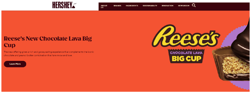
Industry: Chocolate and Confectionery
Use of Brown: As a brand synonymous with chocolate, Hershey’s uses various shades of brown throughout its website to create a direct association with its iconic product. The website incorporates deep chocolate browns in its backgrounds, product showcases, and logo, balanced with lighter colors for text and highlights. This use of brown helps reinforce the sensory experience of chocolate, making the design feel rich and indulgent. The brown tones are not overwhelming but strategically placed to evoke both the product and the feeling of indulgence and tradition.
Key Takeaway: Hershey’s demonstrates how brown can be used to evoke the sensory qualities of the product, creating an immersive brand experience.
Jack Daniel’s

Industry: Alcoholic Beverages (Whiskey)
Use of Brown: Jack Daniel’s utilizes dark brown tones across its website to convey the richness and aged quality of its whiskey. The deep browns, paired with black and white elements, give the site a vintage, sophisticated feel, mirroring the craftsmanship of their products. This color palette is used consistently in the brand’s imagery, packaging, and digital design, reinforcing the brand’s storied history and premium product positioning.
Key Takeaway: Jack Daniel’s uses brown to evoke sophistication and heritage, creating a premium brand experience aligned with its aged whiskey products.
Schemes of Colors That Go with Brown: 4 Tips
Lastly, let’s dive into some practical tips on what colors go well with brown and how you can use them to make your website more visually appealing. Brown can be a surprisingly versatile color, but to really make it work for your design, you need to pair it with the right shades and apply it strategically.
1. Monochromatic Brown Color Palettes
If you’re aiming for a clean, sophisticated look, a monochromatic brown color palette is a great choice. By using different shades of brown—from light to dark—you can create depth and visual interest while keeping the design cohesive.
- Base Color: Pick a medium brown as your primary tone (like #8B4513 – Saddle Brown).
- Add Contrast: Use lighter shades for backgrounds and darker ones for text or accents to keep everything readable.
Example:
- Background: Light tan (#F4E1D2)
- Content Area: Medium brown (#C4A484)
- Headers and buttons: Dark brown (#5C4033)
- Text: Very dark brown or off-white for contrast.

2. Pair Brown with Complementary Colors
One of the best ways to make brown pop is by pairing it with its complementary color—blue! This combo can create a striking, balanced look that’s visually interesting yet grounded.
- Primary Brown: Go with a warm brown (e.g., #A0522D – Sienna).
- Complementary Blue: Add a cool blue (like #4682B4 – Steel Blue) for contrast.
Tip: Use the 60-30-10 rule to balance the colors—60% brown, 30% blue, and 10% accent color like cream or gold for that final touch.
Example:
- Background: Light brown (#E6D1B8)
- Navigation and footer: Dark brown (#5C4033)
- Accents and call-to-action buttons: Steel blue (#4682B4)
- Highlights: Cream (#FFFDD0)

3. Go Natural with Earth Tone Palettes
If you want a more organic, calming vibe, an earth-tone palette with brown at its base is perfect. Pair brown with muted greens, beiges, and rust tones for a natural, grounded feel.
- Base Brown: Start with a medium or dark brown (like #8B4513 – Saddle Brown).
- Add Earth Tones: Greens, beiges, and terracotta shades work wonders in creating a cohesive, earthy look.
Example:
- Background: Beige (#F5DEB3)
- Main Content: Light brown (#D2B48C)
- Accents: Muted green (#556B2F) and terracotta (#E2725B)

4. Brown in Neutral Color Schemes
If you want to keep things sleek and modern, brown can be a great addition to a neutral color scheme. Pair it with shades of gray and cream to add warmth to a cool palette.
- Primary Brown: Use a medium brown (like #A0522D – Sienna) as an accent.
- Neutral Base: Combine with light and dark grays, whites, and creams to keep things minimal yet warm.
Example:
- Background: Light gray (#F5F5F5) or cream (#FFFAF0)
- Headers and accents: Medium brown (#A0522D)
- Text: Dark gray (#333333)

Using these four practical approaches, you can effortlessly incorporate brown into your web design to create warm, visually appealing, and user-friendly sites. So, don’t hesitate to experiment with brown and see how it can elevate your design.
Conclusion
Brown may not always be the first color that comes to mind in web design, but it plays an invaluable role in creating warmth, reliability, and groundedness. From understanding what colors make brown to mastering its use in color schemes, this blog has explored how brown can add depth and sophistication to your website design. Whether you’re using brown in monochromatic palettes, pairing it with complementary hues like blue, or integrating it into neutral and earth-tone schemes, its versatility makes it a powerful tool for creating engaging, user-friendly digital experiences.
Designers need to be mindful of cultural perceptions, readability and contrast when incorporating brown, but with the right approach, it can elevate your brand and enhance your site’s usability. From the ruggedness of Timberland to the indulgence of Hershey’s, real-world examples show just how effective brown can be when used strategically.
Ready to Elevate Your Web Design?
At White Label Agency, we specialize in WordPress development and design for agencies. If you’re ready to take your web projects to the next level with custom-coded websites that reflect your brand’s vision, our team of 100+ expert developers is here to help. From integrating unique color schemes to full-scale custom builds, we’ve got you covered.
Contact us today to learn more about how we can be your invisible WordPress partner and deliver high-quality, on-time results tailored to your specs. Let’s bring your website vision to life
FAQs
Which two colors make brown?
Brown is typically made by mixing complementary colors—colors that are opposite each other on the color wheel. The two primary ways to create brown are:
Mixing a primary color with its complementary color:
Red + Green
Blue + Orange
Yellow + Purple
Mixing all three primary colors together:
Red + Blue + Yellow (in varying ratios)
The exact shade of brown depends on the proportions used. Adding more red results in a warmer brown, while adding more blue or black can darken the shade.
Do red and green make brown?
Yes, red and green make brown when mixed together.
Red and green are complementary colors on the color wheel, meaning they neutralize each other when combined. The result is typically a shade of brown or grayish-brown, depending on the exact tones and proportions used.
If you mix more red, the brown will have a warmer, reddish tint.
If you mix more green, the brown will have an earthy, muted tone.
This color mixing principle applies to both paint mixing and light mixing (although in light, colors mix differently due to additive color theory).
What number colors make brown?
The number of colors that make brown depends on the mixing method:
1. Mixing Two Colors (Complementary Colors)
You can make brown by mixing any two complementary colors from the color wheel:
Red + Green
Blue + Orange
Yellow + Purple
These combinations neutralize each other, resulting in brown.
2. Mixing Three Primary Colors
You can also make brown by mixing all three primary colors:
Red + Blue + Yellow
Adjusting the ratios changes the shade:
More red creates a warm brown.
More blue makes a cooler, deeper brown.
More yellow lightens the brown.
3. Adding Black or White
Adding black to brown darkens it.
Adding white creates a tan or beige color.
So, depending on the method, brown can be made using 2 or 3 colors.
how to make brown from primary colors
To make brown from primary colors (red, blue, and yellow), follow these steps:
Method 1: Mixing All Three Primary Colors
Start with equal parts of red, blue, and yellow.
Mix thoroughly until you get a basic brown.
Adjust the shade:Add more red for a warm, reddish brown.
Add more blue for a deeper, cooler brown.
Add more yellow for a lighter, golden brown.
Method 2: Mixing Complementary Colors (Derived from Primary Colors)
You can also mix two complementary colors (each made from primaries):
Red + Green (Green = Yellow + Blue)
Blue + Orange (Orange = Red + Yellow)
Yellow + Purple (Purple = Red + Blue)
Since green, orange, and purple are made from primary colors, this method still uses primary colors indirectly.
💡 Pro Tip: If your brown looks too dark or dull, add a touch of white to lighten it or a little black to deepen it.
What does brown represent in color theory?
In color theory, brown represents stability, warmth, reliability, and earthiness. It is often associated with nature, comfort, and resilience due to its connection to soil, wood, and natural elements.
Symbolism of Brown in Color Psychology
Stability & Reliability – Brown conveys a sense of security, dependability, and trust.
Warmth & Comfort – It evokes feelings of home, warmth, and coziness, similar to coffee, chocolate, or autumn leaves.
Earthiness & Simplicity – Brown is tied to nature, grounding, and a connection to the earth.
Seriousness & Maturity – It is a no-nonsense, practical color often associated with wisdom and resilience.
Luxury & Elegance – When paired with gold or deep neutrals, brown can represent sophistication and richness.
Brown in Branding & Design
Often used in eco-friendly brands to signal sustainability.
Associated with organic, natural, and handmade products.
Found in luxury packaging (like leather goods and chocolates).
While brown can be warm and inviting, too much brown can feel dull or heavy, so it is often balanced with other colors like white, gold, or green.
What color is complementary to brown?
In color theory, the complementary color to brown depends on the shade of brown and its underlying tones.
1. Classic Complementary Color: Blue
Brown is essentially a dark, desaturated orange, so its complementary color is blue (which is opposite orange on the color wheel).
Shades of blue like teal, turquoise, navy, or cobalt blue create strong contrast and balance when paired with brown.
2. Alternative Complements Based on Brown’s Undertones
Warm browns (reddish-brown, chocolate) → Complemented by cool blues (teal, navy, cerulean).
Cool browns (taupe, grayish-brown) → Complemented by warmer blues (turquoise, sky blue).
3. Split-Complementary Colors
For a softer, more harmonious contrast, use blue-green and blue-violet, which sit near blue on the color wheel.
4. Neutral Pairings
Brown + White/Beige → A clean, classic look.
Brown + Green → Earthy and natural.
Brown + Gold/Copper → Elegant and rich.
💡 Tip: If you want brown to stand out, pairing it with blue (its complementary color) will create strong visual contrast.