

- The Psychological Impact of Black in Web Design
- 5 Advantages of Using a Black Website Background
- Black and Orange Website: A Bold Color Combination
- Best Practices for Designing a Black Website
- The Difference Between Black Websites and Dark Mode
- 7 Inspirational Examples of Black Websites
- 3 Common Mistakes to Avoid in Black Website Design
- Conclusion
- FAQs
Over the last ten years, black websites have become very popular in web design. Once thought unusual, using a black website background is now common for brands wanting a cool, modern, and simple look. As companies and designers try new bold styles, black website design has become a flexible choice that works for many different types of businesses.
The growing popularity of a dark theme, led by tech companies and mobile devices, has helped this trend grow. A significant portion of users, approximately 82.7%, prefer dark mode when using their devices, indicating a strong inclination towards black backgrounds in web design. Black offers a clean, stylish base that makes important things like pictures, text, and buttons stand out. People like them because they look fancy, classy, and professional, while also making it easier to focus on the content.
This guide will look at why black websites are becoming more common, why they work well, and how to use them effectively. We’ll talk about the website color psychology of black, the good things about using a black background, and how color combinations like black and orange website and black and white website design can work. We’ll also cover tips for designing a good black website, how it’s different from dark theme UI, and mistakes to avoid.
Hire a WordPress Designer
Discover the benefits of choosing to hire a WordPress designer. Enjoy focused attention, quick turnaround, cost-effectiveness, and expert design for the projects.
The Psychological Impact of Black in Web Design
Black is a strong color that can change how we feel and think about a website. Using a black background can make things look elegant, expensive, and professional. Many brands choose black when they want to look important or high-quality.
When we think about color psychology, black often makes us think of mystery, power, and things that last a long time. If used well in black website design, it can help us focus on important things like words, pictures, and buttons. This works really well in black and white website design, where the difference between black and white makes things easy to read and understand.
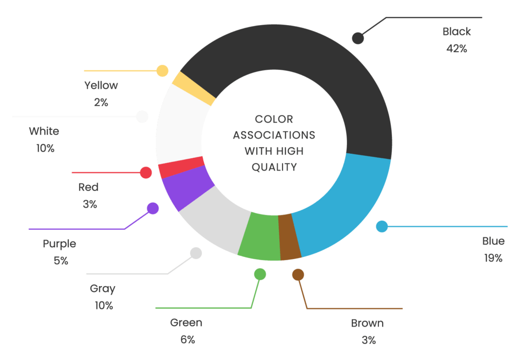
Black is often associated with sophistication and high quality, with 42% of surveyed individuals linking black to high-quality perceptions.
When black is mixed with bright colors, it can create different feelings. For example, a black and orange website looks bold and energetic. This mix can make important things like buttons or special deals stand out. The orange, a tertiary color, looks lively next to the sleek black background.
As part of a dark theme, black can be easier on our eyes, especially when we’re in dark rooms. The convenience color black offers in terms of battery life on devices with OLED screens is also important.
5 Advantages of Using a Black Website Background
A black background offers several benefits that make it a compelling choice for modern web design. Here are some key advantages:
- Improved Visual Focus: A black background naturally draws the viewer’s attention to key elements like text, images, and call-to-action buttons.
- Examples: Apple’s product pages often use a black background to showcase devices like iPhones and MacBooks. This approach makes product images pop and emphasizes key features.

- Luxurious and Professional Aesthetic: A black design can convey sophistication, luxury, and modernity. It’s particularly effective for brands in technology, fashion, or high-end products.
- Examples: The Porsche website uses a predominantly black and white website design, creating a sleek, premium feel that aligns with its brand identity.

- Versatility in Design: Black websites provide a neutral base for various color schemes.
- Black and orange website designs create an energetic and vibrant feel. (e.g., Harley-Davidson’s website)
- Black and white website design exudes classic elegance. (e.g., Chanel’s online store)
- Enhanced User Experience with Dark Theme: Implementing a dark theme offers several benefits:
- Reduced eye strain in low-light environments
- Potential energy savings on OLED displays
- Modern, tech-savvy appearance
- Example: Spotify’s desktop and mobile apps use a dark theme, enhancing the visual appeal of album artwork and improving usability in various lighting conditions.

- SEO and Performance Considerations: While black backgrounds don’t directly impact SEO, they can indirectly influence performance metrics:
- Perceived faster loading times
- Potential improvements in Core Web Vitals
- Increased time on site due to reduced eye strain
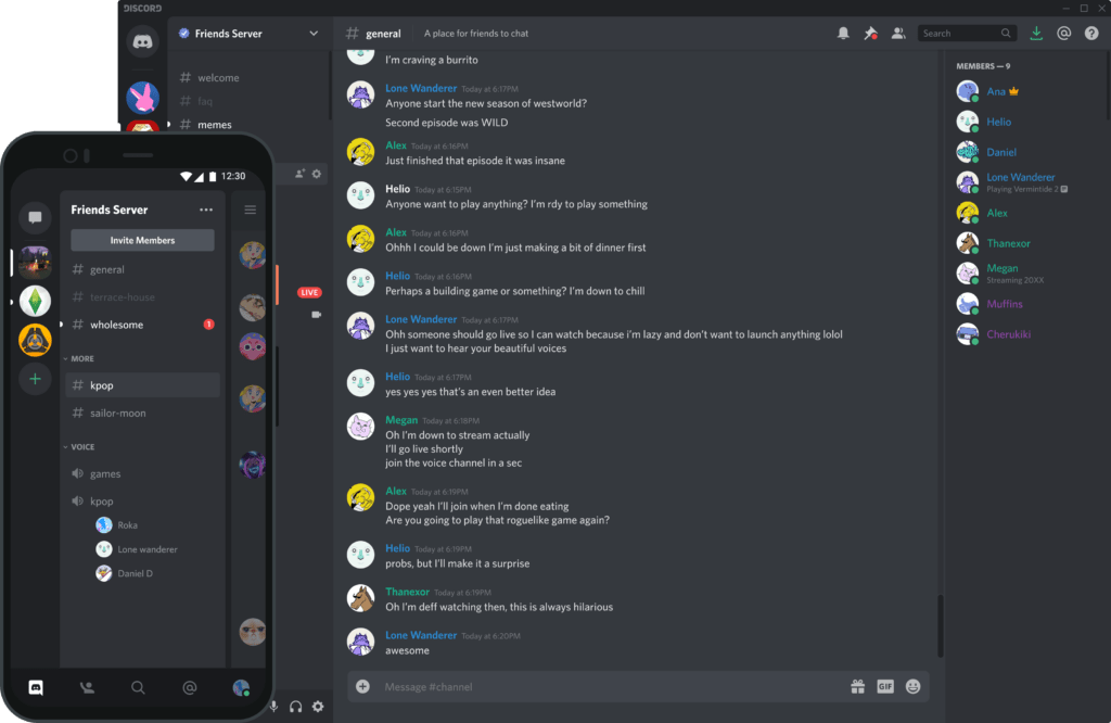
- Example: Discord, a popular communication platform, uses a dark theme by default. This choice contributes to its reputation for a clean, user-friendly interface, potentially boosting user engagement and retention.
Black and Orange Website: A Bold Color Combination
Black and orange create a powerful contrast in web design. This striking combination catches the eye while maintaining a professional appearance. Many black websites use this color scheme to highlight key elements and guide user interactions effectively.
The Significance of Black and Orange in Design
In website color psychology:
- Black represents sophistication, power, and elegance
- Orange signifies energy, enthusiasm, and action
Together, they produce a dynamic visual experience. A black and orange website works well for brands aiming to balance professionalism with urgency or excitement. Harley-Davidson, for instance, leverages this color duo to reinforce its rugged, adventurous image.
Using Orange for Contrast and Calls to Action
On a black website background, orange serves as an excellent accent color, establishing a clear visual hierarchy. Designers often apply it to:
- Call-to-action buttons
- Banners
- Navigation links
This approach ensures these elements stand out and encourage user interaction. Many e-commerce platforms employ this combination to highlight “Buy Now” or “Sign Up” buttons, boosting their visibility and driving conversions.
Example Layouts
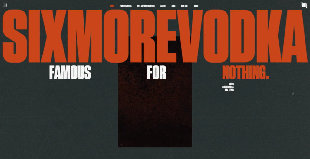
- Sixmorevodka’s website:
- Utilizes orange to emphasize navigation and key sections.
- Creates a bold visual contrast with its black website background.
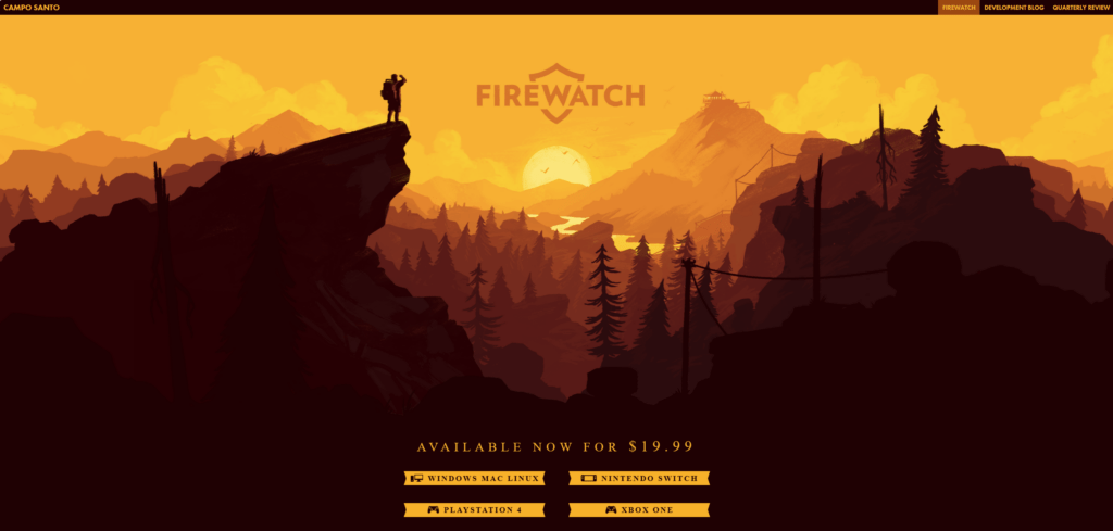
- Firewatch’s website:
- Uses orange to highlight important elements such as navigation links and calls to action.
- Leverages a black background to create a visually striking contrast that enhances the immersive experience.
Best Practices for Designing a Black Website
Designing effective black websites requires careful consideration of readability, contrast, and user experience. Here are some key best practices to ensure your black website design is both visually appealing and functional.
Ensuring Readability and Accessibility
One of the most important aspects of designing a black website is maintaining good contrast between the text and the background. Light-colored text, such as white or light gray, works best to ensure readability.
- Example: Netflix uses a dark interface with white text, ensuring the content is easily legible against the black background
Additionally, designers must consider color psychology to make sure users don’t feel overwhelmed by too much black, especially when combined with bright colors.
- To ensure accessibility:
- Pay attention to text size and font weight, especially for visually impaired users.
- Use tools like WebAIM’s contrast checker to maintain proper contrast ratios and ensure the site meets WCAG accessibility standards.
Choosing Fonts, Icons, and Images
Fonts, icons, and images must stand out against the black website background. Clear, sans-serif fonts like Helvetica or Arial are often used in black design for readability.
- Example: Tech companies like Tesla use sleek, modern fonts that complement their black-themed websites, creating a futuristic feel.
Icons should be in lighter colors or outlined in white to ensure they’re easy to see.
Images used on black websites should either have bright, bold colors or be properly edited with enough contrast to stand out.
- Example: A black and orange website might use product images with orange highlights or vibrant elements that pop against the black website background.
Responsive Design Considerations
Responsive design is critical for all websites, including black websites. The dark tones should adjust well across different devices and screen sizes.
- Example: Apple’s website design seamlessly scales from desktop to mobile, with minimal loss of visual impact or functionality.
Pay attention to:
- Spacing, touch targets, and font size to maintain usability on smaller screens.
- When designing for a dark theme, ensure that the site’s elements, including images and text, maintain clarity and functionality without compromising user experience.
The Difference Between Black Websites and Dark Mode
Black websites:
- Designed with a permanent black website background
- Used for sleek, professional, or minimalist looks
Dark theme UI:
- User preference setting
- Changes website appearance from light to dark
- Not necessarily a permanent design choice
Examples:
- Twitter: Toggles between light and dark modes
- Netflix: Fixed dark interface across all devices
Key distinction: Black websites intentionally feature black as a core design element, while dark mode UI is optional for user comfort.
Why Dark Mode is Trending
Reasons for popularity:
- Reduced eye strain in low-light settings
- Battery conservation on OLED screens
- User preference for flexible designs
Platforms offering dark mode:
- iOS
- Android
- Google Chrome
Popular apps with dark mode:
- YouTube
- Slack
Optimizing for Both Dark Mode and Black Website Design
Considerations:
- User experience across all devices
- Consistent branding and imagery
Black website design example:
- Apple’s homepage: Black background complements branding and product imagery
Dark theme UI optimization:
- Offer seamless switching between light and dark modes
- Ensure all design elements remain functional and visually pleasing
- Adapt icons, text, and images for clarity in both settings
Example:
- Slack’s dark mode adjusts the interface without compromising visibility
Both approaches cater to different user preferences, enhancing overall user experience while leveraging the strengths of black website backgrounds and dark themes.
7 Inspirational Examples of Black Websites
Here are some exceptional black websites that use black backgrounds and black-themed designs to create unique and engaging user experiences.

The Tbilisi Photography & Multimedia Museum’s website design creates an immersive, minimalist experience that lets the artwork take center stage. The black background contrasts beautifully with the vivid photography, highlighting both the visual storytelling and the museum’s focus on creativity and expression.
Black Dog Story uses a black background to emphasize its mysterious and artistic brand identity. With bold white text and minimalist design elements, this website conveys elegance while ensuring readability and visual appeal. The layout allows users to focus on the storytelling and visual content without distractions.

The black and white website design for The Ordinary restaurant creates a sophisticated, sleek aesthetic that aligns with its gourmet offerings. The use of a black background with simple, modern typography provides a luxurious feel, while the striking food photography pops against the dark canvas, enhancing the visual experience.
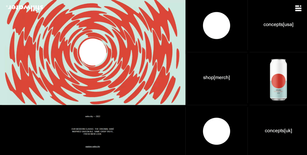
Stillwater’s website embraces a black website design with subtle animated elements that evoke a modern, artisanal feel. The black background serves as a blank canvas for the colorful, quirky product imagery, creating a bold contrast that highlights their unique craft beer offerings.

Ad Milk’s black background serves as a clean, minimalistic foundation for their creative portfolio. The site uses a balance of bright colors and black elements to make their visual content pop, while maintaining a professional, sleek appearance. The layout is simple but highly effective, making it easy for users to navigate through their work.

Stage Eleven Seven uses a black background with vibrant neon colors and dynamic animations to create an engaging, futuristic design. The website acts as a striking backdrop, enhancing the boldness of the brand’s creative offerings, while the interactive elements stand out and keep users engaged.

The Mont-Blanc Climate Change website offers a visually compelling website design that focuses on the urgency of environmental issues. With a minimalist black background paired with white text and stunning imagery, the site communicates a sense of seriousness and sophistication, while effectively raising awareness about climate change.
3 Common Mistakes to Avoid in Black Website Design
When designing black websites, it’s important to avoid certain pitfalls that can affect usability and aesthetics. Here are some common mistakes to be aware of:
- Over-reliance on Black
- Using too much black without enough contrast can lead to poor readability and eye strain.
- On a black background, light-colored text (such as white or light gray) is essential to ensure content is legible.
- Example: Dark gray text on a black background can be difficult to read, especially on mobile devices.
- Balance the dark background with lighter elements to improve readability.
- Ignoring Accessibility
- Accessibility is critical in black website design, especially for users with color blindness or low vision.
- Relying solely on color (especially in black and orange websites) to convey information can confuse users who can’t distinguish between hues.
- Ensure enough contrast and use alternative cues like labels and icons for accessibility.
- Misusing Color Combinations
- While black pairs well with many colors, some combinations can clash or overwhelm the design.
- Avoid overly bright or neon colors on a black background, as they can be distracting.
- Example: A black and orange website looks bold and professional, but too much bright orange can become overwhelming.
- In black and white website design, focus on maintaining clean contrast without overloading the viewer with extreme brightness.
WordPress Web Design Agency
Partner with our white label WordPress web design agency for custom, scalable solutions. We design, develop, and maintain websites tailored to your clients.
Conclusion
Incorporating black into web design offers numerous advantages, from creating a sleek and modern aesthetic to enhancing the visibility of key elements. Black websites provide a sophisticated look that works well across industries, whether through the clean contrast of black and white website designs or the bold, energetic appeal of a black and orange website. Using a black background also aligns with current trends, such as a dark theme, which enhances user comfort and engagement.
By leveraging color psychology, black can evoke feelings of luxury, power, and professionalism. Designers should experiment with black and explore dynamic color combinations to make their sites stand out while ensuring accessibility and readability.
Ready to elevate your brand with bold, impactful black website design? Partner with The White Label Agency to explore innovative web design services. Contact us for further information.
FAQs
What Are Dark Theme Sites?
Dark theme sites are websites designed with a predominantly dark color scheme, typically featuring dark backgrounds with light-colored text, icons, and other elements. This design choice has gained popularity due to its aesthetic appeal and functional benefits.
Key Features of Dark Theme Sites:
Color Palette: Uses shades of black, gray, or other dark colors for the background, with contrasting light text or highlights.
Focus on Readability: Ensures sufficient contrast to make text and visuals easy to read.
Modern Aesthetic: Often associated with sleek, contemporary design trends.
Benefits of Dark Theme Sites:
Benefits of Dark Theme Sites:
Reduced Eye Strain: The darker design can be easier on the eyes, especially in low-light environments.
Improved Battery Life: On OLED and AMOLED screens, dark themes use less power, as black pixels consume no energy.
Enhanced Focus: The minimal, subdued appearance helps draw attention to key content, reducing distractions.
Accessibility Preference: Some users find dark themes more comfortable due to light sensitivity or visual impairments.
Where Are Dark Themes Used?
Websites and Apps: Popular on platforms like YouTube, Reddit, and Twitter.
Development Tools: IDEs like VS Code and PyCharm often feature dark mode as a default or optional theme.
User Settings: Many websites offer both light and dark themes, allowing users to switch based on their preference.
Why Choose a Dark Theme for Your Site?
Dark themes can set your website apart, create a modern vibe, and improve the user experience for visitors who prefer it. It’s a good practice to offer a toggle option for both light and dark modes to cater to a broader audience.
What websites are orange and black?
Websites that use orange and black as their primary color scheme often aim for a bold, dynamic, and high-contrast look. This combination is versatile and can evoke feelings of energy, warmth, sophistication, and even edginess, depending on the design.
Examples of Websites Using Orange and Black:
Harley-Davidson
Harley-Davidson’s website prominently features orange and black to reflect its rugged and adventurous brand identity. The colors align with its powerful and bold image.
SoundCloud
SoundCloud uses orange as its primary brand color with black elements, creating a vibrant, energetic feel while maintaining clarity for audio-focused users.
Halloween Websites
Many Halloween-themed websites and e-commerce stores (e.g., Spirit Halloween) adopt orange and black to resonate with the holiday’s spooky and festive spirit.
Construction and Industrial Brands
Websites for construction companies or heavy machinery brands, such as Caterpillar (CAT), often incorporate orange and black to represent safety and reliability.
Gaming Websites
Some gaming-related websites and platforms use orange and black to create a high-energy and immersive aesthetic.
Sports Teams and Merchandise
Websites for sports teams with orange and black as their team colors (e.g., the Baltimore Orioles or the San Francisco Giants) use this scheme to reinforce their branding.
Why Orange and Black Work Together:
High Contrast: The combination creates a strong visual impact, making elements stand out.
Versatility: Can convey warmth and approachability (orange) while maintaining elegance and boldness (black).
Thematic Resonance: Often used for themes related to energy, creativity, power, or mystery.
If you’re considering using orange and black for a website, ensure the design balances these colors effectively, using white or gray accents for readability and subtlety.
What Is a Monochromatic Website?
A monochromatic website is a website that uses a single base color and its various shades, tints, and tones to create a cohesive and visually appealing design. This approach focuses on simplicity and uniformity while still allowing for creative and dynamic design elements.
Is black a good color for a website?
Yes, black can be an excellent color for a website, depending on the brand, audience, and purpose of the site. Black is a versatile color that conveys sophistication, elegance, and modernity. However, like any design element, it must be used thoughtfully to ensure it enhances the user experience and aligns with the website’s goals.
Benefits of Using Black on a Website:
Sophistication and Elegance:
Black is often associated with luxury, professionalism, and exclusivity, making it ideal for high-end brands.
Modern and Minimalist Aesthetic:
A black background can give a sleek and contemporary look, especially when paired with clean fonts and vibrant accents.
Focus on Visuals:
Images, videos, and bright elements stand out against a black background, making it popular for photography, art, and design portfolios.
Timeless Appeal:
Black never goes out of style and works well across industries, from tech to fashion.
Contrast and Readability (when done right):
With the proper contrast (e.g., white or light-colored text), black can enhance readability and reduce glare in low-light settings.
Challenges of Using Black:
Readability Issues:
If text or other elements lack sufficient contrast, they can be hard to read, causing eye strain.
Perception of Darkness:
Overuse of black can make a website feel heavy, gloomy, or uninviting if not balanced with lighter or colorful elements.
Limited Application for Certain Brands:
Bright and playful brands (e.g., children’s products) might find black unsuitable as it doesn’t align with their image.
Device-Specific Display Challenges:
On older monitors, black backgrounds may not render consistently.


