- The Power of Complementary Colors
- Examples of Complementary Colors
- The Science Behind Complementary Colors
- WordPress Webdesign
- Practical Applications of Complementary Color Schemes
- Choosing the Right Complementary Color Scheme for Your Project
- Tools to Help You Find Complementary Colors
- Complementary Colors in Branding and Marketing
- Why Brands Use Complementary Colors
- Complementary Colors in WordPress Web Design
- WordPress Webdesign
- Transform Your Designs with Complementary Colors
Complementary colors are color pairs that sit opposite each other on the color wheel. This harmonious pairing creates a striking contrast that can enhance visual interest, balance compositions, and evoke specific emotions in design.
The complementary color scheme is a popular choice in various design fields, including art, fashion, interior design, and graphic design. By understanding the relationships between complementary colors, designers can create dynamic and visually appealing works.
The concept of complementary colors is closely tied to the color wheel, a tool created to help designers and artists understand the relationships between colors. By identifying complementary color pairs, such as red and green or blue and orange, designers can make informed decisions to produce dynamic and visually appealing compositions.
Understanding how to use the complementary color scheme is key to mastering color theory in design.

The Power of Complementary Colors
Complementary colors are pairs of colors that are positioned directly opposite each other on the color wheel. This means that when placed together, these colors create a striking contrast that enhances their intensity and makes each color appear more vibrant.
For example, red and green, blue and orange, or yellow and purple are complementary colors. These pairs naturally complement each other because they balance warm and cool tones, resulting in visually appealing designs. When used in a color scheme, these colors can make a design more dynamic and attention-grabbing.
The complementary color of each primary hue – red, yellow, and blue – is created by mixing the other two. For instance, the complementary color to red is green, which is blue mixed with yellow.
When complementary colors are placed side by side, they make each other appear more vivid and intense. For example, red looks brighter next to green than it would alongside more similar colors. This effect is known as the “law of simultaneous contrast,” a concept introduced by 19th-century physicist Michel-Eugène Chevreul. It highlights how opposites on the color wheel can enhance one another, creating eye-catching visual contrasts.
To use the complementary color wheel for quick color matching and design inspiration, simply select a color on the wheel and find its opposite. This method is especially helpful when you want to create a high-contrast design or make certain elements stand out. Designers often rely on color schemes to guide them in choosing vibrant and eye-catching color combinations for websites, logos, interiors, and other creative works.

Examples of Complementary Colors
Complementary colors are widely used across different fields, from art and design to branding and fashion, due to their ability to create vibrant and contrasting visuals. Below are some common complementary colors examples and how they are applied in real-world designs:
- Red & Green: This classic pairing is often seen during the holiday season in decorations and branding. It also works well in interior design, where green walls with red accents can create a bold and dynamic look.
A notable example of this complementary color scheme is Lacoste, which uses a secondary color – green, and a primary color – red in its iconic crocodile logo. The green crocodile paired with the red accents on the clothing tags creates a visually striking and recognizable brand identity, blending sophistication with a playful touch.
- Blue & Orange: In branding, this color scheme is used by companies like Mozilla Firefox, Visa, and Fanta to create strong, eye-catching logos. The vibrant contrast between the cool blue and the warm orange in Fanta’s packaging reflects the fun, refreshing nature of the brand, appealing to younger audiences.
- Yellow & Purple: This combination is frequently used in fashion and sports branding. For example, the Los Angeles Lakers incorporate yellow and purple in their team colors to create a visually striking look that stands out in their uniforms and branding materials.
The Science Behind Complementary Colors
Complementary colors have a psychological and emotional impact on viewers. When two complementary colors are placed next to each other, their contrasting hues stimulate our visual senses, making both colors appear more vibrant and intense. This heightened contrast evokes strong emotional responses, often creating feelings of excitement, energy, or even calmness, depending on the color pair.
In a complementary color scheme, the balance between warm and cool tones naturally creates a sense of harmony. This balance is visually pleasing because our eyes are instinctively drawn to the equilibrium between opposing colors. For example, pairing red and green or blue and orange can create a dynamic look while still maintaining a sense of stability.
Using complementary colors in design, whether in branding, websites, or fashion, ensures that the design is both eye-catching and cohesive. The balance of opposites draws attention without overwhelming the viewer, providing a perfect blend of contrast and harmony.
WordPress Webdesign
Enhance your agency’s offerings with our WordPress website design services. Get custom, high-quality designs that fit your client’s needs.
Practical Applications of Complementary Color Schemes
Complementary color schemes are widely used across multiple design fields due to their ability to create a strong visual impact. Below are some practical ways to incorporate complementary colors into graphic design, web design, and interior design, along with actionable tips to ensure the balance between vibrancy and subtlety.
Graphic Design
In graphic design, complementary color schemes are often used in logo creation and branding to create memorable, eye-catching visuals. For instance, using colors like blue and orange or red and green in logos helps establish contrast, making the design stand out.
- Tip: Use one color as the primary shade (around 70-80%) and the complementary color as an accent (20-30%) to avoid overwhelming the design. For example, a predominantly blue logo with orange highlights can create the perfect balance between boldness and subtlety.
Web Design
Web design heavily relies on complementary colors to enhance user experience by drawing attention to important elements. Complementary pairs like purple and yellow or teal and red can be used to highlight call-to-action buttons or sections that need emphasis.
- Tip: Use complementary colors sparingly – about 10-20% of the design should feature contrasting colors to ensure readability and avoid visual strain. For example, a mostly neutral webpage with vibrant complementary elements in buttons or headings can create a clean yet engaging look.
Interior Design
In interior design, complementary color schemes are used to bring balance and energy to spaces. Combining colors like blue and orange or yellow and purple on walls, furniture, and decor can create a dynamic, yet harmonious environment.
Tip: For a balanced look, use one color for larger areas (e.g., walls) and the complementary color for smaller accents (e.g., cushions or artwork). A 70-30% distribution often works best, ensuring the room feels lively without becoming overwhelming.

Choosing the Right Complementary Color Scheme for Your Project
Selecting the perfect complementary color scheme for your project requires careful consideration of the mood you want to convey, your target audience, and the project’s goals. Follow this step-by-step guide to choose the right complementary colors for any design:
1. Define the Mood and Message
Different color pairs evoke different emotions. For example, red and green create energy and excitement, while blue and orange offer a more balanced, calm look. Think about the mood you want your project to convey.
- Tip: For a playful and vibrant mood, opt for bold color pairings like yellow and purple. For a more professional tone, use more subdued pairs like blue and orange.
2. Understand Your Audience
Your audience plays a crucial role in choosing complementary colors. For example, younger audiences may appreciate brighter, more vibrant pairings, while a more mature audience may prefer subtle contrasts.
- Tip: Research your audience’s preferences and cultural associations with colors to ensure your complementary color scheme resonates with them.
3. Consider Color Contrast Ratios
In web and graphic design, contrast ratios are essential for readability and accessibility. High contrast between text and background is necessary to ensure that the content is easy to read, especially for users with visual impairments.
- Tip: Use tools like a contrast checker to make sure your complementary colors meet accessibility standards. Aim for a contrast ratio of at least 4.5:1 for body text and 3:1 for larger headings.
4. Avoid Clashing Colors
While complementary colors naturally create contrast, using them in equal amounts can sometimes lead to clashing or overwhelming designs. To avoid this, make one color dominant and use the other as an accent.
- Tip: Use about 70-80% of one color and 20-30% of its complementary counterpart to strike the right balance. For example, a predominantly blue website with orange accents can create a striking, yet harmonious design.
5. Test the Color Scheme in Context
Before finalizing your complementary color scheme, test it in the context of your design. Whether it’s a website, a logo, or an interior design project, viewing the colors together in a real-world setting will help you see if they work harmoniously.
- Tip: Use mockups or previews to test how the colors interact in your design and make adjustments if necessary.
By following these steps, you can confidently choose complementary colors that enhance the mood, improve readability, and create visually stunning designs across all types of projects.
Tools to Help You Find Complementary Colors
Finding the right complementary colors for your project can be made easier with the help of various online tools and apps. These resources are designed to assist designers, artists, and creators in building harmonious color palettes quickly and efficiently. Here are some popular tools that can help you discover and apply complementary colors:

1. Adobe Color Wheel
Adobe Color Wheel is one of the most popular and versatile tools for color exploration. This tool allows you to generate complementary color schemes easily by selecting a base color and automatically finding its opposite on the color wheel. Adobe Color Wheel also lets you experiment with different color harmony rules, such as analogous or triadic schemes, to fine-tune your palette.
- How it helps: Adobe Color Wheel offers an intuitive interface for quickly building balanced and harmonious color palettes, perfect for any design project.

2. Coolors
Coolors is a popular color palette generator that provides both beginners and professionals with a fast and easy way to create stunning color combinations. With a simple interface, you can lock in one color and let the tool automatically find its complementary color or explore other combinations. Coolors also offers pre-built color schemes, making it easy to find inspiration.
- How it helps: Coolors is perfect for experimenting with complementary colors and provides a seamless way to export color codes for use in web or graphic design projects.
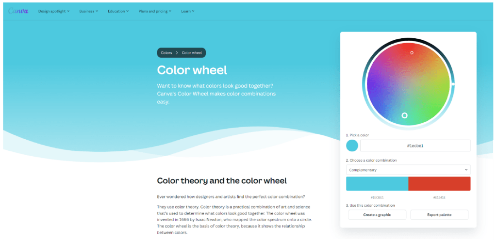
3. Canva Color Wheel
Canva’s Color Wheel is a free, easy-to-use tool for generating complementary color schemes. By selecting a primary color, Canva instantly finds the complementary hue, helping you create balanced designs in seconds. This tool also provides tips on how to use your chosen colors effectively within the Canva design platform.
- How it helps: Canva’s Color Wheel is excellent for quick color matching and building complementary color schemes within its design suite, making it ideal for users looking to create on-brand content.

4. Paletton
Paletton is another great tool for exploring complementary colors and creating professional-looking color schemes. It allows you to adjust brightness, saturation, and hues to find the perfect balance between your complementary colors. The tool also provides a preview of how the colors will look in real-world contexts, such as websites or presentations.
- How it helps: Paletton is a comprehensive tool for designers who want more control over their color palettes, allowing for detailed adjustments to create the perfect harmony.
These tools help you find complementary colors and ensure that your color palette is visually appealing and suited to your project. Whether you’re working on a graphic design, web project, or branding, these apps can simplify the process of building cohesive and harmonious color schemes.
Complementary Colors in Branding and Marketing
As mentioned earlier, complementary colors play a crucial role in branding and marketing, helping brands create memorable identities and evoke specific emotions in their audience. By using contrasting color pairs, companies can draw attention to their logos, products, and marketing materials, making their brand stand out in a competitive marketplace. The strategic use of complementary colors captures attention and helps you communicate a brand’s message more effectively.

For example, FedEx’s bold use of complementary colors – purple and orange – makes its logo instantly recognizable. The high contrast between these colors creates a sense of energy, reliability, and movement, aligning perfectly with the company’s mission as a global shipping leader. The bright orange also adds a sense of urgency, while the calming purple balances it out, reflecting professionalism and trustworthiness. This combination helps create a vibrant, memorable visual identity that communicates energy and reliability, making it stand out in a competitive market.
Why Brands Use Complementary Colors
Brands use complementary colors because these color schemes naturally create visual harmony and contrast, which is essential in grabbing attention and making a lasting impression. When executed well, complementary color schemes evoke specific emotions – such as excitement, trust, or reliability – that align with a brand’s message and goals. Additionally, these colors help ensure brand recognition by creating strong, distinctive visuals that are easy for consumers to remember.
By carefully choosing complementary colors, brands can craft identities that resonate emotionally with their audience, enhancing both their marketing campaigns and overall brand recognition.

Complementary Colors in WordPress Web Design
In web design, color choice plays a critical role in shaping the user experience and conveying the brand’s identity. One of the most effective approaches to creating visually striking websites is the use of complementary colors. These color pairings, located opposite each other on the color wheel, offer a powerful way to introduce contrast, highlight important elements, and guide visitors’ attention.
Why Use Complementary Colors?
- Bold and Dynamic Visual Appeal
Complementary colors create high contrast, making them ideal for grabbing users’ attention. In WordPress design, this contrast can be used to create visually dynamic pages that keep visitors engaged. Whether you’re designing a portfolio, blog, or eCommerce store, applying a complementary color scheme makes the website look polished and professional.
- Highlight Key Elements
By using complementary colors in your web design, you can easily direct attention to important elements like call-to-action buttons, banners, or feature sections. For example, a button using a bright orange against a blue background will naturally stand out, prompting users to take action.
- Easy Integration with WordPress Themes and Plugins
Many WordPress themes and page builders like Elementor and Divi allow for easy color customization. You can seamlessly integrate complementary color schemes within these themes by adjusting background colors, typography, buttons, and more to reflect your brand’s personality and style. Additionally, plugins like WPBakery or Beaver Builder offer color pickers and customizable options that help you implement complementary colors with precision.
Best Practices for Using Complementary Colors in Web Design
Maintain Balance
When applying complementary colors, use one color as the dominant shade and the other as an accent. This creates balance and avoids overwhelming the user. For example, if your background is predominantly blue, orange could be used sparingly in buttons, icons, or headings to create contrast.
Enhance User Experience
Complementary colors can be particularly effective in improving user experience (UX). By pairing contrasting colors in navigation bars or text highlights, users can easily distinguish sections and navigate your website more efficiently.
Tints and Shades for Depth
To create more dimension in your WordPress design, explore the use of tints (lighter variations) and shades (darker variations) of your chosen complementary colors. This technique helps soften the intensity of the colors while adding depth and nuance to the design. For example, using a lighter version of your primary color for background sections can make the overall site feel cohesive without being too bold.
Testing for Accessibility
Make sure to test your complementary color scheme for accessibility. Contrast ratios between text and background are crucial for readability. Use accessibility tools like the WP Accessibility plugin or Contrast Checker to ensure your design works for all users, including those with visual impairments.
Real-World Examples of Complementary Colors in Web Design
- Purple and Yellow: This combination is perfect for fashion or luxury brand websites, creating a unique and memorable look.
- Blue and Orange: Tech websites or creative agencies often use blue and orange complementary color schemes to create a professional yet energetic feel.
- Red and Green: While often associated with holidays, this pairing can be used effectively in eCommerce websites to highlight sale items or promotional banners.
WordPress Webdesign
Enhance your agency’s offerings with our WordPress website design services. Get custom, high-quality designs that fit your client’s needs.
Transform Your Designs with Complementary Colors
Understanding and using complementary colors in design is a powerful way to create visually striking, balanced, and memorable interiors, logos, social media posts, websites, or other creative works. These color schemes offer both contrast and harmony, making them ideal for highlighting key elements, improving user experience for websites, and building strong brand identities. By mastering the use of complementary colors, you can elevate your design projects to new levels of impact and engagement.
We encourage you to experiment with complementary color schemes using the tools and tips provided in this guide. Whether you’re designing for branding, UI/UX, or web content, applying these concepts will help your work stand out.
At White Label Agency, we specialize in WordPress web design services that take full advantage of color theory, including the strategic use of complementary colors. If you’re looking to create a professional, user-friendly WordPress website, our expert team is ready to help. Contact us to discuss how we can bring your vision to life with custom designs tailored to your needs.