- What Are Intermediate Colors and Their Role in Modern Web Design?
- The Role of Intermediate Colors in Web Design
- WordPress Webdesign
- Intermediate Colors in UI/UX Design
- Intermediate Color Schemes for Web Design
- How to Choose Intermediate Colors for Your Website?
- Practical Tips for Using Intermediate Colors in Web Design
- The Future of Intermediate Colors in Web Design
- Hire a WordPress Designer
- Why Web Designers Should Master Intermediate Colors?
- FAQs
Have you ever wondered about the colors that lie between primary and secondary hues? These are known as intermediate colors, also called tertiary colors. They’re the result of blending two primary colors, creating a unique and versatile palette.
Understanding intermediate colors is crucial in color theory as they offer a bridge between the bold primary colors and the harmonious secondary hues. They provide a wider range of options for designers, allowing for more nuanced and sophisticated color schemes.
In web design, intermediate tones can be a game-changer. They can create a unique and modern aesthetic that sets the website apart from the crowd. By skillfully incorporating colors, designers can achieve a balanced and visually appealing composition that resonates with the audience.
Let’s delve deeper into the world of intermediate colors and explore how they can elevate web design projects.

What Are Intermediate Colors and Their Role in Modern Web Design?
Intermediate colors are created by mixing a primary color with a secondary color. For example, mixing red (primary) and orange (secondary) results in a shade of orange-red, an intermediate color.
Intermediate Colors vs. Tertiary Colors: A Quick Comparison
While both intermediate and tertiary colors are derived from primary and secondary colors, there’s a key difference:
- Intermediate colors are formed by mixing a primary color with a secondary color.
- Tertiary colors are formed by mixing two secondary colors.
Why Intermediate Colors Matter in Web Design
Intermediate colors offer a unique advantage in web design: they provide a wider range of hues, allowing for more nuanced and sophisticated color schemes. Unlike primary and secondary colors, which can sometimes feel overly bold or basic, intermediate colors offer a subtle and sophisticated alternative.
By incorporating colors into your web design, you can create a more visually appealing and engaging user experience.
The Role of Intermediate Colors in Web Design
What are the intermediate colors, and why do they matter in web design? Intermediate colors provide a perfect balance of vibrancy and subtlety. They offer designers more options when creating a visually appealing website.
In web design, an intermediate color scheme helps build both harmony and contrast. For UI/UX design, this is important because harmony creates a smooth, pleasant user experience, while contrast draws attention to key elements, making a site easier to navigate.
Many websites use intermediate colors to strengthen their brand identity and keep users engaged.

For example, Spotify blends green (a secondary color) with intermediate hues like teal and darker purples. This creates contrast and helps highlight key sections of the platform, such as playlists and features. The use of intermediate colors also adds to the brand’s modern, sleek identity while enhancing user engagement.

Another great example is Airbnb’s website which uses a mix of soft pinks, purples, and oranges in various elements of their design, from buttons to background colors. These intermediate colors evoke feelings of warmth and trust, which aligns with their brand message of offering welcoming and personal accommodations. This color scheme also helps draw attention to important sections of the website without being too overpowering.
These thoughtful combinations help websites stand out, making them visually pleasing and more memorable to users.
WordPress Webdesign
Enhance your agency’s offerings with our WordPress website design services. Get custom, high-quality designs that fit your client’s needs.
Intermediate Colors in UI/UX Design
Colors play a significant role in influencing how users feel and behave on a website. These colors, which blend primary and secondary hues, can have a psychological impact, helping guide user decisions and actions. For example, softer intermediate colors like teal or lavender can create a calm, welcoming atmosphere, while more vibrant shades like orange or lime green can encourage users to take action.
When it comes to calls-to-action (CTAs), navigation menus, and buttons, using intermediate colors wisely is key to creating a clear and engaging user experience. Best practices include:
- CTAs: Use vibrant intermediate colors, like teal or coral, to make your CTAs stand out. These colors draw attention without being too harsh or overwhelming, increasing the likelihood of users clicking.
- Navigation Menus: Softer colors like muted greens or purples work well for menus, as they help maintain a sense of harmony across the page without distracting users from the main content.
- Buttons: Buttons should use intermediate colors that contrast with the background but still feel cohesive. For example, a soft blue or orange button can make a great impact while staying aligned with the overall color scheme.
Case Studies:

- Slack
Slack uses a mix of soft purples, blues, and greens throughout its design, particularly in buttons and navigation. These intermediate colors create a friendly, professional vibe that encourages user interaction and engagement.

- Trello
Trello’s use of green and blue intermediate tones in its buttons and CTAs keeps the platform visually consistent while making important actions, like creating new boards or adding cards, stand out. The color choices contribute to an intuitive and pleasant user experience.
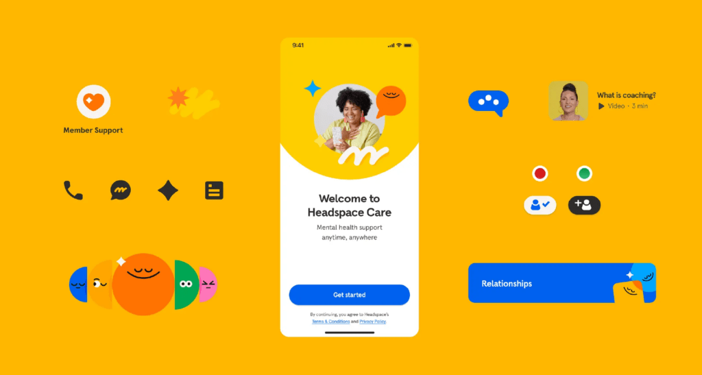
- Headspace
Headspace, a meditation app, uses a calming color palette of soft oranges and blues. These shades promote relaxation and make it easy for users to navigate and engage with the content.
By using intermediate colors thoughtfully in UI/UX design, websites can enhance user experience, guide behavior, and create an inviting atmosphere that encourages interaction.
Intermediate Color Schemes for Web Design
When designing a website, intermediate colors offer a wide range of possibilities for creating visually appealing and harmonious layouts. Depending on the color scheme you choose, intermediate tones can help you achieve different design goals. Let’s explore three popular color schemes and how they can be used in web design.
Analogous Schemes
In an analogous scheme, intermediate colors that are next to each other on the color wheel are used to create smooth transitions and a cohesive design. For example, using shades of blue, teal, and green together can result in a calm and unified look. These colors naturally blend into one another, making the website feel balanced and harmonious.
Best for:
- Creating a soothing, seamless flow across different sections of a website.
- Ensuring that elements like backgrounds and text work together without clashing.
Complementary Schemes
A complementary scheme uses colors that are opposite each other on the color wheel to create contrast. For example, pairing a soft orange with a muted blue can help certain elements, like buttons or forms, stand out. Intermediate colors can add subtle contrast without being too harsh, making them perfect for highlighting key areas of your site while still maintaining an overall visual appeal.
Best for:
- Drawing attention to calls-to-action, buttons, and important forms.
- Adding visual interest to your design without overwhelming users.
Monochromatic Schemes
A monochromatic scheme focuses on using different shades and tints of a single intermediate color to create a minimalist and elegant design. For instance, using various shades of teal – ranging from light to dark – can give the site a clean, modern look. This approach is great for websites aiming for simplicity and sophistication while maintaining consistency throughout the design.
Best for:
- Achieving a minimalist, clean look.
- Creating depth and interest without introducing too many different colors.
By carefully choosing how to use colors in these schemes, you can craft a website that looks visually appealing and together with that, improves user experience and brand recognition.

How to Choose Intermediate Colors for Your Website?
Selecting the right intermediate colors for your website requires thoughtful consideration. Here are some key factors to keep in mind when choosing the best colors for your site:
- Consider Your Target Audience
The colors you choose should resonate with your audience. For example, softer, muted colors like light greens and blues work well for a calming, professional tone, which is ideal for healthcare or wellness websites. On the other hand, vibrant tones like teal or coral may be better suited for younger audiences or creative industries.
- Match the Industry
Different industries tend to use different color schemes. A tech company might benefit from cooler colors like blues and purples, while a fashion brand might lean towards warmer, more expressive intermediate colors like pinks and oranges. Understanding the norms of your industry can guide your choices.
- Reflect Your Brand Personality
Your brand’s personality should shine through the colors you choose. If your brand is bold and energetic, go for vibrant intermediate tones like lime green or tangerine. If your brand is more about trust and professionalism, softer shades like lavender or seafoam green can communicate those values effectively.
Design Tools for Choosing Intermediate Colors
Several tools make choosing colors easier:
- Coolors: A user-friendly palette generator that lets you explore a range of colors, including intermediate shades. It’s great for quickly building a cohesive color scheme.
- Adobe Color: This tool allows you to create color schemes based on color theory principles, helping you find the perfect color scheme for your site.
Practical Tips for Using Intermediate Colors in Web Design
Using colors effectively in web design can greatly enhance contrast, readability, and overall user experience. Here are a few practical tips:
Create Contrast and Readability
To ensure text and icons stand out, pair intermediate colors with high-contrast backgrounds. For example, use a soft green background with dark text, or a light coral button with white icons. This keeps your site readable and visually engaging.
Balance Neutral Tones
When working with intermediate colors, balance them with neutral tones like gray, white, or beige. This creates a clean look and prevents the design from becoming overwhelming. Neutrals also help make your website more accessible and user-friendly by providing areas of visual rest.
Responsive Design Across Devices
Ensure that colors remain consistent and visually appealing across all devices – desktop, mobile, and tablet. Test how colors appear in different lighting conditions and screen sizes to maintain readability and user experience. Avoid overly vibrant colors on small screens, as they can be harder to read.
By keeping these tips in mind, you can use colors to create a balanced, accessible, and visually appealing website across all platforms.
The Future of Intermediate Colors in Web Design
Intermediate colors are becoming more popular as designers embrace minimalist and modern aesthetics. Subtle, blended colors offer a way to create sleek, uncluttered designs that still feel vibrant and engaging. These hues are often used to add personality without overwhelming the user, which aligns with current trends in web design.
As digital interfaces become more central to brand identity, color schemes play a crucial role in building brand loyalty. The careful use of colors helps create memorable, cohesive experiences that keep users coming back. Brands are increasingly using these colors to create a unique, yet approachable, visual style that stands out in competitive markets.
Emerging design trends like dark mode, glassmorphism, and skeuomorphism are also influenced by intermediate colors. In dark mode, softer intermediate shades like muted blues or purples provide contrast without straining the eyes. For glassmorphism, translucent effects pair well with subtle intermediate tones, creating depth and dimension. Skeuomorphism – bringing real-world textures into digital spaces – benefits from intermediate colors to maintain a lifelike, yet modern, feel.
Hire a WordPress Designer
Discover the benefits of choosing to hire a WordPress designer. Enjoy focused attention, quick turnaround, cost-effectiveness, and expert design for the projects.
Why Web Designers Should Master Intermediate Colors?
Mastering intermediate colors is essential for any web designer aiming to create polished and professional websites. These colors strike the perfect balance between vibrancy and subtlety, allowing for a wide range of design possibilities. Whether you’re looking to build harmony, contrast, or depth, intermediate tones can help you achieve your desired aesthetic while enhancing user experience.
By incorporating intermediate color schemes into your projects, you can make your designs stand out, offer a unique brand identity, and keep users engaged. The versatility of intermediate tones makes them suitable for everything from minimalist layouts to more complex, layered designs.
Our designers at White Label Agency know exactly how to use intermediate colors perfectly in web design. Contact us today to discuss how our web design services can elevate your agency’s projects.
FAQs
What are the 6 tertiary or intermediate colors?
The six tertiary (or intermediate) colors are created by mixing one primary color with an adjacent secondary color in equal parts. These are:
Red-Orange (mix of red and orange)
Yellow-Orange (mix of yellow and orange)
Yellow-Green (mix of yellow and green)
Blue-Green (mix of blue and green)
Blue-Violet (mix of blue and violet)
Red-Violet (mix of red and violet)
These colors are essential in creating a complete color wheel and offer more nuanced shades for design and artistic projects.
What is the difference between secondary and intermediate colors?
The primary difference between secondary and intermediate (tertiary) colors lies in how they are created and their position on the color wheel:
Secondary Colors:
How They’re Made: Secondary colors are created by mixing two primary colors in equal parts.Example: Red + Blue = Purple, Blue + Yellow = Green, Yellow + Red = Orange.
Position on the Color Wheel: Secondary colors are located directly between the primary colors from which they are mixed.
Intermediate (Tertiary) Colors:
How They’re Made: Intermediate colors are created by mixing a primary color with a neighboring secondary color on the color wheel.Example: Red (primary) + Orange (secondary) = Red-Orange.
Position on the Color Wheel: Intermediate colors are located between primary and secondary colors on the color wheel, creating a more nuanced spectrum.
Summary:
Secondary colors are a direct mix of two primary colors.
Intermediate colors involve a blend of one primary and one secondary color, resulting in more complex hues.
Is grey an intermediate color?
No, grey is not an intermediate (tertiary) color. Here’s why:
Intermediate Colors:
Intermediate (or tertiary) colors are created by mixing a primary color with an adjacent secondary color on the color wheel, such as red-orange or blue-green.
They are vibrant and are part of the color wheel.
Grey:
Grey is considered a neutral color, not part of the primary, secondary, or tertiary color groups.
It is typically created by:Mixing black and white (to create a pure grey).
Mixing complementary colors (like red and green) in the right proportions, which results in a desaturated tone.
Key Difference:
Intermediate colors are part of the color spectrum and appear on the color wheel.
Grey is neutral and falls outside the color wheel, used to add balance or tone down other colors in design or art.
Is pink an intermediate color?
No, pink is not an intermediate (tertiary) color. Here’s why:
Intermediate Colors:
Intermediate (tertiary) colors are created by mixing a primary color (red, yellow, or blue) with an adjacent secondary color (green, orange, or purple) on the color wheel. Examples include red-orange, yellow-green, and blue-violet.
These colors are part of the color wheel and are vibrant, transitional hues.
Pink:
Pink is a tint of red, created by mixing red (a primary color) with white.
It does not involve mixing a primary color with a secondary color and, therefore, is not classified as intermediate.
Like grey, pink is considered a non-spectral color, meaning it doesn’t appear naturally in the visible spectrum or the standard color wheel.
Key Difference:
Intermediate colors involve combinations of primary and secondary colors.
Pink is a tint, resulting from lightening red with white, and does not fit into the primary, secondary, or intermediate categories.
What is an example of an intermediate color might be?
An example of an intermediate (tertiary) color is yellow-green.
Explanation:
Intermediate colors are formed by mixing a primary color with an adjacent secondary color on the color wheel.
In this case:Yellow (primary) + Green (secondary) = Yellow-Green.
Other Examples:
Red-Orange (Red + Orange)
Yellow-Orange (Yellow + Orange)
Blue-Green (Blue + Green)
Blue-Violet (Blue + Violet)
Red-Violet (Red + Violet)
These colors bridge the gap between primary and secondary colors, creating a more detailed and nuanced color wheel.