
Pixel perfect web development means “coding a website to match the web designs pixel by pixel”. In reality, this is achievable only for a fixed set of screen resolutions, so the general meaning of the term is “web development that follows the web designer’s intent perfectly”.
“Pixel perfect web design” has been widely criticized as a concept because it sets an impossible standard for responsive development. What looks just like the designs on one screen or device may look different on another. But it’s still a useful term to express that you expect a perfect result from your web developer, so it’s better to explore the implications of it than to abandon it.
Why Pixel-Perfect Matters
After defining what is pixel perfect web design, it’s worthwhile to consider why striving for pixel perfection is important for customers. Understanding why pixel perfect web development matters helps us see beyond technical accuracy—it brings us closer to what users experience and how they perceive a brand.
UX and UI
Pixel perfect design goes beyond matching visual specifications to the finest detail. It directly impacts the user experience (UX) and the user interface (UI), shaping how end users perceive and interact with a website.
A consistent and precise design contributes to a seamless UX by making sure that every button, every image, and every element appears exactly as intended, regardless of the device. Users are more likely to enjoy interacting with a website when the layout is perfectly crafted, as it feels more professional and reliable.
Brand Consistency
The exacting nature of pixel perfect design also helps to establish brand consistency. Consistent design elements—like typography, colors, and spacing—create a unified visual identity that reassures users and builds trust. Brands invest heavily in their visual language, and pixel perfect web development ensures that the designer’s vision is executed precisely, maintaining the tone and style of the brand across all customer touchpoints.
When every detail aligns perfectly, it also reinforces a sense of care and precision. Even if users don’t consciously notice perfect alignment or spacing, they often sense the quality of a polished design. In contrast, small discrepancies—like misaligned buttons or inconsistent spacing—can make a website feel rushed or unprofessional. These imperfections can undermine the perception of quality, ultimately impacting how users view the brand and its credibility.
Although achieving pixel perfect web development might not be feasible across all devices and screen sizes, aiming for pixel perfection shows dedication to quality. It provides a foundation where the brand’s essence translates seamlessly into the digital experience—something customers recognize and appreciate, even if it’s on a subconscious level. Ultimately, a website that looks and functions as intended contributes to better user engagement and loyalty.
With a solid understanding of why pixel perfect web design matters, we can now proceed to the essential steps that ensure this level of quality is met.
Hire a WordPress Designer
Hire a WordPress designer for your agency. Choose from junior, middle, or senior levels with fixed monthly rates and seamless onboarding.
5 steps to achieve pixel perfect web development
Follow these 5 steps to achieve pixel perfect web development:
- Choose a design tool that supports design symbols/components
- Select screen resolutions to design for
- Discuss non-obvious responsive behavior
- Follow a design system when coding the site
- Test the result with the PerfectPixel plugin
In the following parts of the article, we go through each of these steps. The first three steps are covered in the first section on how to prepare the web designs correctly, and the last two are covered in the section on how to develop for pixel perfection.
Preparing pixel perfect web designs
Before asking your developer for pixel perfect web development, you need to ask yourself whether your designer prepares pixel perfect web designs. Otherwise, the developer will struggle to turn your web designs into pixel perfect front-end code. We know this for a fact, since this stage is our specialty at White Label Agency. We’ve performed Photoshop to WordPress theme conversion for agencies about 3000 times at the time of writing (including a growing number of Adobe XD to WordPress projects).
Some web designers pride themselves in never having a pixel off. They make sure the typography is correct everywhere in the designs, and each element is sized and placed consistently across the site. However, far from every professional web designer checks their work with that rigor. Why? It’s too time-consuming, and often not even necessary to get a perfect result.
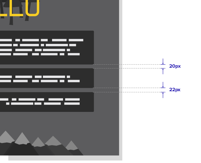
If developers were asked to literally follow the web designs with pixel perfect development, they would copy all the mistakes made by the designers through the use of unique CSS classes. For example, to set a margin to 22px instead of the 20px used across the rest of the web designs.
But since web developers use HTML and CSS rules to place and style elements, they can correct all small inconsistencies in the designs. It saves time for both web developers and web designers to agree on how to read the “mistakes” of the designs.
“Since web developers use HTML and CSS rules to place and style elements, they can correct all small inconsistencies in the designs.”
Step 1: Design tools that support design symbols/components
A simple way to improve design consistency, and save time, is to make use of design tools like Sketch and Adobe XD. They have features to design pre-styled elements called symbols or components that can be reused across the designs.
If you style a button or card as a symbol, it will have the same look everywhere in the designs and can be changed in one place instead of having to change each instance of it.
The reusable components are referred to as a design system. A design system typically includes:
- Colors
- Typography
- Button design
- Card design
- Bullet lists
- Styles like shadows & radiuses
- Spacing between elements
- Pseudo-classes for links: Active, Focus, Hover, Visited
Step 2: Select screen resolutions for your web design
If you change the size of your web browser window, the website will adapt. If you change your web design tool window, the elements will not change size or move around. This difference is the source of one of the main gaps in the communication between a web designer and a web developer.
Note: This is true for most websites that get built today but web design tools are improving fast. I know Figma has a feature that lets you set “constraints” and see how the design adapts responsively and Adobe XD now has that too. But since most web designers don’t use features like that yet, this article assumes the traditional workflow is still in use.
Design grids and CSS frameworks help to set standards for responsiveness, but a lot is still left to the developers’ judgment when setting up responsive behavior.
💡 Recommendation: Read more about the key differences between adaptive vs responsive web design.
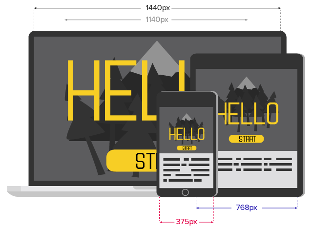
If mobile design is a priority, web designers can create two versions of the design files: mobile and desktop. To cover the most common smartphones and desktops, you can use 1440px wide for desktop (with the main content container that is 1140px) and 375px wide for mobile. We sometimes see tablet designs as well, but it’s not so common. If tablet is important on your project, 768px is a good resolution to use for it.
Setting the correct size of the main container is important and too often forgotten about. Many designers choose to design desktop layouts that are 1920px wide, which can be problematic on smaller desktop screens if not done right. If they fill the screen with content from left to right with 16px font size, the developer will have to play an advanced game of Tetris to squeeze them into a 1024px screen.
“A lot is still left to the developers’ judgement when setting up responsive behavior.”
Alternatively, if the font size is 24px to make use of the 1920px widescreen, the developer will need to adjust the font size for smaller desktop resolutions. Otherwise, the typography will look overwhelming and few characters will fit on each line of text.
Another approach for handling desktop resolutions is to design for 1024px and instruct the developer to code all elements to scale proportionally from there and up using “rem” instead of pixels. It’s not always appropriate and it forces the developer to do a lot of ratio calculations, but worth mentioning.
💡 Recommendation: Learn more about 1080p vs 1440p screen resolutions in web design.

Step 3: Discuss non-obvious responsive behavior
A sidebar is a typical example of an element that doesn’t translate easily into a predicted responsive behavior. You need to inform the developer if the sidebar should be placed on top of the main content on mobile, below it or disappear completely to know what the result will be.
Decorative images and background graphics could also take up unnecessary space on condensed views. Think through if you want them to scale down or be hidden on smaller screens.
Repeating elements such as cards displaying team members should preferably be designed with an odd number of elements to show developers what the behavior should be when new items are added. Should the next card be centralized or left-aligned if it falls on a new row?
Tables with data are also challenging for small screens since their purpose is to arrange information both vertically and horizontally. For example, on Wikipedia, you’ll see that tables scroll horizontally on mobile screens.

Step 4: Analyze and implement the design system
Before starting development, developers should review if they understand the design system and if it’s complete for their needs. Analyzing which styles will need to be set up, where they are used and how they might differ from page to page will help the developer make a plan for the project.
It’s great to have a simple sample page for all basic typography and elements (like links, lists and buttons) to review and confirm that all the CSS styles have been prepared. Add this as a default page that you reuse on all projects. If the designs don’t have any bullet lists, for example, this page will remind you to style them anyway since they are likely to be used at some point on the website.
Both for increased speed and for avoiding human error, developers should use the tools provided by the web design software for copying the CSS styles straight from the designs. Photoshop has an extension that lets you do this, while Sketch, Adobe XD, Zeplin, Avocode, and other software have it out-of-the-box.
“It’s great to have a simple sample page for all basic typography and elements (like links, lists and buttons).”
A small but important tip is to ensure you have installed your premium fonts right away with valid licenses. If you don’t have the license, you’ll need to develop with a temporary font and that will have all kinds of effects on how the page looks. Adding the right font later will force you to go back and adjust pages, especially responsiveness, costing unnecessary time.
If you as a developer find that something in the design doesn’t look right, make sure to ask the designer about it if it’s not obvious that it’s a design error. If an element is 2px off the grid it’s probably a mistake, but if there’s something bigger it could be intentional.
“If you as a developer find that something in the design doesn’t look right, ask the designer about it.”
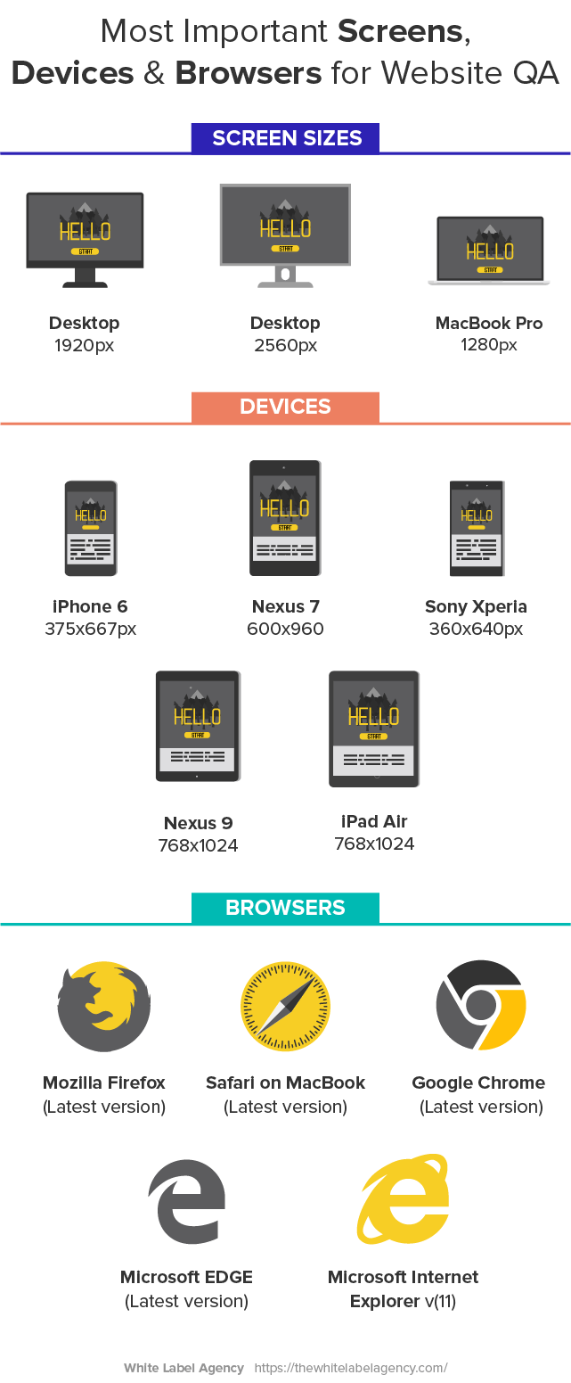
Step 5: Pixel perfect design quality assurance
After a page has been developed, you want to check it against the design files on the provided resolutions. There’s a great browser extension that we use for this called PerfectPixel. It allows you to overlay your designs on the page with transparency so you can see where it doesn’t match up.
You also need to check difference browsers, devices, and screen resolutions. In our quality assurance process, we check the following by default:
Final thoughts
Before asking for pixel perfect web development, ask yourself if it’s worth the effort and if you have taken the right measures to prepare for it.
You’ll want the website to look great, but if you have a few pixels off here and there I’m sure only fellow designers will notice. Pixel perfect standards will increase the time needed for both design and development.
To give the developer a good chance of succeeding, designers can prepare web designs that reuse symbols and components across the site with tools that allow developers to copy-paste the CSS styles.
Even with all the measures taken, it’s possible that some discussions are needed to decide on the direction for non-obvious responsive behavior. And even with the best developer and designer on the project team, thorough quality assurance will help guarantee that nothing important was overlooked.
“Close to pixel perfect web development” is our default as a more affordable option than pixel perfect, but we offer additional precision for those who prefer.
What are your standards? Send us a note to share your thoughts on the importance of pixel perfect development and how you achieve it. Also, never hesitate to reach out to us in case you need assistance with WordPress website design.
Recommended further reading:
- Handoff guide for design to development (by Pixel Point)
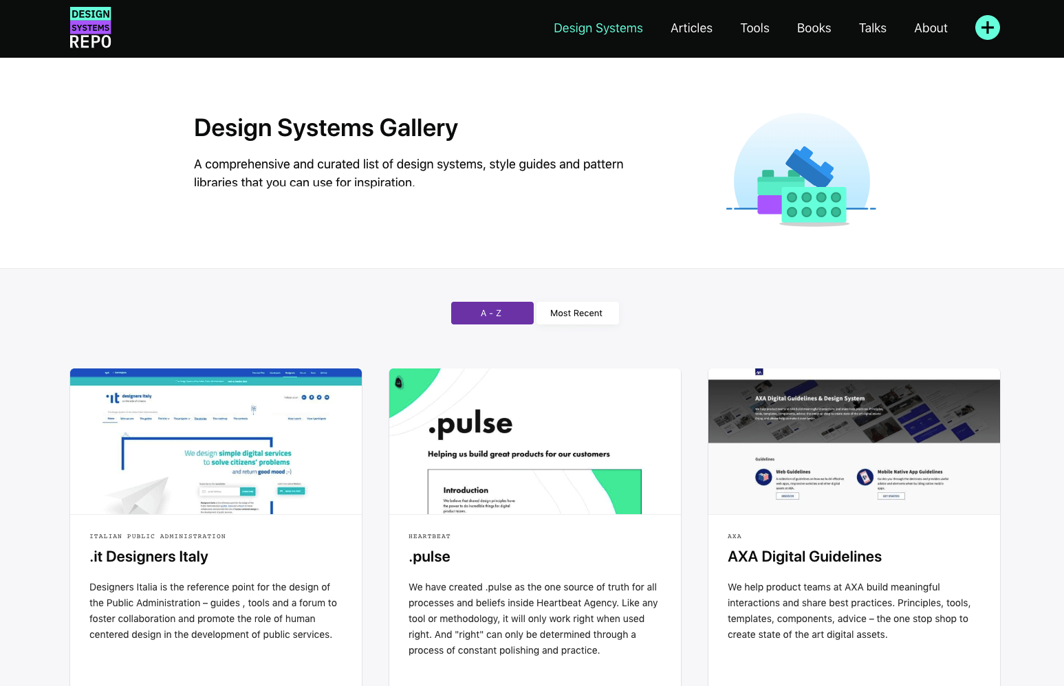
- Design Systems Gallery (by Design Systems Repo)
- Criticism of pixel perfect development (by Kyle Gawley)
- A Front-End Developer’s Ode To Specifications (Smashing Magazine)
Pixel perfect design
Get flawless designs with our Pixel Perfect Design Service. Elevate your brand with precision, creativity, and attention to every detail. Learn more today!
FAQs
What is pixel perfect web design?
Pixel Perfect Web Design refers to the meticulous process of ensuring that every design element on a website matches the original design mockup or prototype down to the smallest pixel. This approach guarantees that the visual representation of the website is precisely as intended, with no discrepancies between the design file (often created in tools like Figma, Sketch, or Adobe XD) and the live website.
Why is Pixel Perfect Important?
Pixel perfect web design is important because it ensures a high level of visual consistency and quality. It enhances user experience by making the website appear more professional and polished, which helps build trust with users and reinforces brand identity. Consistent design details improve usability and create a seamless experience.
What is 100% Pixel Perfection?
100% pixel perfection refers to achieving an exact match between the web design mockups and the final coded website, down to the smallest detail. This means that every element, such as spacing, alignment, colors, and typography, appears precisely as designed without any discrepancies.
What is the Pixel Width for Web Design?
The pixel width for web design can vary based on the target device. A common width for desktop design is 1440 pixels, with a main content container of 1140 pixels. For mobile designs, 375 pixels is often used, and for tablets, 768 pixels is a good benchmark. These pixel widths help ensure designs work well across different devices.
What is Pixel Perfect tool?
A pixel perfect tool allows developers to overlay the design on top of the developed webpage to identify discrepancies. This comparison helps them see where adjustments are needed to ensure that the final output matches the design specifications accurately.