
Often, tertiary colors fly under the radar among the many aspects of color theory. However, they should not be overlooked because they hold the key that will unlock deeper layers of creativity for artists and designers. If you mix a primary color with a secondary color, you create tertiary colors, resulting in hues like red-orange, yellow-green, etc. They make a color palette rich and nuanced, allowing a designer to add subtle sophistication or bold dynamism to any design project.
For many artists and designers, these colors provide more options for creating harmonious color schemes. Those mastered in tertiary colors can create more appealing and impactful visuals by using them thoughtfully. These colors offer unique combinations that can harmonize or contrast in ways that primary and secondary colors alone cannot achieve.
Before diving into tertiary colors, let’s understand the basics of primary and secondary colors, as these form the foundation of all color theory.
Understanding Primary and Secondary Colors
Primary colors—red, blue, and yellow—are the core hues that cannot be created by mixing other colors. They are the starting point for creating all other colors. In design, primary colors are often used for their bold, eye-catching qualities, making them ideal for creating a strong visual impact.
When you mix two primary colors together, you get secondary colors. These include green (from blue and yellow), orange (from red and yellow), and purple (from red and blue). Secondary colors offer more variety and are often used to create contrast and harmony in a design.
We can explore how mixing these can lead to the creation of tertiary colors. They open up even more possibilities for creating rich, nuanced, and sophisticated designs. For an example of how black can create a stunning contrast with these colors, check out these black websites
What Are Tertiary Colors?
On the color wheel, tertiary colors are positioned between the primary and secondary colors from which they are derived. So, they are transitional colors, between the more dominant hues, contributing to a more complex and harmonious color scheme.

It’s worth noting that the term “tertiary” itself comes from the Latin “tertiarius,” meaning “of the third rank” or “third in order.” This describes their position in the color hierarchy after primary and secondary colors.
The Six Standard Tertiary Colors
On a standard 12-part color wheel, tertiary colors are placed between primary and secondary colors. They’re typically positioned at the 30°, 90°, 150°, 210°, 270°, and 330° marks. This placement creates a smooth transition between the main color groups, allowing for a more fluid and natural progression of hues.
The six standard tertiary colors are:
- Red-orange (vermilion)
- Yellow-orange (amber)
- Yellow-green (chartreuse)
- Blue-green (teal)
- Blue-violet (indigo)
- Red-violet (magenta)
Color Theory Examples of Tertiary Colors
Tertiary colors are incredibly versatile when it comes to applying color theory in design. With them, you can create more nuanced, balanced, and visually engaging color schemes. This is how they contribute to several key color relationships:
Split-Complementary Schemes
A split-complementary scheme involves using a base color and the two colors adjacent to its direct complement on the color wheel. Tertiary colors often serve as these adjacent colors, offering a more refined and less jarring contrast than a straight complementary scheme. For instance, if your base color is blue, instead of pairing it with its direct complement (orange), you might use yellow-orange and red-orange. This approach gives your design a more sophisticated contrast while still maintaining visual interest.
Triadic Color Schemes
In a triadic scheme, three colors are evenly spaced around the color wheel. When you incorporate tertiary colors into this mix, the result is a more subtle and harmonious palette. For example, instead of using the primary colors red, yellow, and blue, you could opt for red-orange, yellow-green, and blue-purple. This creates a triadic scheme that feels more balanced and less intense, making it ideal for designs where you want a vibrant yet controlled color interaction. To learn more about how triadic colors work and why they are effective, check out our detailed guide on triadic colors.
Tetradic Color Schemes
Tetradic (or double-complementary) schemes use four colors arranged into two complementary pairs. Tertiary colors can add depth and sophistication to these schemes by softening the overall palette. For example, pairing blue-purple with yellow-orange and red-purple with yellow-green creates a rich, layered look. The inclusion of tertiary colors in a tetradic scheme can help avoid the harshness that sometimes comes with using four strong, contrasting colors.
Analogous Color Schemes
Analogous schemes consist of colors that are next to each other on the color wheel. Tertiary colors shine in these schemes because they create smooth transitions between hues. For example, a sequence of yellow, yellow-green, and green can be made more complex and interesting by adding yellow-orange into the mix. This approach ensures that your design remains cohesive and easy on the eyes, making it perfect for projects where a calm, unified look is desired.
Tertiary Colors Examples
Vermilion
Red-orange, often called vermilion, is a vibrant, energetic color that combines the passion of red with the warmth of orange. It’s a color that demands attention without being as aggressive as pure red.
- Design: Often used in logo design for food and beverage companies to stimulate appetite and convey energy. For example, it’s prominent in the branding of fast-food chains like Burger King.
- Art: Vermilion has been a favorite of artists throughout history, from ancient cave paintings to Renaissance masterpieces. It’s particularly striking in the works of Vincent van Gogh.
- Nature: Found in the plumage of tropical birds like the Vermilion Flycatcher, and in vibrant sunset skies.

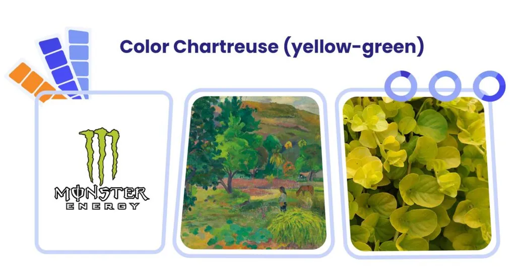
Chartreuse
Yellow-green, commonly known as chartreuse, is a fresh, lively color that evokes images of new growth and vitality. It sits at the intersection of the warmth of yellow and the natural associations of green. These are yellow-green tertiary colors examples in real life:
- Design: Popular in sports and energy drink branding to convey freshness and vitality. It’s also used in eco-friendly product design to suggest natural origins.
- Art: A key color in Art Nouveau designs and in the works of artists like Paul Gauguin.
- Nature: Abundant in spring foliage and certain varieties of apples and grapes.
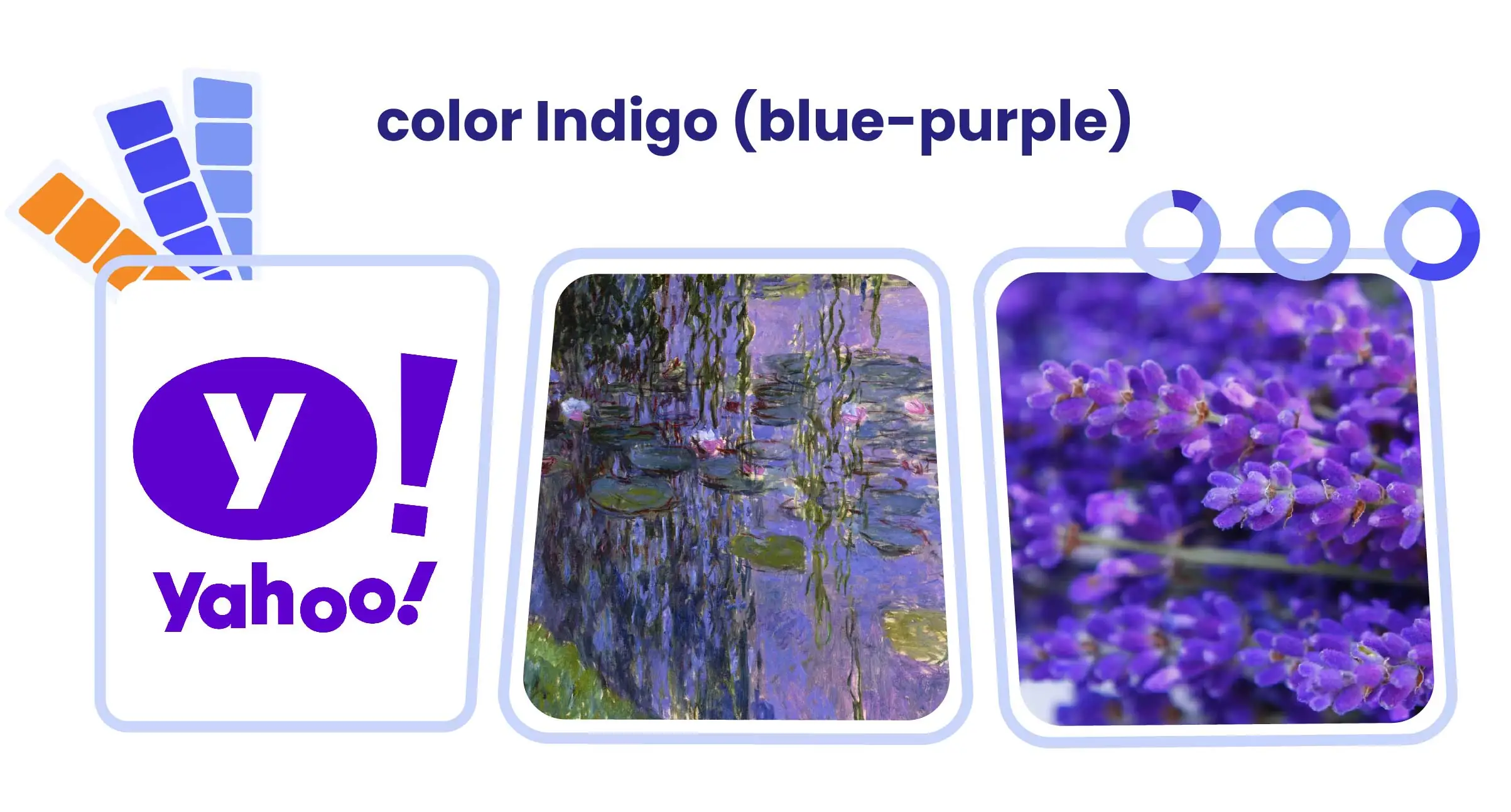
Indigo
Blue-purple, or indigo, is a deep, rich color that suggests depth and complexity. It combines the calmness of blue with the mystery and luxury connotations of purple.
- Design: Often used in luxury branding and high-tech product design to convey sophistication and innovation.
- Art: A staple in impressionist paintings, particularly in the works of Claude Monet for rendering twilight scenes.
- Nature: Found in deep ocean waters and night skies, as well as in flowers like irises and lavender.
Amber
Yellow-orange, often referred to as amber, is a warm, inviting color that combines the cheerfulness of yellow with the comfort of orange. It evokes images of golden sunsets and autumn leaves, conveying a sense of warmth and optimism without the intensity of pure yellow or orange. Let’s explore examples of amber tertiary colors:
- Design: Frequently used in food packaging design, particularly for products associated with honey, citrus, or comfort foods. It’s also popular in hospitality branding to create a welcoming atmosphere.
- Art: Prominent in works by artists like J.M.W. Turner, especially in his luminous sunset paintings.
- Nature: Found in amber gemstones, fall foliage, and the fur of certain animals like lions or golden retrievers.

Teal
Blue-green, commonly known as teal, is a serene, balanced color that blends the calmness of blue with the freshness of green. It’s reminiscent of tropical waters and lush landscapes, suggesting tranquility and renewal. Teal strikes a harmonious balance between the coolness of blue and the natural vitality of green. Here is a list of teal tertiary colors examples:
- Design: Often used in healthcare and wellness branding to convey a sense of cleanliness and calm. It’s also popular in tech companies’ logos to suggest innovation and trustworthiness.
- Art: A favorite of Art Deco designers and artists. It’s also prominent in many of Pablo Picasso’s works during his Blue Period.
- Nature: Seen in tropical waters, peacock feathers, and certain varieties of jade.

Magenta
Red-purple, or magenta, is a vibrant, bold color that merges the passion of red with the mystery of purple. It’s a color that exudes energy and creativity, often associated with innovation and unconventionality. Magenta captures attention with its intensity while maintaining an air of sophistication.
- Design: Frequently used in cosmetics branding and packaging to convey luxury and femininity. It’s also popular in creative industry logos to suggest innovation and boldness.
- Art: A key color in Pop Art, particularly in the works of Andy Warhol.
- Nature: Found in vibrant flowers like fuchsias and certain tropical fish.

Note from our web designer: “The names of tertiary colors can vary. For instance, teal is sometimes called aqua or turquoise, while magenta might be referred to as fuchsia. This can lead to confusion in design specifications, so it’s crucial to use precise color codes.”
How to Use Tertiary Colors in Design
8 Tips on Using Tertiary Colors in Web Design
To provide you with the best insights, we consulted our web designers, who shared their expert tips on how to use tertiary colors in your projects for a truly refined and sophisticated look. Here are some of them:
- Color Proportion: When incorporating tertiary colors, consider the 60-30-10 rule: 60% dominant color, 30% secondary color, and 10% accent color. This can help create balanced designs.
- Brand Consistency: If using tertiary colors in branding, ensure they can be consistently reproduced across all mediums. Provide exact color codes (RGB, CMYK, and Pantone) in your brand guidelines.
- Color Accessibility: When using tertiary colors, always consider color contrast for accessibility. Tools like WebAIM’s Contrast Checker can help ensure your designs are readable for all users.
- Call-to-Action Buttons: Tertiary colors can make CTAs stand out without being as jarring as primary colors. For example, a teal button on a predominantly blue and white website can draw attention effectively.
- Hover States: Use tertiary colors for hover states on interactive elements. For instance, a link could change from blue to blue-violet when hovered over, providing visual feedback without dramatic contrast.
- Color Variables in CSS: Use CSS variables (custom properties) to define your tertiary colors. This makes it easier to maintain consistency and make global color changes.

- Dark Mode: Tertiary colors often work well in dark mode designs. They can provide necessary contrast without the harshness of primary colors against a dark background.
- Micro Interactions: Use tertiary colors in micro-interactions like loading spinners or progress bars to add a touch of sophistication to these small but important elements.
Tertiary Colors: Use Cases in Web Design & Branding
Let’s discuss some successful use cases of tertiary colors in digital design and branding.
Spotify
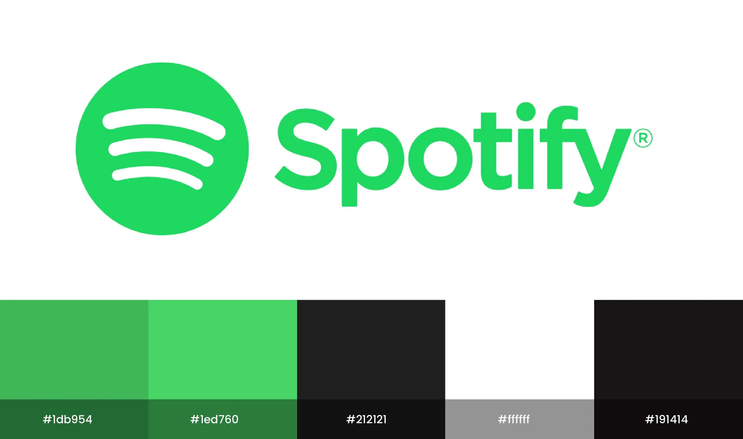
Color Palette: Spotify employs a vibrant green as its primary color, complemented by shades of blue-green (tertiary) for various UI elements.
Design Insights: The use of blue-green in the background and accent elements creates a modern and fresh look. This color choice resonates with the brand’s focus on music and creativity, enhancing user engagement. The contrasting colors also help guide users’ attention to key features like playlists and album artwork.
Airbnb
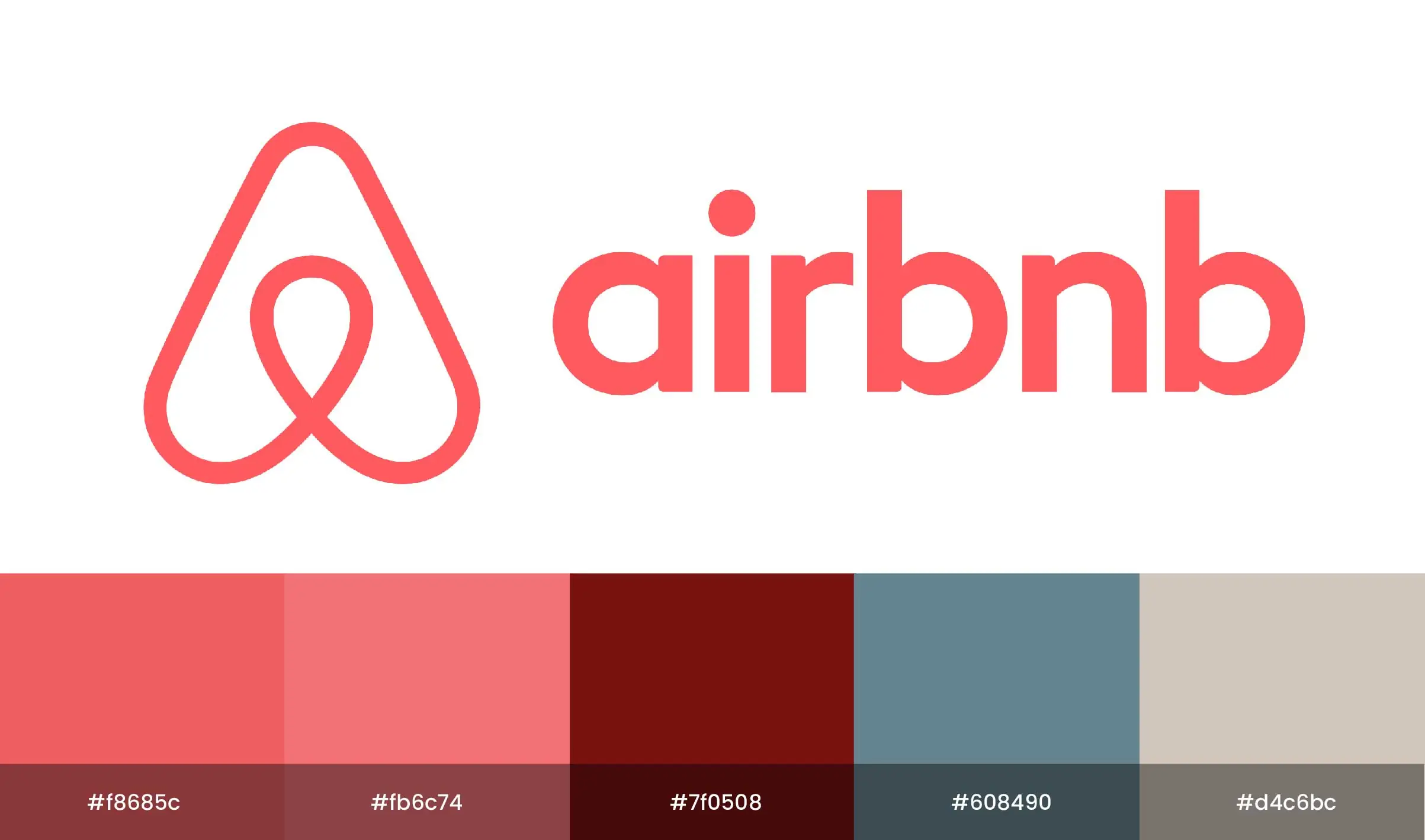
Color Palette: Airbnb’s branding features a warm coral that leans towards red-orange (tertiary), combined with soft neutrals.
Design Insights: The use of red-orange creates an inviting and friendly atmosphere, essential for a platform focused on hospitality. This color choice enhances the overall user experience, making visitors feel welcomed and encouraging them to explore listings. The warmth of the color also evokes feelings of comfort and community.
Trello

Color Palette: Trello uses a combination of blue (primary) and blue-green (tertiary) in its interface.
Design Insights: The use of blue-green helps create a calming and organized environment, which is crucial for a project management tool. The color scheme is applied consistently across the platform, from task cards to navigation elements, creating a seamless user experience. This approach not only enhances usability but also aligns with the brand’s identity of efficiency and productivity.
Slack

Color Palette: Slack’s branding incorporates vibrant purple (secondary) along with blue-purple (tertiary) accents.
Design Insights: The use of blue-purple in Slack’s interface adds a touch of creativity and innovation, aligning with its mission as a collaborative communication tool. The color is used in icons and notifications, ensuring that important elements are easily distinguishable while maintaining a cohesive look throughout the platform.
WordPress Webdesign
Enhance your agency’s offerings with our WordPress website design services. Get custom, high-quality designs that fit your client’s needs.
Let’s Collaborate to Create Impactful Designs
We have explored the significance of tertiary colors in design and how they offer a rich, nuanced palette that can elevate any project. At White Label Agency, we understand the power of tertiary colors in creating compelling digital experiences. If you are an agency that is crafting visually stunning websites, our team of expert designers can bring your vision to life. Reach out to us today to see how we can collaborate on your next project.
FAQs
Which colors are tertiary?
Tertiary colors are created by mixing a primary color with a secondary color that is adjacent to it on the color wheel. The six tertiary colors are:
Red-Orange (mix of red and orange)
Yellow-Orange (mix of yellow and orange)
Yellow-Green (mix of yellow and green)
Blue-Green (mix of blue and green)
Blue-Violet (mix of blue and violet)
Red-Violet (mix of red and violet)
These colors form a bridge between the primary and secondary colors and add depth to color palettes.
What is the tertiary color triad?
A tertiary color triad is a set of three tertiary colors that are evenly spaced around the color wheel, creating a balanced and harmonious combination. These triads can be used in design and art to achieve visually appealing color schemes. An example of a tertiary color triad includes:
Red-Orange
Yellow-Green
Blue-Violet
This arrangement ensures a balanced use of colors that provide contrast and vibrancy without overwhelming the viewer. Tertiary color triads can add complexity and richness to a design while maintaining a cohesive look.
What is the difference between intermediate and tertiary colors?
Intermediate and tertiary colors are often used interchangeably, but technically, intermediate colors refer to hues formed by mixing a primary color with a nearby secondary color (e.g., blue-green). Tertiary colors are a broader term encompassing all colors created by mixing primary and secondary hues, including intermediate colors. In essence, intermediate colors are a type of tertiary color.
What is the difference between tertiary and analogous colors?
Tertiary colors are created by mixing a primary and a secondary color, resulting in six distinct hues (e.g., red-orange, blue-violet). Analogous colors, on the other hand, are groups of three colors next to each other on the color wheel (e.g., red, red-orange, orange). The key difference is that tertiary colors refer to specific blended hues, while analogous colors describe a harmonious grouping used in color schemes.
Is amber a tertiary color?
Yes, amber is considered a tertiary color. It is a specific hue formed by mixing yellow (a primary color) and orange (a secondary color). Amber falls between yellow-orange on the color wheel and is known for its warm, golden appearance.
Is teal a tertiary?
Yes, teal is considered a tertiary color. It is created by mixing blue (a primary color) and green (a secondary color). This results in a color that is positioned between blue and green on the color wheel, known for its cool, deep hue.


