- Hire a WordPress Designer
- What Is the Color Wheel?
- 3 Categories of Colors
- Color Properties
- Color Harmonies and Schemes
- Color Temperature
- WordPress Web Design Agency
- Psychology of Colors
- Color Models and Systems
- 5 Practical Applications of Color Theory in Web Design
- Color Trends in Modern Web Design
- Final Words
- FAQs
Color is one of the most powerful tools in visual communication. Whether in art, design, branding, or everyday life, colors shape perception, evoke emotions, and influence decisions. Understanding different types of colors and their interactions can help designers, marketers, and artists create compelling visuals that leave a lasting impact.
This guide explores the fundamentals of color theory, beginning with the origins of the color wheel and the primary categories of colors that form the foundation of all color relationships.
Hire a WordPress Designer
Discover the benefits of choosing to hire a WordPress designer. Enjoy focused attention, quick turnaround, cost-effectiveness, and expert design for the projects.
What Is the Color Wheel?

The concept of the color wheel has been a fundamental part of color theory for centuries. First introduced by Sir Isaac Newton in the 17th century, the color wheel serves as a visual representation of color relationships, organizing hues in a circular layout. Over time, it has been refined by scientists and artists to better illustrate how colors interact and complement one another.
The modern color wheel is divided into primary, secondary, and tertiary colors. It helps artists and designers understand how colors can be combined to create harmony or contrast in various applications. Whether you’re designing a website, painting a masterpiece, or selecting an outfit, the color wheel acts as a reliable guide to achieving aesthetically pleasing results.
3 Categories of Colors

As we point out above, colors can be grouped into three fundamental categories: primary, secondary, and tertiary colors. Each category plays a crucial role in color mixing and design, allowing for endless possibilities in visual expression.
Primary Colors
Primary colors are the foundation of all other types of colors. In traditional color theory, red, blue, and yellow are the three primary colors. These colors cannot be created by mixing other hues; instead, they serve as the building blocks for secondary and tertiary colors.
- Red: Often associated with energy, passion, and urgency, red is a dominant color in branding and advertising.
- Blue: A color that conveys trust, calmness, and professionalism, blue is widely used in corporate design and digital interfaces.
- Yellow: Representing optimism, warmth, and creativity, yellow is commonly used to grab attention and evoke a sense of happiness.
Secondary Colors
Secondary colors are created by mixing two primary colors in equal parts. They add variety and richness to the color spectrum, expanding the possibilities for color combinations.
- Orange (Red + Yellow): A color that exudes enthusiasm and warmth, orange is often associated with creativity and energy.
- Green (Blue + Yellow): Representing nature, balance, and harmony, green is widely used in branding for environmental and wellness-focused industries.
- Purple (Red + Blue): A color linked to royalty, sophistication, and mystery, purple is frequently used in luxury branding and artistic expression.
Tertiary Colors
Tertiary colors are created by mixing a primary color with a neighboring secondary color. These hues add depth and complexity to color schemes, offering more nuanced choices for designers.
- Red-Orange, Yellow-Orange, Yellow-Green, Blue-Green, Blue-Purple, Red-Purple
- Each tertiary color brings unique visual appeal, allowing for more diverse and sophisticated designs.
Recommendation
Want to dive deeper into color theory? Check out our blog on primary, secondary, and tertiary colors
Color Properties

As we explore color theory further, it’s essential to understand the key properties that define how different types of colors appear and interact. These properties—hue, value, and saturation—affect the perception, mood, and usability of colors in design.
Hue
Hue refers to the purest form of a color, without any alterations in brightness or intensity. It is what differentiates colors like red, blue, and yellow from one another. Hues are positioned on the color wheel and serve as the foundation for all other colors. By adjusting their properties, designers can create various tones, shades, and tints, influencing the overall aesthetic of a composition.
Value
Value determines the lightness or darkness of a color. It plays a crucial role in creating contrast and depth within a design. Value is manipulated by adding white (tint) or black (shade) to a hue:
- Tints: Achieved by mixing a hue with white, creating a softer, lighter version of the original color.
- Shades: Created by adding black, making the color darker and more intense.
Mastering value is essential in design, as it helps direct attention, establish hierarchy, and create a sense of dimension.
Saturation
Saturation, also known as chroma or intensity, refers to the purity of a color. Highly saturated colors appear vivid and bold, while desaturated colors look muted and closer to grayscale.
- High saturation: Often used in branding and advertising to capture attention and create energetic visuals.
- Low saturation: Common in minimalistic and sophisticated designs where subtlety and refinement are desired.
Understanding these properties allows designers to manipulate different types of colors effectively for diverse purposes, from vibrant advertisements to calming user interfaces.
Color Harmonies and Schemes

Now that we understand color properties, we can explore how different colors work together to create harmony in design. Color harmonies are established combinations of colors that provide aesthetic balance and visual appeal.
Complementary Colors
Complementary colors are positioned opposite each other on the color wheel (e.g., red and green, blue and orange). These pairs create strong contrast and high visual impact, making them ideal for attention-grabbing designs.
- Usage: Often used in branding, sports team logos, and bold advertising campaigns to create a striking effect.
Analogous Colors
Analogous colors sit next to each other on the color wheel (e.g., blue, blue-green, and green). They create a sense of harmony and cohesiveness, making them popular for natural and calming designs.
- Usage: Common in interior design, branding, and digital interfaces that require a soft, visually appealing palette.
Triadic Colors
A triadic color scheme consists of three colors evenly spaced on the color wheel (e.g., red, yellow, and blue). This combination offers high contrast while maintaining harmony, leading to vibrant and dynamic designs.
- Usage: Frequently used in web design, fashion, and artistic compositions to create balanced yet lively visuals.
Split-Complementary Colors
This scheme involves a base color and two adjacent colors to its complementary counterpart. Split-complementary colors provide contrast similar to complementary colors but with a softer, less intense effect.
- Usage: Suitable for posters, marketing materials, and website designs where contrast is needed without overwhelming the viewer.
Tetradic (Double-Complementary) Colors
Tetradic color schemes involve two complementary color pairs (e.g., red & green + blue & orange). This results in a rich and diverse color palette but requires careful balancing to avoid visual chaos.
- Usage: Best for complex, vibrant designs that need a variety of colors while maintaining visual harmony.
Monochromatic Colors
A monochromatic color scheme consists of variations of a single hue by altering its tints, shades, and saturation levels. It is subtle, elegant, and easy on the eyes.
- Usage: Ideal for minimalist designs, branding, and modern user interfaces that require a clean, professional look.
By choosing the right color types, designers can create visually engaging compositions that effectively communicate their intended message
Color Temperature
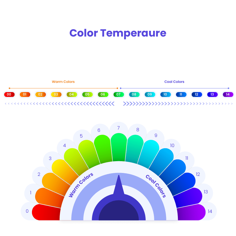
Another important aspect of color theory is color temperature, which categorizes different types of colors into warm, cool, and neutral tones. Color temperature affects how colors influence emotions and interactions in design.
Warm Colors
Warm colors include reds, oranges, and yellows. They evoke feelings of energy, excitement, and warmth, often associated with passion and action.
- Psychological Effects: Warm colors can stimulate emotions, increase appetite, and create a sense of urgency.
- Usage: Frequently used in food branding, call-to-action buttons, and retail signage to attract attention.
Cool Colors
Cool colors, such as blues, greens, and purples, create a sense of calm, trust, and relaxation. They are often linked to nature and tranquility.
- Psychological Effects: Cool colors can evoke a sense of peace, professionalism, and reliability.
- Usage: Common in healthcare, technology, and corporate branding to establish trust and stability.
Neutral Colors
Neutral colors include black, white, gray, and brown. They serve as a backdrop, allowing other colors to stand out or creating a sophisticated, understated look.
- Psychological Effects: Neutral tones can convey elegance, professionalism, and timelessness.
- Usage: Used in minimalist designs, branding, and typography to balance more vibrant color elements.
By understanding color temperature, designers can strategically choose types of colors that align with their goals, ensuring that their visuals effectively communicate the intended message.
WordPress Web Design Agency
Partner with our white label WordPress web design agency for custom, scalable solutions. We design, develop, and maintain websites tailored to your clients.
Psychology of Colors

Understanding the types of colors is not just about aesthetics—it’s also about the emotions and reactions they evoke. Color psychology examines how colors influence human behavior, mood, and decision-making, making it a crucial tool in marketing, branding, and design.
Emotional and Psychological Impact of Colors
Each color carries a psychological association that can affect perception and emotions. Here’s a breakdown of some common colors and their effects:
- Red: Excitement, passion, urgency (used in sales, fast food brands, and warning signs).
- Blue: Trust, calmness, professionalism (popular among banks, healthcare, and tech companies).
- Yellow: Optimism, happiness, energy (seen in branding that aims to be cheerful and youthful).
- Green: Nature, growth, health (used by organic brands, sustainability campaigns, and wellness industries).
- Purple: Royalty, creativity, luxury (common in beauty, high-end products, and spirituality).
- Black: Sophistication, power, elegance (frequently used in luxury fashion and premium products).
- White: Purity, simplicity, cleanliness (found in medical branding, minimalist design, and modern web interfaces).
Cultural Variations in Color Perception
The meaning of colors can change based on cultural contexts. For example:
- In Western cultures, white is associated with purity and weddings, while in some Eastern cultures, it signifies mourning.
- Red in China symbolizes luck and prosperity, whereas in financial contexts, it indicates financial loss.
Being mindful of these cultural differences is essential when designing for a global audience.
Using Color Psychology in Marketing and Branding

Companies strategically use types of colors to reinforce their brand identity and influence consumer behavior. For example:
- Fast-food brands (McDonald’s, KFC) use red and yellow to stimulate appetite.
- Social media platforms (Facebook, Twitter, LinkedIn) use blue to convey trust and communication.
- Luxury brands (Chanel, Prada) use black and gold to signify exclusivity and sophistication.
Applying color psychology effectively can enhance brand recognition and customer engagement.
Color Models and Systems
While the different types of colors help define aesthetics and emotions, color models and systems provide the technical framework for using colors across various mediums. Understanding these systems ensures color consistency across digital and print designs.
RGB (Red, Green, Blue) – Digital Displays
RGB is an additive color model used for screens, where colors are created by blending light.
- How it works: The primary colors (red, green, blue) are mixed in different intensities to produce a full spectrum.
- Usage: Used in web design, television, mobile apps, and digital graphics.
- Color mixing: Combining all three at full intensity results in white; reducing them creates black.
CMYK (Cyan, Magenta, Yellow, Black) – Printing
CMYK is a subtractive color model used for printed materials.
- How it works: Colors are created by layering ink, subtracting light reflected from the paper.
- Usage: Used in brochures, magazines, packaging, and branding materials.
- Color mixing: Mixing all four colors results in deep black, while subtracting them creates white (the color of the paper).
Other Color Models
In addition to RGB and CMYK, designers and artists use alternative color systems to fine-tune color representation.
- HSV (Hue, Saturation, Value): Helps in adjusting color properties in design software.
- HSL (Hue, Saturation, Lightness): Similar to HSV but used for color-correcting and design workflows.
- LAB Color Space: A perceptual model that aligns with how humans see colors, useful in high-end image editing and photography.
Choosing the right color model depends on the medium and the required color accuracy for a project.
5 Practical Applications of Color Theory in Web Design

Now that we’ve explored the theory behind colors, it’s time to apply these principles to web design. Effective use of types of colors in digital platforms influences user engagement, readability, and branding success.
1. Creating Mood and Atmosphere in Websites
The colors used in a website significantly impact the user’s emotional response and experience.
- Warm color palettes (reds, oranges) create excitement and urgency (e.g., eCommerce, promotions).
- Cool color palettes (blues, greens) create calmness and trust (e.g., banking, healthcare).
- Neutral color palettes (whites, grays, beiges) provide sophistication and simplicity (e.g., corporate, tech websites).
2. Enhancing User Experience (UX) with Color Psychology
Color plays a vital role in guiding users and improving website functionality.
- Navigation & readability: High-contrast text ensures content is easy to read.
- Call-to-Action (CTA) optimization: Bright, contrasting colors (like orange or green) highlight CTA buttons, improving conversions.
- Accessibility considerations: Using color contrast tools ensures readability for users with visual impairments (following WCAG standards).
3. Choosing the Right Color Schemes for Websites
Selecting an effective color scheme helps establish a website’s visual identity.
- Monochromatic palettes: Clean, minimalist feel (e.g., luxury brands, portfolios).
- Analogous colors: Smooth color flow (e.g., wellness, lifestyle blogs).
- Complementary colors: High contrast and energy (e.g., entertainment, advertising).
- Neutral tones: Professional and balanced (e.g., corporate websites, legal firms).
4. Using Color to Guide Viewer’s Attention
Strategic color placement helps direct users to key elements.
- Contrast for focal points: Dark text on light backgrounds enhances readability.
- Hierarchy in layouts: Primary colors highlight important sections, while secondary colors support visual balance.
- A/B testing colors: Testing CTA button colors helps optimize user conversions.
5. Dark Mode vs. Light Mode in Web Design
User preferences influence how colors are displayed on websites.
- Dark mode advantages: Reduces eye strain, makes bright elements stand out.
- Light mode benefits: Enhances readability, feels open and spacious.
- Best practice: Ensuring color consistency across both modes maintains brand identity.
Color Trends in Modern Web Design
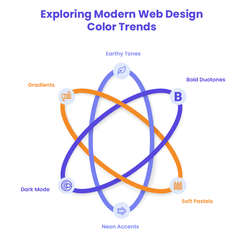
As digital design evolves, so do the types of colors used in modern web aesthetics. Color trends shift based on user preferences, technology, and industry needs, making it essential for digital agencies to stay ahead of the curve.
1. Gradients for Depth and Dimension
Gradients have made a strong comeback, replacing flat color types with dynamic transitions.
- How it works: Smooth color blending between two or more hues creates depth and visual intrigue.
- Usage: Popular in backgrounds, buttons, and brand identities (e.g., Instagram’s gradient logo).
- Industry trends: Found in creative agency websites and tech startups looking to appear innovative and vibrant.
2. Neon and Futuristic Accents
Neon colors provide a high-energy, futuristic aesthetic that stands out on digital screens.
- How it works: Bright, glowing hues contrast against dark backgrounds for a cyberpunk-inspired look.
- Usage: Used in SaaS and gaming industries for a cutting-edge feel.
- Examples: Brands like Spotify Wrapped and entertainment platforms frequently leverage neon highlights.
3. Soft Pastels for a Friendly Aesthetic
Pastel colors offer a warm, approachable look, especially in wellness, beauty, and lifestyle industries.
- How it works: Muted shades of pink, blue, green, and yellow create a relaxed and welcoming atmosphere.
- Usage: Ideal for health and eCommerce sites targeting a calming user experience.
- Examples: Popular in brands like Airbnb and Notion, which use pastels to convey friendliness and creativity.
4. Bold Duotones for Striking Visuals
Duotone color schemes use two contrasting colors to create high-impact visuals.
- How it works: A combination of a primary and secondary color applied over images or backgrounds.
- Usage: Common in hero images, branding, and editorial websites for a dramatic effect.
- Examples: Seen in Spotify’s marketing campaigns, where bold duotones enhance contrast and visual appeal.
5. Dark Mode and High-Contrast UI
With the rise of dark mode in web design, color schemes have shifted to accommodate high-contrast layouts.
- How it works: Dark backgrounds paired with vibrant text and accents for readability and reduced eye strain.
- Usage: Used in mobile apps, SaaS websites, and creative agency portfolios.
- Examples: Websites like Apple and Discord incorporate dark mode for a sleek, modern look.
6. Earthy and Natural Tones for Sustainability
As sustainability becomes a priority, many brands are shifting toward natural and earthy color palettes.
- How it works: Greens, browns, and beiges create an organic, eco-friendly vibe.
- Usage: Found in environmental brands, wellness industries, and farm-to-table businesses.
- Examples: Companies like Patagonia and Whole Foods use muted, nature-inspired tones to reinforce their sustainability mission.
Why These Trends Matter for Digital Agencies
Keeping up with color trends in modern web design allows agencies to deliver visually relevant, user-friendly websites that resonate with audiences. Whether creating eCommerce platforms, SaaS applications, or creative portfolios, leveraging the right types of colors enhances usability and brand perception.
Final Words
Understanding types of colors is essential for designers, marketers, and digital agencies aiming to create visually compelling and emotionally engaging content. From mastering the color wheel to leveraging color psychology, applying these principles can significantly impact branding, website design, and user experiences.
By strategically selecting different types of colors, businesses can communicate their brand values, guide user behavior, and establish strong emotional connections with their audience. Whether it’s crafting a high-converting eCommerce site, an eye-catching advertisement, or a user-friendly web interface, color theory is a powerful tool that shapes perception and influence.
Team Up with WLA for Your Web Design Needs
Creating a visually stunning and high-performing website requires expert knowledge of design principles, development best practices, and strategic branding. White Label Agency (WLA) specializes in custom WordPress development and design for digital agencies, ensuring seamless execution of your clients’ projects.
Whether you need a scalable solution, professional web design, or expert development, WLA is your reliable partner. Let’s work together to elevate your agency’s offerings and create stunning websites that captivate audiences. Contact us today!
FAQs
What are the different shades of colors?
Shades are created by adding black to a color, making it darker and richer while maintaining its original hue. For example, navy blue is a shade of blue, and maroon is a shade of red. Shades add depth and contrast, often used in sophisticated and bold designs.
How many different colors are there?
The number of colors is theoretically infinite since colors blend seamlessly across spectrums. However, in digital displays, the RGB color model supports 16.7 million colors, while the Pantone Matching System (PMS) and traditional color wheels categorize thousands of identifiable hues.
How many main colors are there?
There are three main colors, known as primary colors: red, blue, and yellow. These colors serve as the foundation for creating all other colors in the RYB (Red-Yellow-Blue) color model used in traditional art and design.
How many secondary colors are there?
There are three secondary colors: orange, green, and purple. These colors are created by mixing two primary colors together:
Red + Yellow = Orange
Blue + Yellow = Green
Red + Blue = Purple
Orange, green, and purple are what types of colors?
Orange, green, and purple are secondary colors. They are formed by mixing two primary colors in equal parts. Secondary colors are essential in color theory as they help expand the color palette and create harmonious and contrasting combinations in design.