
- Mobile-First vs Responsive Design: What’s the Difference?
- Benefits of a Mobile-First WordPress Website
- Planning Your WordPress Website with a Mobile-First Strategy
- Choosing a Mobile-First WordPress Theme
- Implementing Mobile-First Design in WordPress
- Essential Mobile Optimization Techniques
- Mobile-First Plugins & Tools for WordPress
- How to Test Your Mobile-First WordPress Website
- Common Mistakes to Avoid in Mobile-First WordPress Design
- Why WordPress Mobile First Should Be Your Top Priority
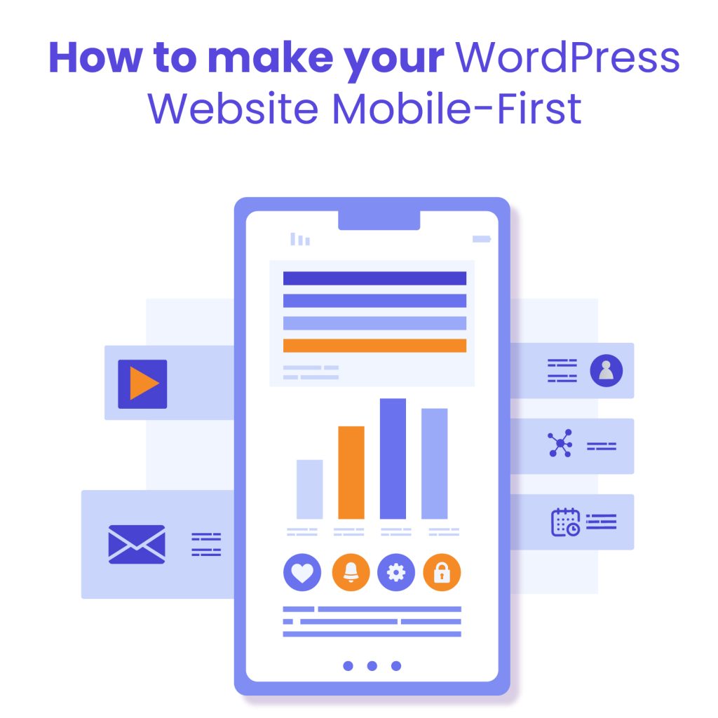
A mobile-first website is one that’s designed with mobile users as the top priority. Instead of starting with a desktop layout and scaling down, mobile-first design begins with smaller screens and builds upward. The result is a faster, more responsive experience that meets the needs of users on smartphones and tablets before adapting to larger devices.
Mobile traffic now accounts for over 58% of global web usage, and that number continues to climb. If your WordPress site isn’t optimized for mobile, you’re likely losing potential visitors, leads, and customers due to slow load times, poor navigation, or formatting issues on small screens.
Google has responded to this shift with mobile-first indexing, meaning it primarily uses the mobile version of a website’s content when determining search rankings. For WordPress site owners, adopting a WordPress mobile first approach is no longer optional – it’s a critical step for SEO, usability, and staying competitive.
In this guide, we’ll explore the benefits of mobile-first design, walk you through how to apply it to your WordPress site, and highlight tools and themes to make the process easier.
Mobile-First vs Responsive Design: What’s the Difference?
When optimizing a WordPress site for mobile, two terms often come up: mobile-first design and responsive design. While they sound similar, they represent different approaches to web development.
What is Mobile-First Design?
Mobile-first design means building your website starting with the smallest screen size – typically smartphones – and then gradually enhancing the layout for larger devices like tablets and desktops. This approach forces developers and designers to focus on essential content, fast load times, and streamlined navigation from the start.
What is Responsive Design?
Responsive design is a flexible layout strategy where a website automatically adjusts to fit any screen size, from mobile phones to desktop monitors. It typically starts with a desktop layout and then uses CSS media queries to adapt elements for smaller screens.
Key Differences in Development Approach
| Aspect | Mobile-First Design | Responsive Design |
| Starting Point | Mobile screens | Desktop screens |
| Performance Focus | Prioritizes speed and minimalism | May require stripping down desktop features |
| Design Strategy | Progressive enhancement (add features as screen size increases) | Graceful degradation (remove features as screen size shrinks) |
| Content Hierarchy | Starts with essential content | Adapts existing content for smaller screens |
Which Approach is Better for Modern WordPress Websites?
For most modern WordPress websites, mobile-first design is the smarter choice – especially with Google’s mobile-first indexing and the growing dominance of mobile traffic. It ensures your site delivers a seamless experience where it matters most: on the devices your users are actually using.
While responsive design is still widely used and effective, combining it with a WordPress mobile first strategy offers the best of both worlds: performance, usability, and improved SEO.
Benefits of a Mobile-First WordPress Website
Shifting to a WordPress mobile first approach offers far more than just visual appeal—it can directly impact how your site performs in search, how users interact with your content, and how effectively you convert visitors into customers. Here are the key benefits of building your WordPress site with a mobile-first mindset:
Better SEO Rankings
With Google’s mobile-first indexing, the mobile version of your site is what gets crawled and ranked. If your mobile experience is lacking, your search visibility may suffer – regardless of how good your desktop site looks. A mobile-first WordPress site ensures your content is structured and optimized for the version Google prioritizes, giving you a better chance to climb the search engine rankings.
Improved User Experience
A mobile-first approach focuses on what users need most when browsing on smaller screens: simplicity, clarity, and ease of navigation. By prioritizing content and functionality for mobile users, you eliminate clutter and streamline the experience – making it easier for visitors to find what they’re looking for and engage with your site.
Faster Load Times
Mobile users expect websites to load quickly, and speed is also a ranking factor for SEO. Mobile-first design encourages lightweight layouts, optimized images, and cleaner code – all of which contribute to faster load times. A WordPress mobile-first site built with performance in mind can reduce bounce rates and keep users engaged longer.
Higher Conversion Rates on Mobile
Whether it’s signing up for a newsletter, making a purchase, or booking a service, mobile users are more likely to convert when the experience is smooth and frictionless. By designing your site specifically for mobile interaction, you remove common obstacles like slow load times, hard-to-tap buttons, or unreadable content – helping boost your mobile conversion rates.
WordPress website building
Enhance your agency’s offerings with expert WordPress website building services. We design, develop, and maintain fast and responsive WordPress sites.
Planning Your WordPress Website with a Mobile-First Strategy
Designing with a mobile-first strategy starts well before you begin development. It requires a thoughtful approach to how your site will perform and be experienced on smaller screens. Here’s how to lay the groundwork for a successful mobile-first website:
Identify Your Mobile Audience and Behaviors
Start by understanding who your mobile visitors are and how they interact with your site. Use tools like Google Analytics or Hotjar to uncover patterns – such as which pages get the most mobile traffic, how long users stay, and where drop-offs happen. Knowing what your audience expects and needs on mobile will help guide decisions about layout, navigation, and content prioritization.
Set Mobile Performance Goals
Establish clear performance goals for your mobile site. This could include target page load times, bounce rate reductions, or improving mobile conversion rates. Setting measurable benchmarks early helps keep your design and development teams aligned and focused on what matters most for mobile users.
Mobile Wireframing Before Desktop Design
Before jumping into a full site layout, start with mobile wireframes. Designing for the smallest screen first forces you to focus on core functionality and essential content. It’s a powerful way to simplify the user experience and ensure your most important elements are always front and center. Once the mobile version is solid, you can progressively enhance the design for larger screens.
Choosing a Mobile-First WordPress Theme
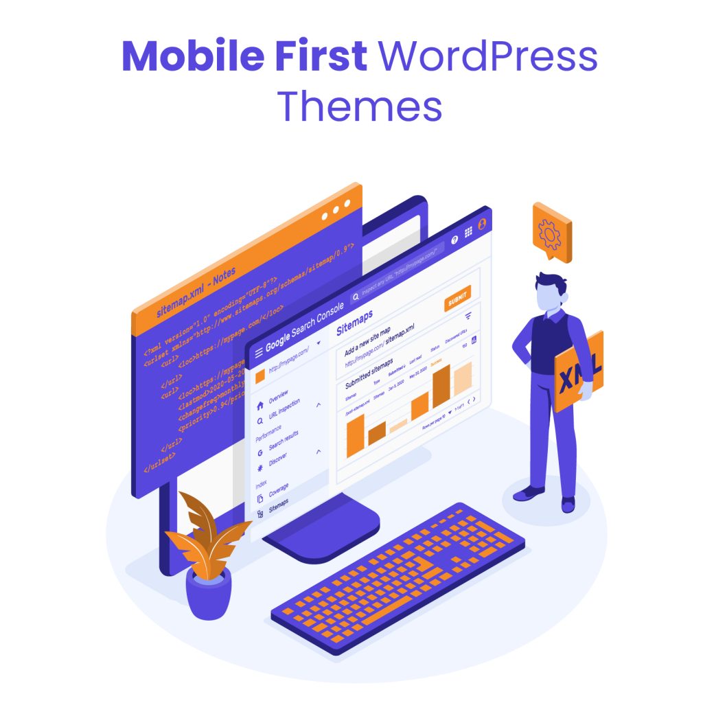
Not all WordPress themes are built with mobile users in mind. If you’re following a WordPress mobile-first strategy, choosing the right theme is critical to ensure your site looks and performs well across all devices – especially smartphones.
Features to Look for in a Theme
When evaluating themes for mobile-first design, look for:
- Responsive and mobile-first layout: Confirm the theme is designed starting with mobile layouts, not just resized for smaller screens.
- Fast loading speed: Lightweight themes with clean code will help reduce load times on mobile networks.
- Customizable typography and spacing: Mobile-friendly fonts and spacing improve readability on small screens.
- Touch-friendly navigation: Menus, buttons, and forms should be easy to use with thumbs and fingers.
- Built-in SEO and accessibility support: Themes that follow best practices for mobile SEO and accessibility give you a strong foundation.
Recommended Mobile-First or Mobile-Optimized Themes
Here are a few popular themes that work well with a WordPress mobile first approach:
- GeneratePress – Known for speed, accessibility, and mobile-first structure.
- Astra – Lightweight, SEO-friendly, and optimized for mobile performance.
- Kadence – Offers mobile-first controls and fast loading times.
- Neve – A flexible and mobile-optimized theme that works well with page builders.
- Blocksy – Designed with modern performance standards and mobile responsiveness in mind.
How to Test a Theme’s Mobile Performance Before Purchase
Before committing to a theme, it’s smart to test how it performs on mobile. Here’s how:
- Use Google’s Mobile-Friendly Test: Enter the theme demo URL to check if it passes basic mobile usability standards.
- Test speed with PageSpeed Insights or GTmetrix: These tools highlight load times and mobile performance issues.
- Browse the demo on different devices: Open the theme demo on your phone or use browser developer tools to simulate various screen sizes.
- Check for layout issues: Look for overlapping text, broken navigation, or hard-to-tap elements that could impact usability.
Choosing the right theme is a big step toward building a successful WordPress mobile first site that’s fast, user-friendly, and optimized for search.
Implementing Mobile-First Design in WordPress
Once you’ve planned your site and chosen the right theme, the next step is to bring your mobile-first strategy to life through design and development. Here’s how to implement mobile-first principles effectively within WordPress.
Designing with a CSS Mobile-First Approach
A mobile-first approach in CSS means writing styles for small screens first, then adding styles for larger screens using media queries. Start by setting default styles that work well on mobile devices. Then use @media rules to enhance the layout as screen sizes increase.
Example:
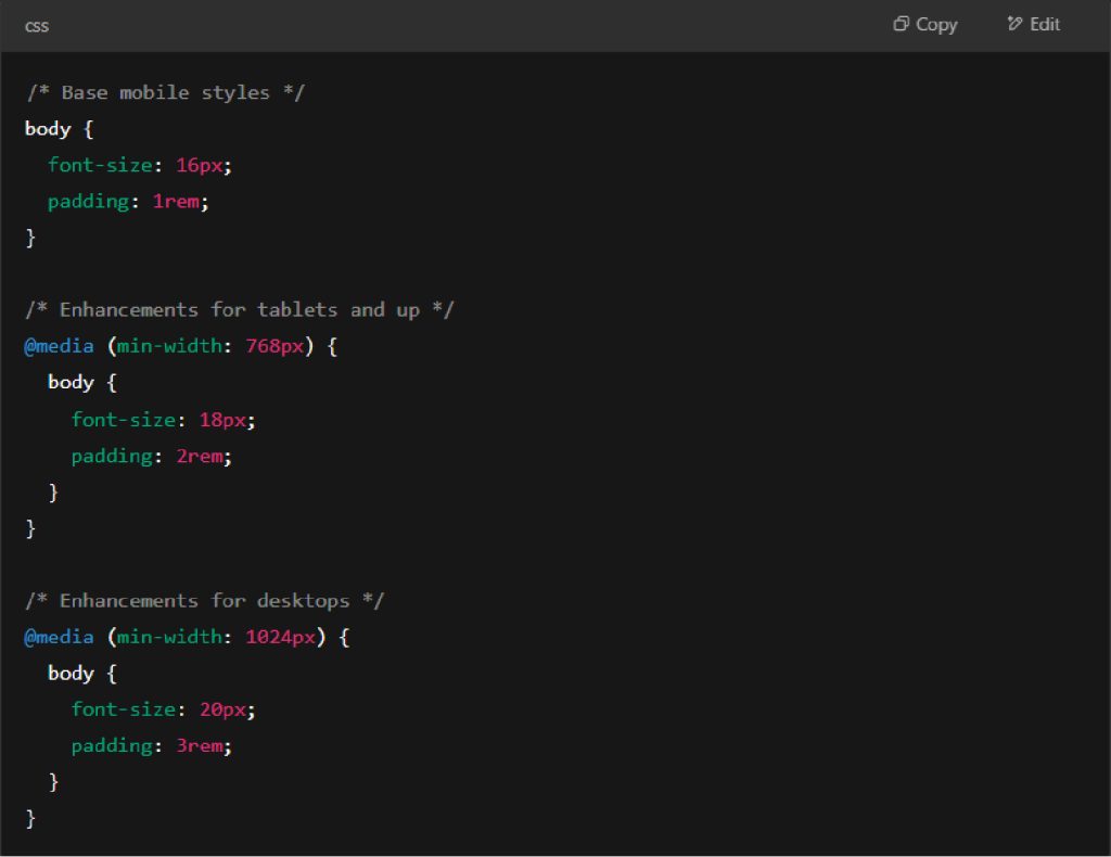
This method ensures that your site is optimized for smaller screens first and progressively improves for larger ones.
Gutenberg vs Page Builders: Which is Better for Mobile-First?
Both Gutenberg and page builders like Elementor or Beaver Builder offer tools to create responsive designs – but they approach it differently.
- Gutenberg is lighter and more performance-friendly. It offers good control over spacing, columns, and layout blocks with mobile responsiveness built in. It’s a great choice if you want to keep your site fast and lean.
- Page builders offer more design flexibility and visual controls, often with mobile-specific settings (like hiding elements or adjusting padding per device). However, they can add extra bloat if not used carefully.
If performance and clean code are your priority, Gutenberg is usually the better option. If design flexibility is more important, a modern page builder with mobile controls may suit your needs.
Structuring Layout and Mobile-Friendly Navigation
Mobile-friendly layout means simplicity. Use single-column structures for mobile and keep key content near the top. Avoid sidebars or elements that don’t scale well on small screens.
Navigation should be:
- Easy to tap with thumbs
- Collapsible (like a hamburger menu)
- Clear and concise (limit menu items)
Sticky navigation bars or back-to-top buttons can also improve usability without overwhelming the screen.
Typography and Font Size Optimization
On smaller screens, readability is everything. Use a base font size of 16px or larger and avoid lightweight or overly decorative fonts. Ensure enough line spacing (1.4–1.6) for easy scanning and choose high-contrast color combinations.
Keep headers clear and scaled appropriately using relative units like em or rem to ensure they adjust naturally with screen size.
Essential Mobile Optimization Techniques

Building a WordPress mobile first website doesn’t stop at layout and design – it also requires fine-tuning your site’s performance so it loads quickly and runs smoothly on mobile devices. Here are essential optimization techniques every site owner should implement:
Compress and Resize Images for Mobile
Large images are one of the biggest culprits behind slow mobile load times. Use tools or plugins to compress image file sizes without losing quality. Additionally, serve appropriately sized images for different screen widths using responsive image attributes like srcset or plugins that handle this automatically. This ensures that mobile users aren’t downloading unnecessarily large files.
Minify CSS, JavaScript, and HTML
Minifying your code removes unnecessary characters like spaces, comments, and line breaks to reduce file size. This helps your site load faster, especially on slower mobile networks. Many caching plugins for WordPress include built-in options to minify CSS, JS, and HTML files with just a few clicks.
Use Lazy Loading for Images and Videos
Lazy loading defers the loading of media content until it’s needed – typically when a user scrolls down to that part of the page. This reduces the initial page load time and improves performance for mobile users. WordPress has native support for lazy loading images, and you can extend it to videos with the help of performance plugins.
Enable Browser Caching
Browser caching stores parts of your site on a user’s device so returning visitors don’t have to reload everything from scratch. This is especially helpful for mobile users who may be revisiting your site on the go. Most WordPress caching plugins allow you to enable browser caching with default or customizable settings.
Eliminate Render-Blocking Resources
Render-blocking resources (usually CSS or JavaScript files) can delay how quickly a page displays. To optimize your WordPress mobile first site, defer non-critical scripts and use inline styles for essential elements. Tools like Google PageSpeed Insights can help you identify and fix render-blocking issues.
Mobile-First Plugins & Tools for WordPress
To fully embrace a WordPress mobile first approach, it’s important to use the right plugins and tools that enhance mobile user experience, boost performance, and ensure accessibility. Below are some of the most effective plugins for mobile-first optimization.
Top Plugins to Improve Mobile UX
- AMP (Accelerated Mobile Pages) – Automatically creates fast-loading mobile versions of your pages. Google-backed and SEO-friendly, AMP is ideal for content-heavy sites like blogs or news platforms.
- WPtouch – Instantly adds a mobile-specific theme to your WordPress site without modifying your existing desktop theme. It’s a quick way to offer a clean and user-friendly mobile experience.
- Smush – Helps optimize images for mobile by compressing and resizing them without losing quality. Ideal for improving mobile load times.
- Responsive Menu – Lets you create highly customizable, mobile-optimized navigation menus that are easy to tap and look great on small screens.
Mobile-Specific Caching and Performance Plugins
- LiteSpeed Cache – Offers mobile-specific cache options, image optimization, and lazy loading – perfect for a WordPress mobile first performance setup.
- WP Rocket – Although not mobile-exclusive, it includes powerful features like mobile caching, minification, and deferred loading that greatly improve mobile performance.
- Autoptimize – Helps with minifying CSS/JS/HTML and optimizing scripts that could slow down your mobile site.
Accessibility Tools and Plugins
- WP Accessibility – Adds features to improve mobile accessibility, like skip links and better keyboard navigation support.
- AccessibleWP Toolbar – Gives users control over font size, contrast, and other visual elements for better mobile readability.
- One Click Accessibility – Offers a lightweight way to boost accessibility across devices, ensuring that your mobile site is usable by all audiences.
These tools help bring your WordPress mobile first strategy to life by ensuring a fast, intuitive, and inclusive experience for mobile users. Up next, we can wrap it up with a summary or add a checklist – just let me know what you need!
Projects
Outsource web projects with confidence. We provide fixed-price white-label WordPress development and dedicated management with no upfront payment.
How to Test Your Mobile-First WordPress Website
After designing and optimizing your WordPress mobile first site, it’s essential to test how it performs across various mobile devices and screen sizes. Proper testing ensures your site meets performance, usability, and SEO standards. Here are the top tools to help you evaluate and fine-tune your mobile-first design:
Google Mobile-Friendly Test
This free tool from Google quickly checks if your site is mobile-friendly. Just enter your URL, and it will analyze factors like text readability, button spacing, viewport configuration, and overall usability on mobile devices. It’s a fast way to validate whether your WordPress mobile first efforts align with Google’s standards.
Chrome DevTools for Mobile Simulation
Chrome’s built-in DevTools allow you to simulate your website on various mobile devices. Open your site, right-click, and choose “Inspect,” then click the device icon to toggle mobile view. You can test responsiveness, touch interactions, and performance across multiple screen sizes – all without needing physical devices.
PageSpeed Insights and Core Web Vitals
PageSpeed Insights evaluates your website’s loading performance and provides specific recommendations to improve it. It includes key Core Web Vitals metrics like:
- Largest Contentful Paint (LCP) – Measures loading speed
- First Input Delay (FID) – Measures interactivity
- Cumulative Layout Shift (CLS) – Measures visual stability
Optimizing these metrics is crucial for a high-performing WordPress mobile first site, as they directly impact user experience and search rankings.
Lighthouse Performance Audit
Lighthouse is an open-source auditing tool built into Chrome DevTools. It runs a full performance analysis across categories like speed, accessibility, SEO, and best practices. The mobile-focused audit helps you catch overlooked issues and provides actionable suggestions to enhance your site’s mobile-first experience.
Common Mistakes to Avoid in Mobile-First WordPress Design
One of the most common missteps in mobile-first design is starting with a desktop layout and then trying to adapt it for smaller screens later. This approach often leads to cluttered interfaces, awkward navigation, and performance issues on mobile devices. True mobile-first design begins with the constraints and priorities of mobile users in mind – anything less is a missed opportunity.
Another issue is relying on heavy themes or bloated plugins that add unnecessary scripts, styles, and features. These can drastically slow down load times, especially on mobile networks. Choosing lightweight, performance-optimized tools is essential for creating a smooth and fast experience on smaller screens.
Touch-friendly navigation is often overlooked. Menus, buttons, and interactive elements need to be large enough and spaced appropriately to be used comfortably with fingers. Neglecting this leads to frustration for users and increases the likelihood they’ll abandon the site.
Finally, overcomplicating your layout or using excessive animations can hinder the user experience. What might look sleek on a desktop could feel sluggish or distracting on mobile. Simple, focused design that prioritizes usability will always outperform complex visuals that add little value to the user.
Avoiding these mistakes can make the difference between a site that frustrates visitors and one that performs beautifully across all devices.
Why WordPress Mobile First Should Be Your Top Priority

Mobile-first is no longer a trend – it’s the standard. Designing your site with a WordPress mobile first mindset ensures that you’re meeting your audience where they are: on their phones. From faster load times and better SEO to improved user engagement and higher conversions, the benefits of mobile-first design are impossible to ignore.
If you haven’t already, now is the time to audit your current WordPress site. Check how it performs on mobile, evaluate your theme and plugins, and identify areas where speed, usability, or layout may be falling short.
Need help implementing a mobile-first strategy or optimizing your site for today’s users? At White Label Agency, we specialize in building high-performance, mobile-optimized WordPress websites for agencies and businesses. Whether you need a fresh redesign, performance improvements, or a mobile UX audit – we’re ready to help you deliver a better experience across all devices. Contact us to make your WordPress site truly mobile-first.