Websites are getting bolder and smarter. They’re not just about looks; they’re also built to engage.
At White Label Agency we’re getting a surge of design requests from digital marketing agencies, especially for distinctive and interactive designs. Agencies are clearly investing more in design. Although, from what our clients are telling us, it’s not just end clients who’re driving this change; agencies are highly aware of what their competitors offer and they don’t want to be left behind.
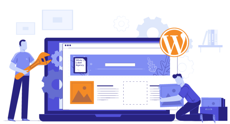
Is your agency keeping up in design? Let’s go over some proven strategies in WordPress website design. We’ll draw from our experience, serving WordPress outsourcing services to over 600 digital marketing agencies, to examine what works and help you elevate the design of your websites.
Empowering user-centric experiences through responsive design
Understanding responsive design
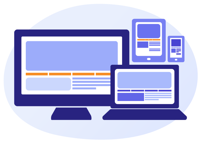
Nowadays, the concept of responsive design has evolved from an option to a necessity. Throughout our decade-long journey, The White Label Agency has stood firmly committed to sculpting websites that seamlessly adjust to every conceivable screen dimension. Whether it’s a desktop, tablet, or smartphone, our approach ensures that users enjoy a consistent and engaging experience, irrespective of the device they choose.
The impact on user experience
Responsive design transcends being a mere buzzword; it’s about making the user experience as effortless and engaging as possible. Drawing from our extensive experience, we’ve witnessed firsthand the tangible benefits of this approach. Websites optimized for diverse devices exhibit substantially lower bounce rates, suggesting that users find the content compelling enough to explore further. This heightened engagement naturally paves the way for increased conversions, as visitors are more likely to take desired actions on a platform that feels tailor-made for their chosen device.
Leveraging cutting-edge techniques
Our proficiency in employing modern techniques sets us apart in the area of WordPress website design. The implementation of fluid grid systems allows content to dynamically adjust, providing optimal visual appeal regardless of screen size. Complementing this, CSS media queries enable us to apply specific styling rules based on the device’s characteristics, ensuring an impeccably functional design. This dedication to staying at the forefront of design techniques empowers us to consistently deliver websites that not only captivate users but also function flawlessly across the ever-expanding spectrum of devices.
Best screen resolutions for WordPress sites
When creating a WordPress website design, it is important to consider the best screen resolutions for your target audience. The most popular screen resolutions for WordPress sites include:
- 1920 x 1080: This is the most common screen resolution for desktop computers and laptops. It provides a good balance between screen real estate and image quality.
- 1440 x 900: This is a slightly smaller resolution than 1920 x 1080, but it is still considered a relatively large size for computer monitors and laptops.
- 1366 x 768: This is a common resolution for laptops and tablets. It is smaller than 1920 x 1080, but it is still large enough to provide a good user experience.
- 1280 x 720: This is a common resolution for smartphones. It is the smallest resolution on this list, but it is still large enough to be readable and usable on a small screen.
When choosing the best screen resolution for your WordPress website, you should consider the following factors and ask several questions:
- The target audience: What are the screen resolutions of the devices your target audience is most likely to use?
- The content and functionality of the website: How much content will be on the website? What features will be included?
- The budget: How much are you willing to spend on designing and developing the website?
Having answers to all these questions will determine which resolution is optimal for your future goals.
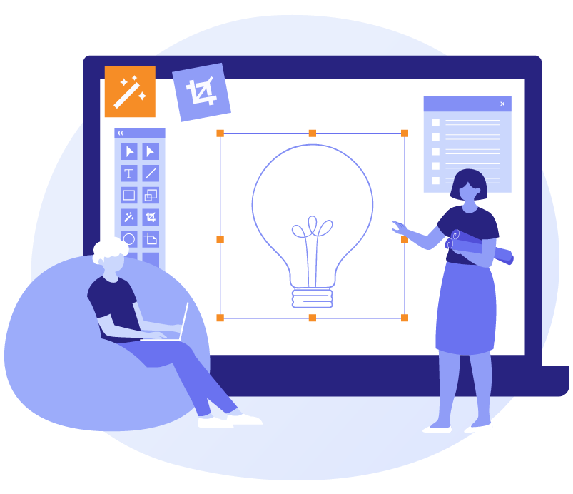
For The WLA, creating a WordPress website design has been a common practice throughout these years. I spoke to Elene, one of WLA’s web designers, and before we summarize, let’s take a look at her method.
Elene’s design philosophy is centered on a seamless and user-centric encounter. She adopts a multidimensional approach by crafting numerous designs for a single website, ensuring user-friendliness across diverse sizes while maintaining a consistent experience. Employing a flexible grid system, she artfully arranges elements on the page, allowing for visually captivating and responsive designs. Her arsenal includes creating design elements in various iterations, such as large and small buttons with or without icons. This empowers her to seamlessly adapt designs based on screen size, optimizing user engagement. Notably, Elene harnesses vector files for all design elements, ensuring pixel-perfect clarity across different screen sizes.
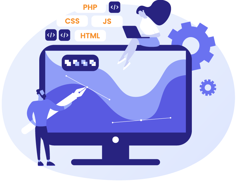
Responsive synergy: Designer-Developer collaboration
Responsive web design is not a solo performance, it’s a harmonious duet between designers and developers. Let’s highlight several important factors:
Harnessing Grid System Brilliance: The shared appreciation for grid systems is pivotal. Developers, working within frameworks like Foundation, ensure the grid adapts fluidly to diverse screen sizes, creating a consistent user journey.
Vector Files: Both parties endorse vector files for their resolution independence, preserving image quality across screens. However, challenges arise when raster images are embedded within vector files. Smart solutions involve high-resolution images or strategic optimization to prevent pixelation.
Viewport Width: The introduction of viewport width (vw) units is a revelation. This technique ensures proportional scaling of elements with the viewport width, echoing the dedication to the adaptable design and delivering a uniform experience.
Harmonizing Element Order: Synchronizing the logical order of section elements is essential for consistency. This shared perspective highlights the complexity of maintaining a seamless user journey across diverse designs.
Digital marketing agencies place great focus on WordPress website design. They push ahead of each other with ever bolder and smarter designs and the pace of the industry is swift.
Yet, with the right strategies, your agency needn’t be left behind. At White Label Agency, we recommend a strong focus on responsive design, screen resolution and on effective collaboration between designers and developers.
If your agency would like to partner with a WordPress outsourcer that can help you lead the industry in design, contact us at White Label Agency. Over ten years we’ve produced over 10,000 websites and we know responsive web design. In addition to WordPress design services, we offer website development, maintenance and dedicated developer rental. Don’t hesitate to contact our sales team today.